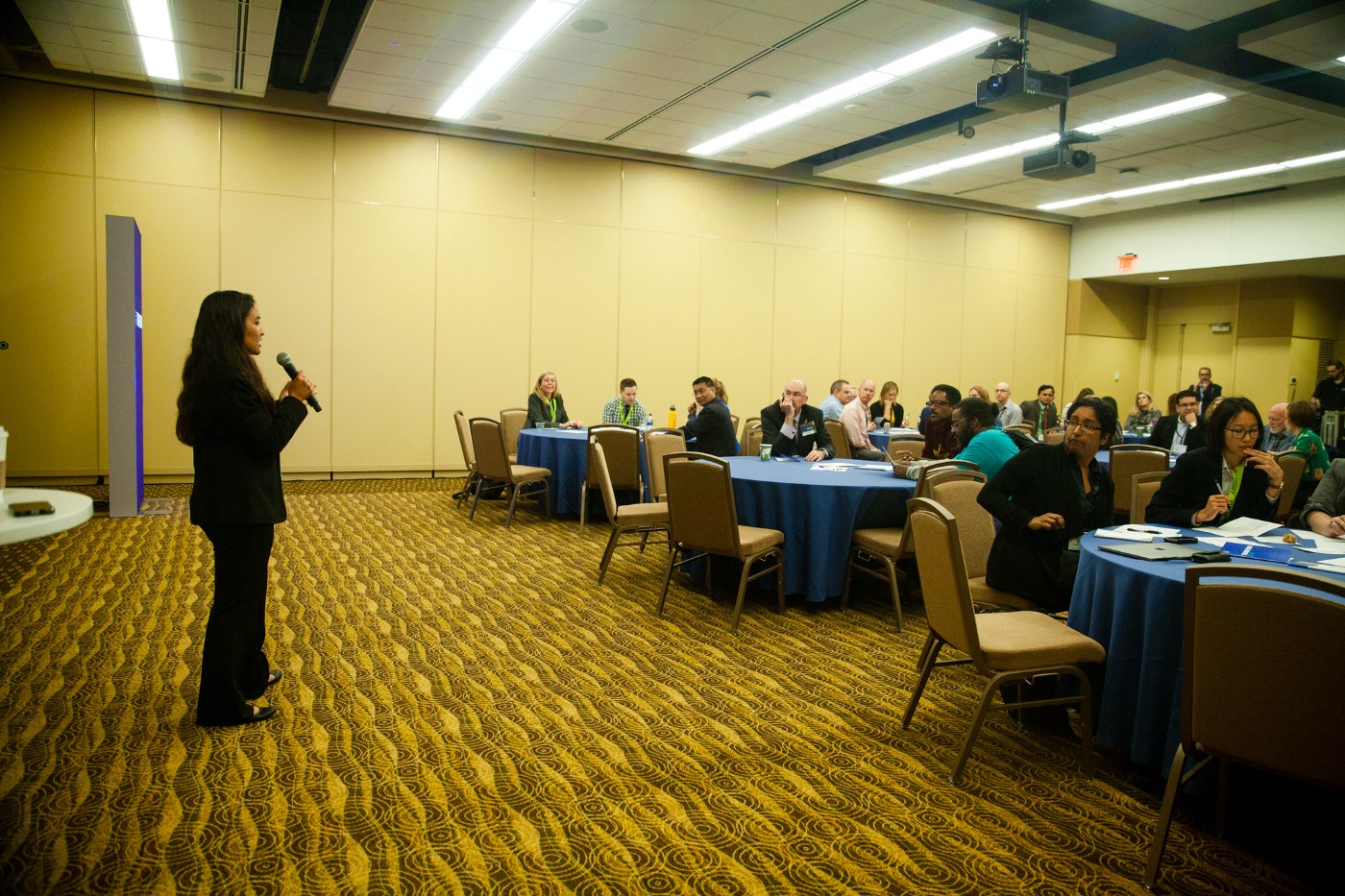
Earlier this year, we collaborated with Mayo Clinic’s Center for Innovation to develop prototypes of data-driven healthcare applications for the future. Our design and development process is unusual in the healthcare field — as it is in many fields — and Mayo, impressed with the results, asked us to run a breakout session at Transform outlining how we use our process to approach problems surrounding patient data.
In order to effectively communicate our process, we didn’t simply explain it; we had participants act on it themselves.
Each group of 3–4 people received a set of fake patient data and a scenario card outlining the audience and context for which they were designing. You can see an example scenario card below. They also received a worksheet.
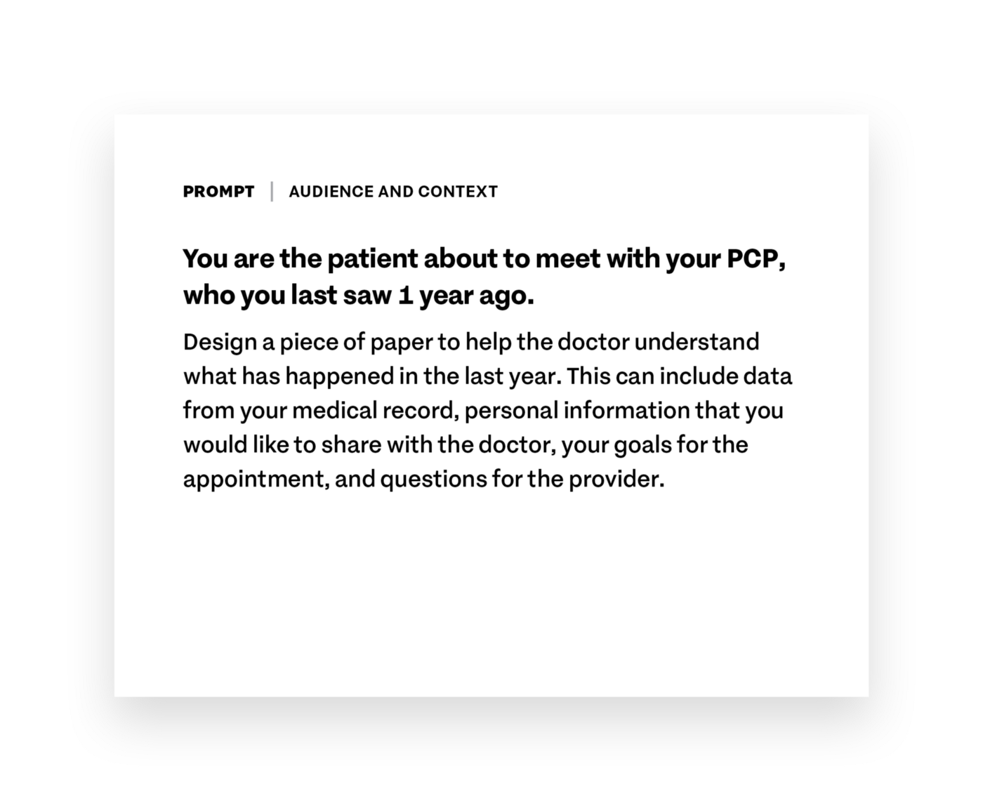
The worksheet walked everyone through the process of choosing the most important and/or relevant pieces of data for their scenario and sketching out a wireframe that highlights said pieces of data. We also encouraged them to pick one piece of data that lends itself well to visual representation (e: a line graph of step count data) and include that in the wire frame as well.
Overwhelmingly, people were open-minded and curious to see what would come of the exercise.
A few participants started off more skeptical, though, concerned about the constraints of the exercise. Comments included, but were not limited to:
- But I don’t have enough data
- But I don’t have the right data
- But I, a physician, am being asked to think from the patient’s perspective. I don’t know how to think from the patient perspective!
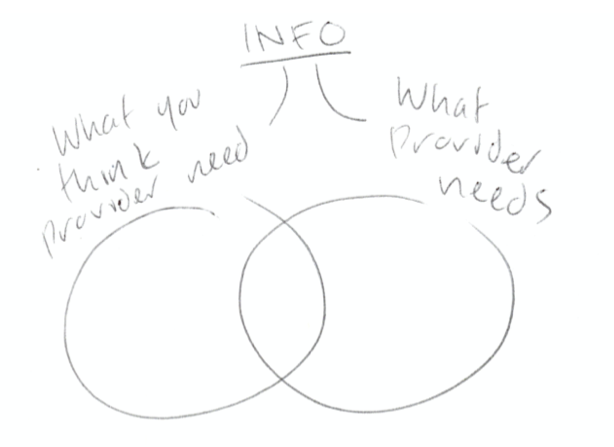
One participant quickly realized one of the key difficulties of these scenarios, indicated in the Venn diagram below.
By the end of the activity, however, everyone was excited about what they’d created, skeptics included.
The same physician as above who had just claimed that he couldn’t think from the patient perspective had an moment of enlightenment. In his wireframe, he mapped out what one of his team members described as “the patient’s data ecosystem,” drawing patient symptoms as nodes and potential correlations between symptoms as connections between the nodes.
“This is how the patient thinks of their symptoms,” he said. We saw the look on his face as the value of what he had just drawn dawned on him. “This is amazing,” he said. “Can you guys make the EHR look like this?”
It was exciting to hear everyone raise design concerns and considerations that were above and beyond the scope of the activity.
As nurses, physicians, and care team members, many problems immediately and intuitively stood out to them. It was proof that they were thinking seriously and critically about the scenarios they were given. For example:
- One group was told to design a phone interface that would help a family member keep track of specific care instructions for a patient who had just received open heart surgery. Coincidentally, one of the group members was a cardiac physician. She noted that most people receiving open heart surgery are elderly, and their caregiver is usually their elderly spouse. For this demographic, a smart phone is not the right device. A paper worksheet is much more fitting.
- Several groups rightly pointed out that all of our scenarios lacked accessibility considerations. What if the user is visually impaired? What if they can’t look at a screen?
Two people from the University of Minnesota, who work with and advocate for the health needs of housing unstable individuals, made a particularly salient point. Imagine a patient who had been regularly attending medical appointments until a year ago, at which point they stopped attending appointments altogether. What happened? Are there socioeconomic factors that are preventing them from attending their appointments? What if the EHR could flag these individuals so that the care network could reach out to them and help them meet their healthcare needs?
After the session ended, we collected the sketches and notes that people had left behind.
When we returned to Boston and had a chance to look at them, we were thrilled to discover the range of ideas and level of creativity that was evident in just 45 minutes of work. As we were hoping, most participants didn’t get too bogged down worrying about details and technicalities. They thought big-picture, which informed their design.
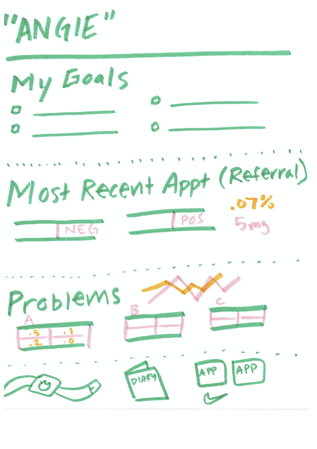
In the example below, patient goals are prominently displayed at the top of the page. We love this! It’s so easy for a provider to quickly understand exactly what a patient wants to accomplish in order to have a successful visit.
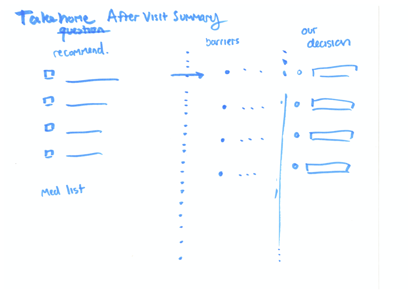
Another example takes patient goals even further, asking the question, “What is the biggest barrier to achieve your goals?” In the second image below, you can see how this question informed their wireframe. There’s a clear path from a recommended care plan, to considering individual patient barriers, to a resulting decision that makes sense for the patient. The last column, “Our Decision,” makes it clear that the patient and provider should be working together. This is ideally always the goal, but as many of us know, this doesn’t always happen, or it doesn’t always feel that way.
At the end of the worksheet, we asked each group, “What are you trying to understand about this data?”
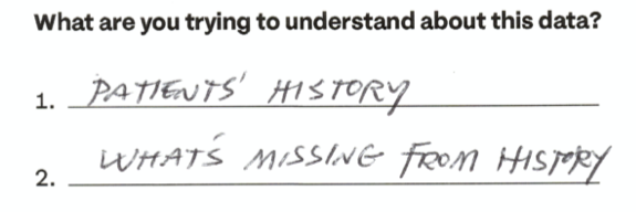
Two groups came up with questions that can and should serve as guiding principles for anyone designing technologies related to patient data and patient-provider communication. The first group wrote down “patient history” and “what’s missing from history.” These pieces of information together can create a powerful picture of a patient. We shouldn’t just be focused on what existing data can tell us, but also what gaps in the record can tell us.
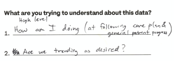
Another group wrote “How am I doing?” and “Are we trending as desired?” If you can’t look at a patient’s data and quickly understand the high-level pieces of their medical history — if you can’t simply answer the question “is this person relatively healthy?” — then our healthcare technology and the EHR are not serving the needs of the patient.
Throughout the Transform conference, we heard again and again that patient needs and outcomes should, but often fail, to come first and foremost in every aspect of the healthcare system.
But it was encouraging to hear many voices echoing this need for improvement and renovation. We were so glad that our workshop was a part of this effort, encouraging others to see patient data and health records in a new light.
We’d love to hear what you’re working on, what you’re curious about, and what messy data problems we can help you solve. Drop us a line at hello@fathom.info, or you can subscribe to our newsletter for updates.