Take these examples:
“We tackle the problem of counting the number of k-cliques in large-scale graphs, for any constant k ≥ 3.”
“Now, I’m guessing we won’t agree on health care anytime soon. A little applause right there. Just a guess. But there should be other ways parties can work together to improve economic security.”
You can probably guess from the terminology that the first sample comes from an academic paper in the math/science domain. Even absent of the references to applause and political parties, the contractions and casual tone suggest that that the second is a transcript of a speech.
For a recent project analyzing large document collections, we wanted to see whether we could make some of the same inferences using code.
The goal was to write a program that would encode key characteristics of a document into a set of numbers that could be plotted and analyzed. Ideally, those metrics could be used to clearly distinguish between very different document formats (e.g. song lyrics vs a legal brief). They could also be used to look at variation and identify outliers within a set of similar documents (e.g. a cache of diplomatic cables).
We started by coming up with a set of axes that might be used to characterize a document. Is it accessible or esoteric? Does it dive deeply into one topic or cover many topics? Is it free form or does it follow a set format? Here are a few more:
- breadth ← → depth
- short ← → long
- simple ← → complex
- objective ← → subjective
- casual ← → formal
Some of these characteristics were easy to quantify, and others much less so. We particularly liked the following five metrics, both because they felt useful and meaningful and because the methodology behind them was easy to understand and communicate.
- Word Count: You know this one from high school (I’ve been checking it while writing this blog post). Word count is a quick way to get a sense whether you’re looking at a news brief, a tweet, or an in-depth report.
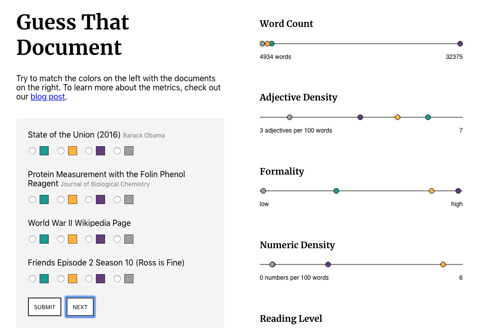
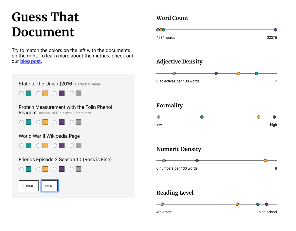
Taken together, these numbers can be used to create a sort of “report card” for a document. To show these tools in action I’ve created a simple interactive game that lives here (screenshot below).
We’d love to hear what you’re working on, what you’re curious about, and what messy data problems we can help you solve. Drop us a line at hello@fathom.info, or you can subscribe to our newsletter for updates.