Over the past few years, a lot of our work at Fathom has been focused on large document sets. Much of that work hasn’t yet been made public, so we decided to release a quick sketch to share an example of what we’ve been up to. Taking documents filed by Special Counsel Robert Mueller, we augmented them with other news sources, and wrote code to extract the dates and people mentioned. We then arranged that data into a timeline of events, paying particular attention to when multiple people were mentioned together in the text. We challenged ourselves to complete this project — which we named Porfiry, after the sardonic detective in Crime and Punishment — in the space of a week or two.
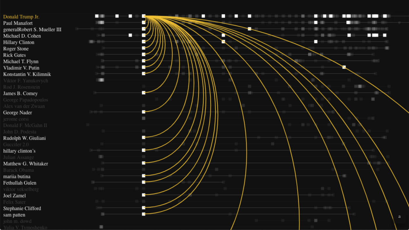
In an early iteration, large yellow arcs connect individuals involved in the same event. With this layout, we could see that we had enough data to show a good story. However, because many events fall on the same day, a lot of the data was getting stacked and buried. This also gave the appearance of many false connections.
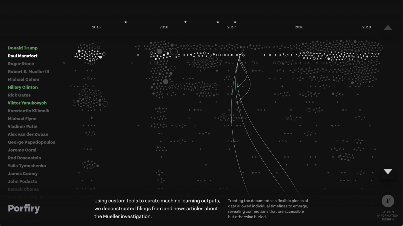
We decided to loosen the time constraints in order to show each event in its own space. Of course, that had a cascading effect: when connecting players in the same event, they wouldn’t align vertically. Our original arcs would be too heavy if they ran across the whole page, and straight lines would clash with the timelines we had in place. We wanted a curve, but something with enough variation to make it easy to follow the connection. This is where the Bézier curves came in.
Béziers are popular in visualization because they rely on a simple algorithm to create elegant curves. In addition to the dots you want to connect, you place some “control points” off to the side, and the line bends in towards those points as it progresses. Deciding where to put the control points can be an issue. For visualizations, it’s typical to build an imaginary box around the dots you want to connect, then put the control points along that box. The interactive illustration below shows how this process often works.
See the Pen Bézier Explainer by Mark Schifferli (@mark-fathom) on CodePen.
In order to introduce more variation, we had the idea to move that imaginary box away from the line that connects the dots. The result is that the lines have different shapes depending on whether they are moving towards the box or away from it.
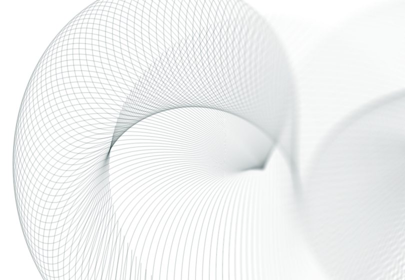
We also tried plotting the control points on circles instead of boxes and added the ability to rotate the circles. But our big breakthrough was deciding to plot lines that simultaneously radiated out in every direction. That allowed us to evaluate how much variation we would get, and helped us steer away from curves that had distracting corners or peculiar shapes. It also elicited a number of “oooo”s and “ahhhh”s in the office, as all the lines together suggest a flowing three-dimensional shape.
In Porfiry, each dot represents a place in the text where a person is mentioned with a date. When more than one person is mentioned at the same time in connection with the same event, the dots are connected with one of those elegant Bézier curves. The ones moving up to the right have a single bend, whereas the ones moving down have an extended “S” shape. This gave us just the right amount of variation and gave the piece a distinct visual identity.
While we don’t expect that everyone has a need for bespoke Bézier curves, we were all mesmerized by process of creating them. So as a fun extension of that experience, we built a web version that automatically changes all those variables for you. Our Bézier Playground is less of a tool and more of a generative drawing sketch. The control points lie on two circles that you can move, rotate, and expand or shrink. If you’d prefer watching to experimenting, by default everything is set to change on its own, and you can just let it play out. We hope you enjoy it.
We’d love to hear what you’re working on, what you’re curious about, and what messy data problems we can help you solve. Drop us a line at hello@fathom.info, or you can subscribe to our newsletter for updates.