Final Project Guidelines, or A Brief Walkthrough of the Information Design Process
At Fathom, as I understand, the information design process has roughly four stages: data collection, data cleaning, data analysis, and data representation. Depending on the project, one might be involved in a few parts of the process. Nonetheless it is important for one to understand the effort and expertise required at each stage.
The final project in Fathom’s MIT Information Design course has students work through all of the stages to produce their own data-driven piece. To make sure all the important points and questions are covered, I created Final Project Guidelines, or A Brief Walkthrough of the Information Design Process and did a case study with the so-called “tampon tax” to demonstrate how these guidelines can be used.
I collected data, mostly from articles, on how much sales tax is placed on feminine hygiene products such as tampons and sanitary napkins. I organized the data into a table and added notes if there were any interesting facts or stories regarding each state’s tax rate. Not much cleaning or analysis was needed because the piece was rather straightforward. For the last step of the process, data representation, I created a heat map with R’s ggplot2 package to show at a glance how much sales tax each state places on female hygiene products.
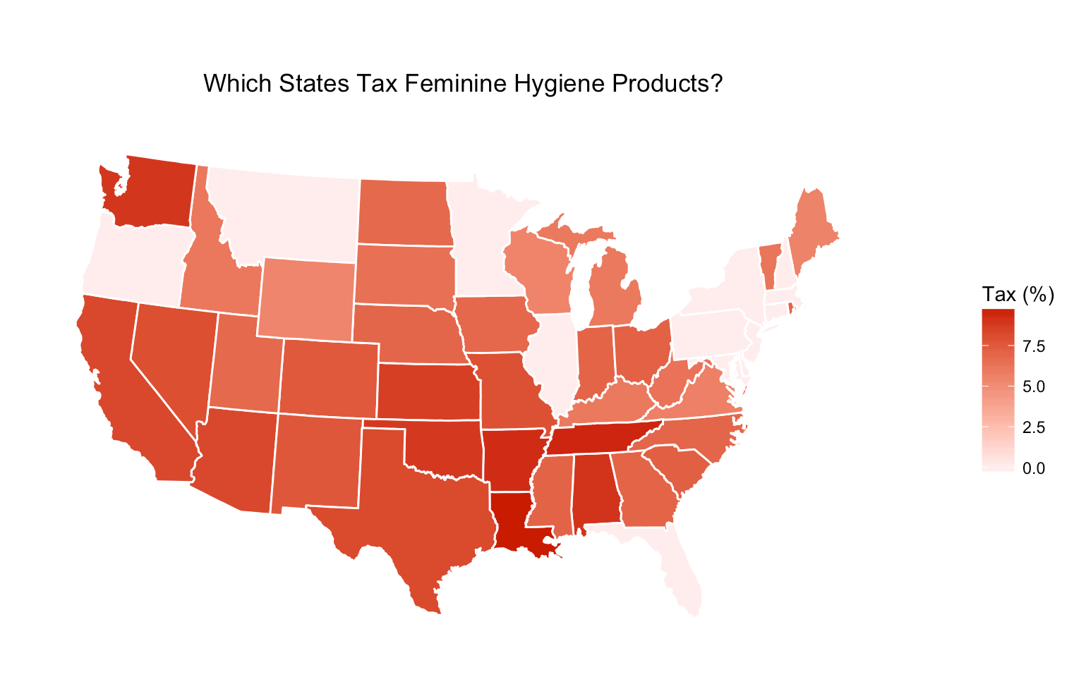
To date, 12 states don't charge tax on feminine hygiene products. 5 states (AL, DE, MT, NH, OR) don't have sales tax to begin with, and 7 states (IL, MD, MA, MN, NJ, NY, PA) lifted the tax between 1975 and 2016. 2 states (CT, FL) passed bills to eliminate the tampon tax, but they don't go into effect until July 2018 and January 2018, respectively.
1hr Introduction to Statistics: What should information designers think about when they first see data?
I also put together material for an hour-long class, titled 1hr Introduction to Statistics: What should information designers think about when they first see data?, and shared it with the team during two sessions for practice and feedback.
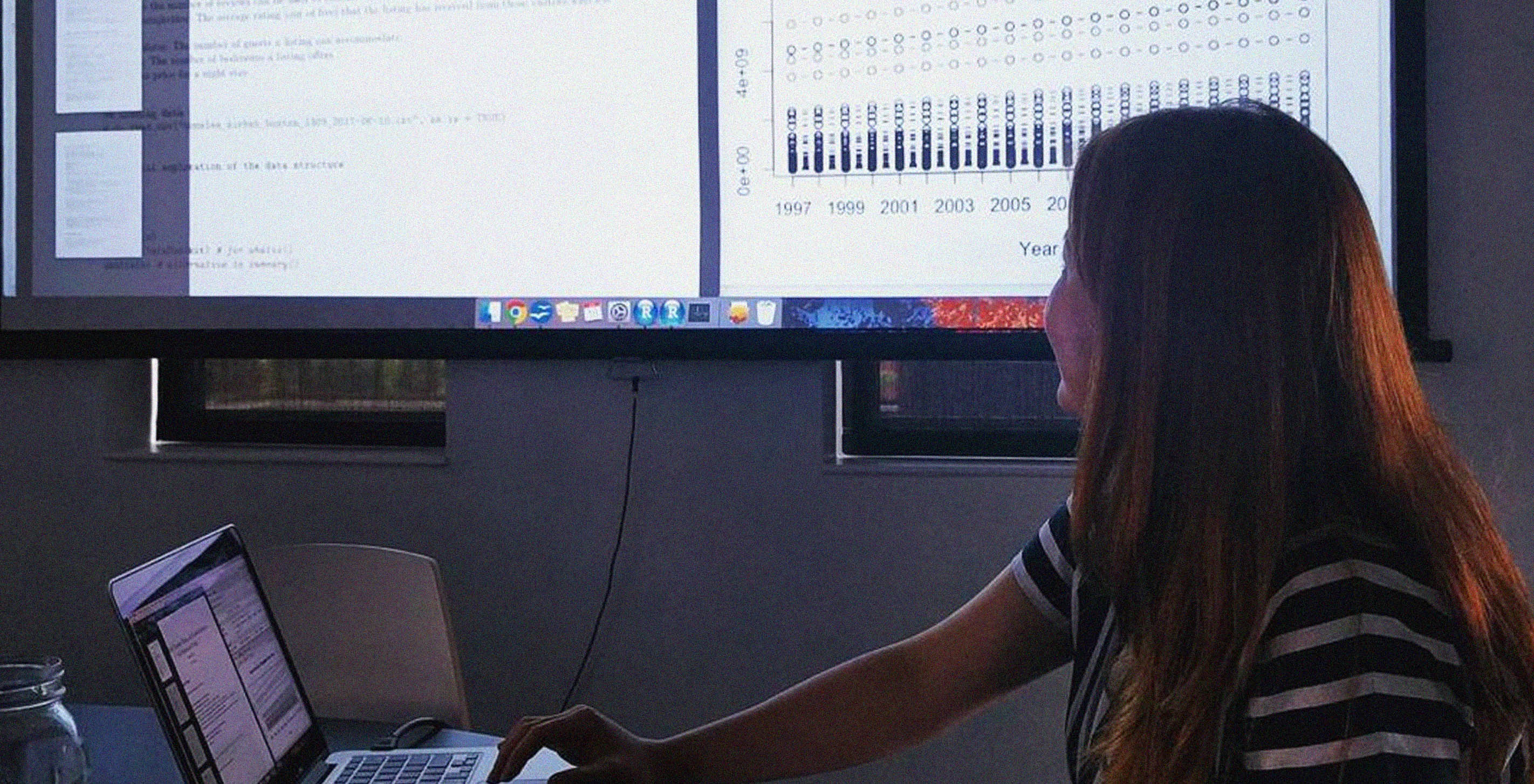
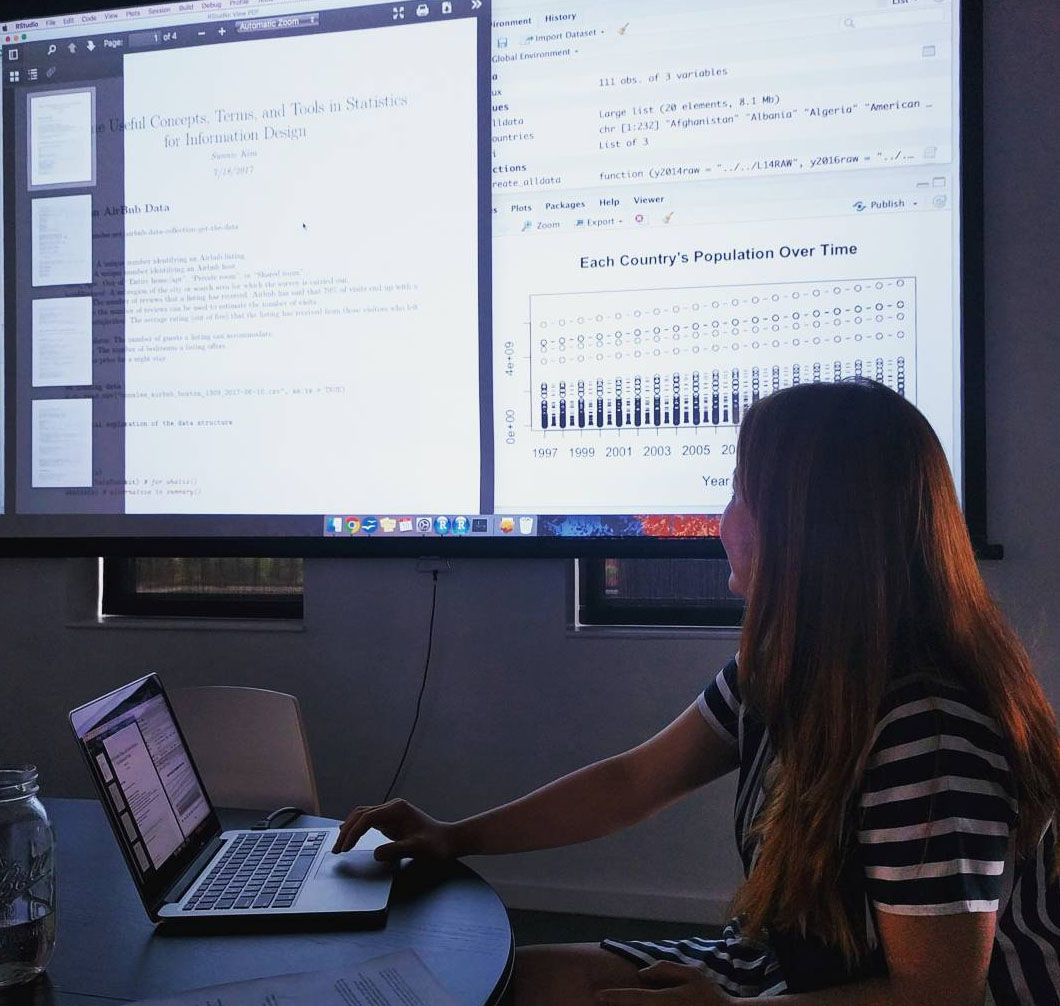
In creating the material, I first brainstormed a list of topics that I believe essential and most useful in exploratory data analysis, referencing several textbooks on statistics and data analysis. Then I searched for quality data sets with good documentation to walk through the selected topics. The data sets I settled on are as follows: Boston Airbnb, world GDP and population, Massachusetts crime estimates, significant earthquakes in the world, national wage estimates, Boston street names, popular baby names in the US, and global temperature changes. Most of them have comprehensive metadata and come from government or research institutes or data centers. Using R, I cleaned and analyzed all of the data sets, produced plots, and created a set of material.
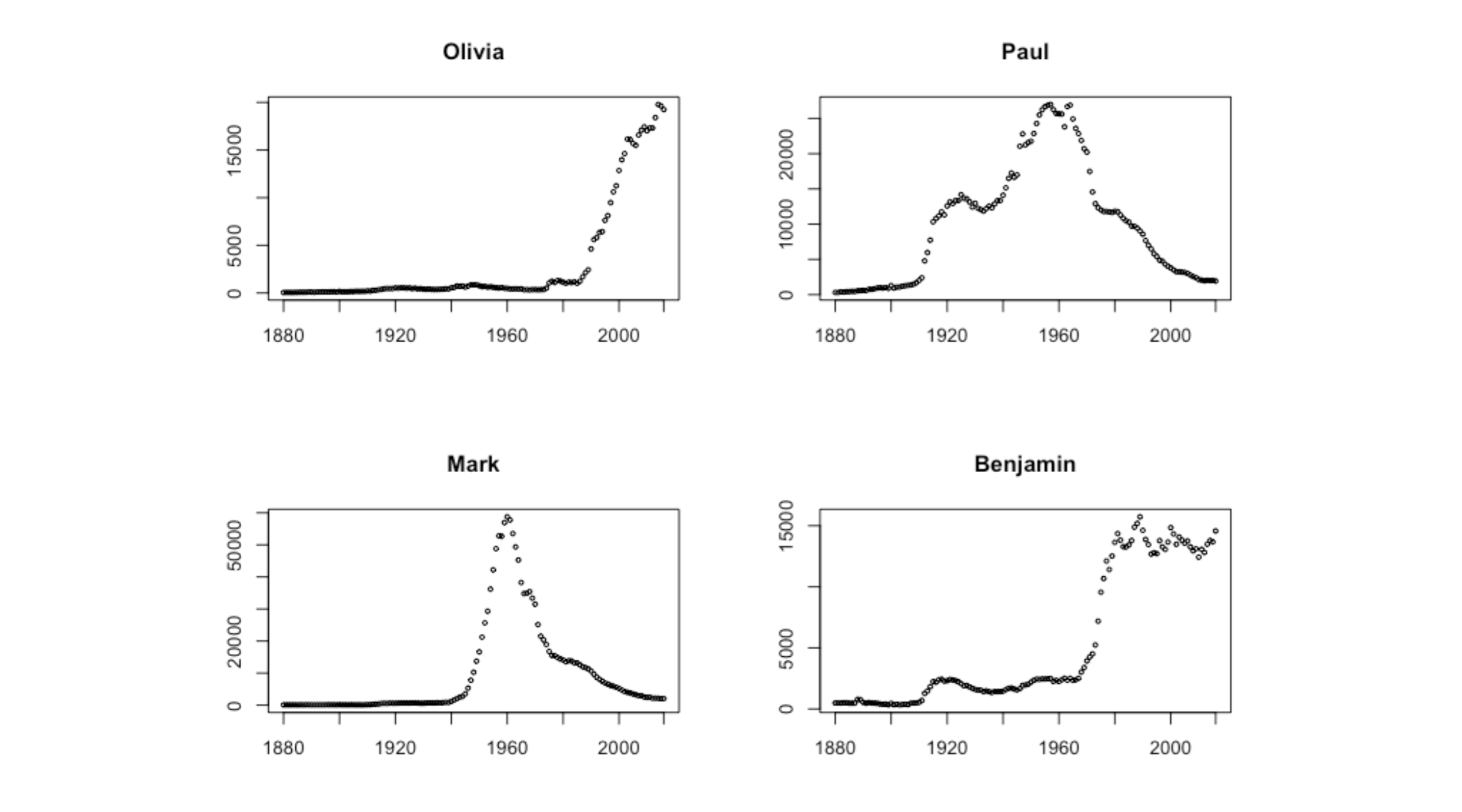
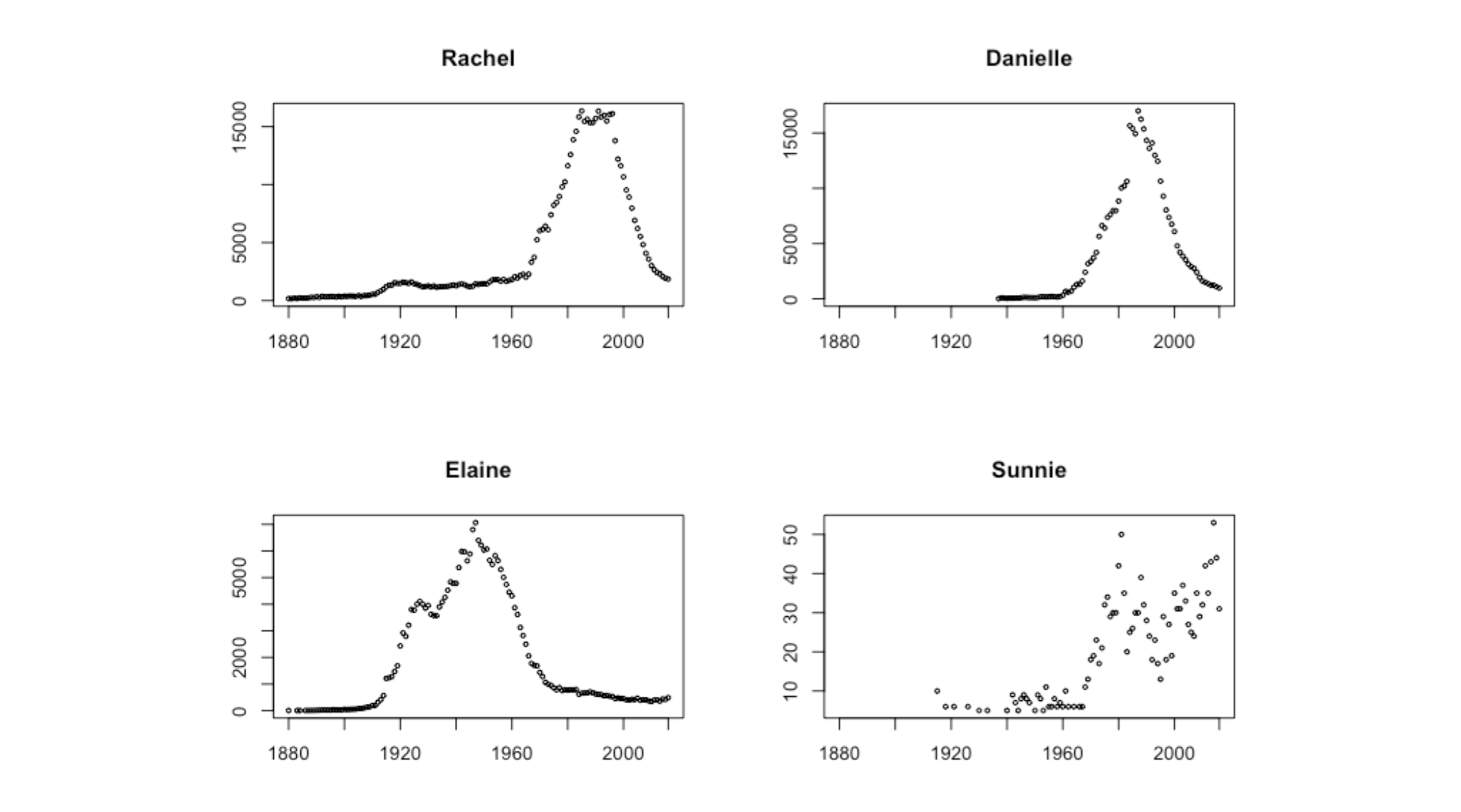
Below are some of the findings looking at Fathom members' names in the baby names data:
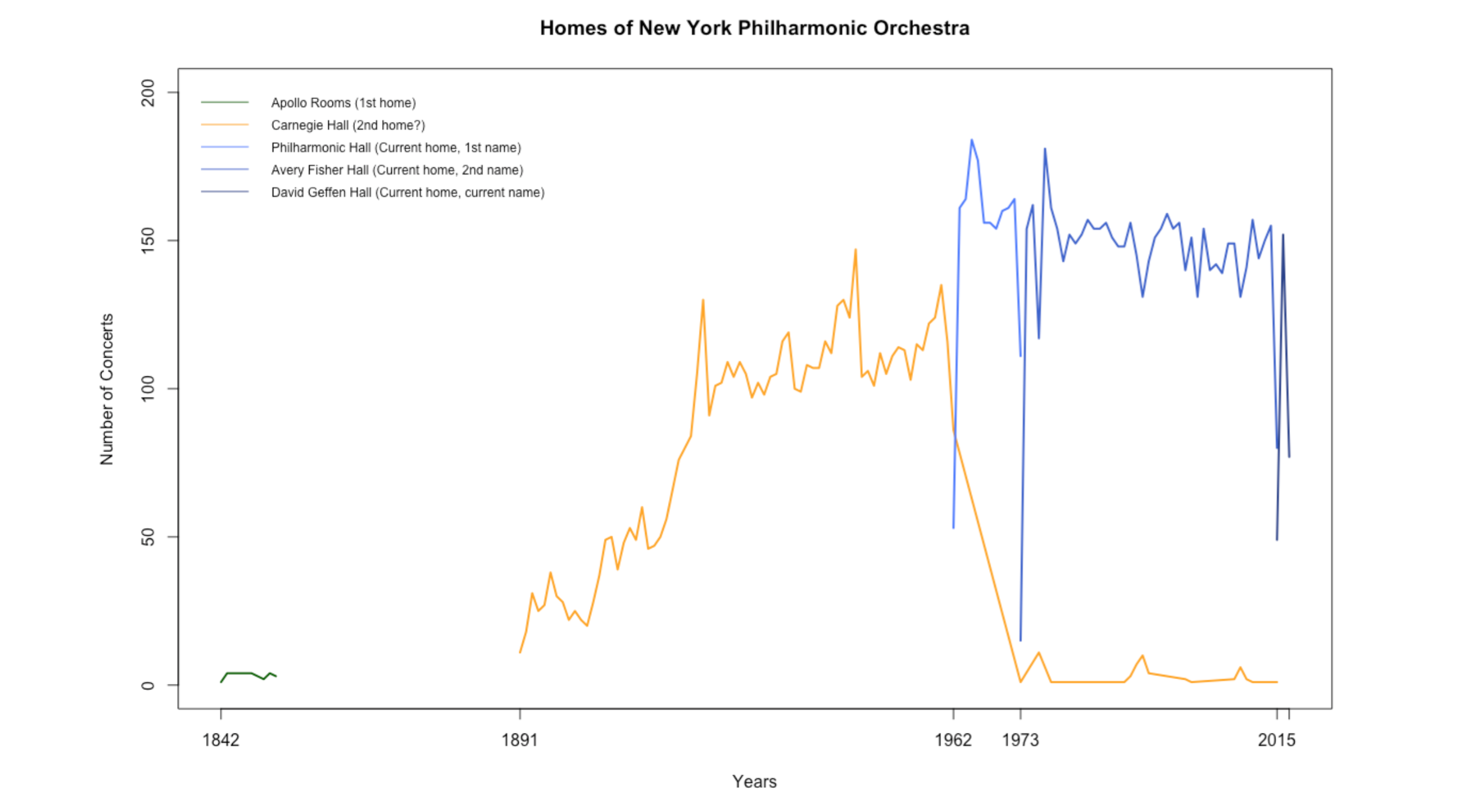
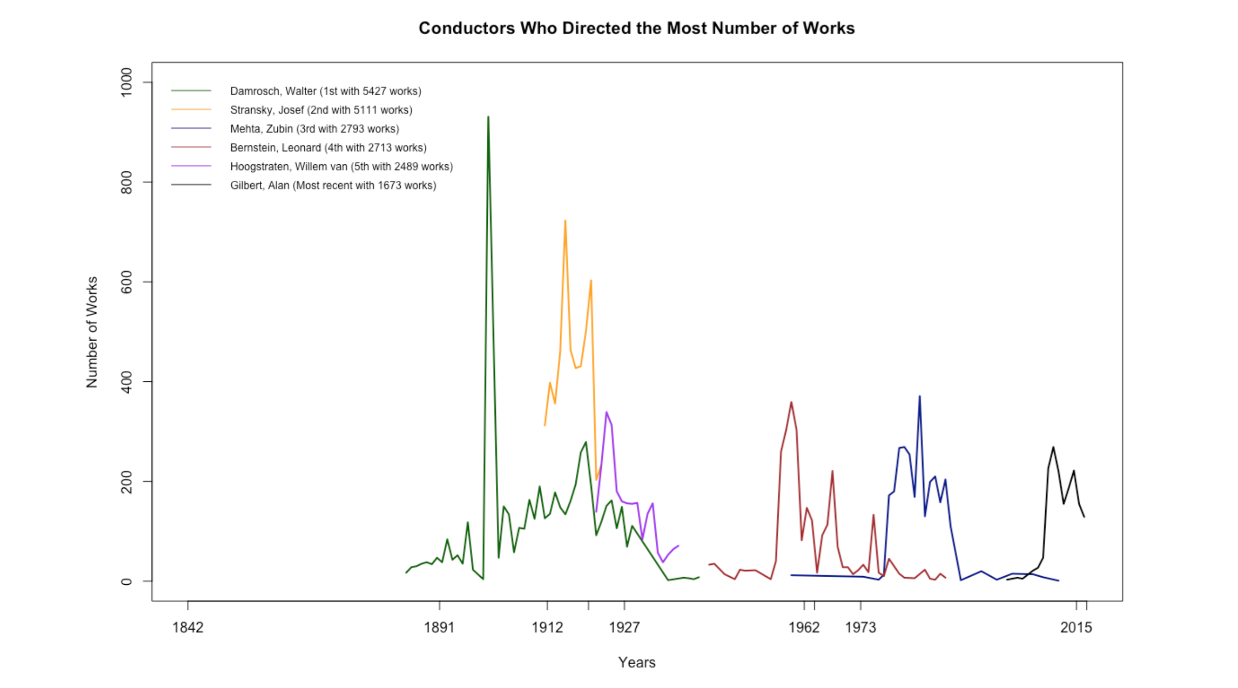
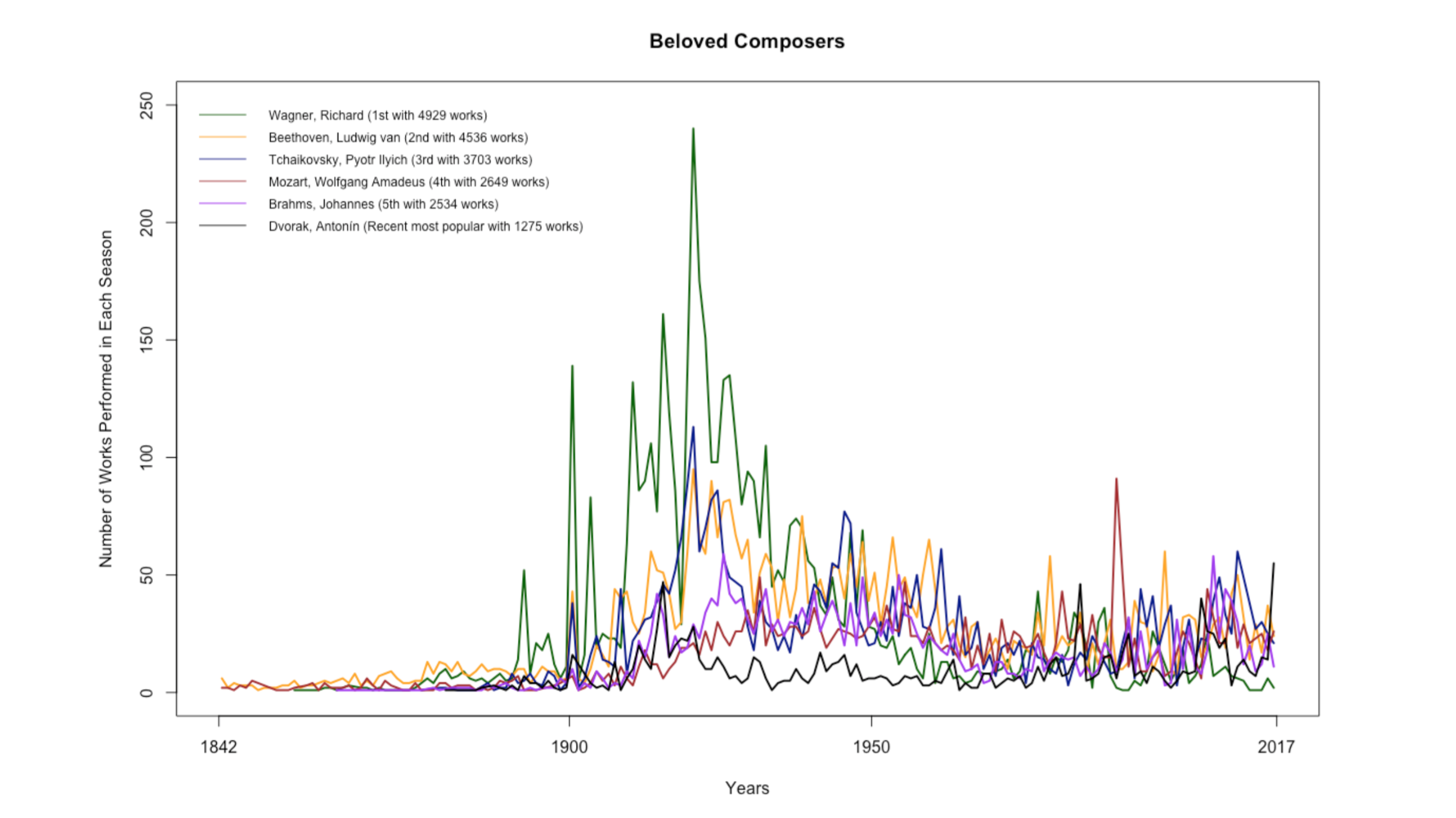
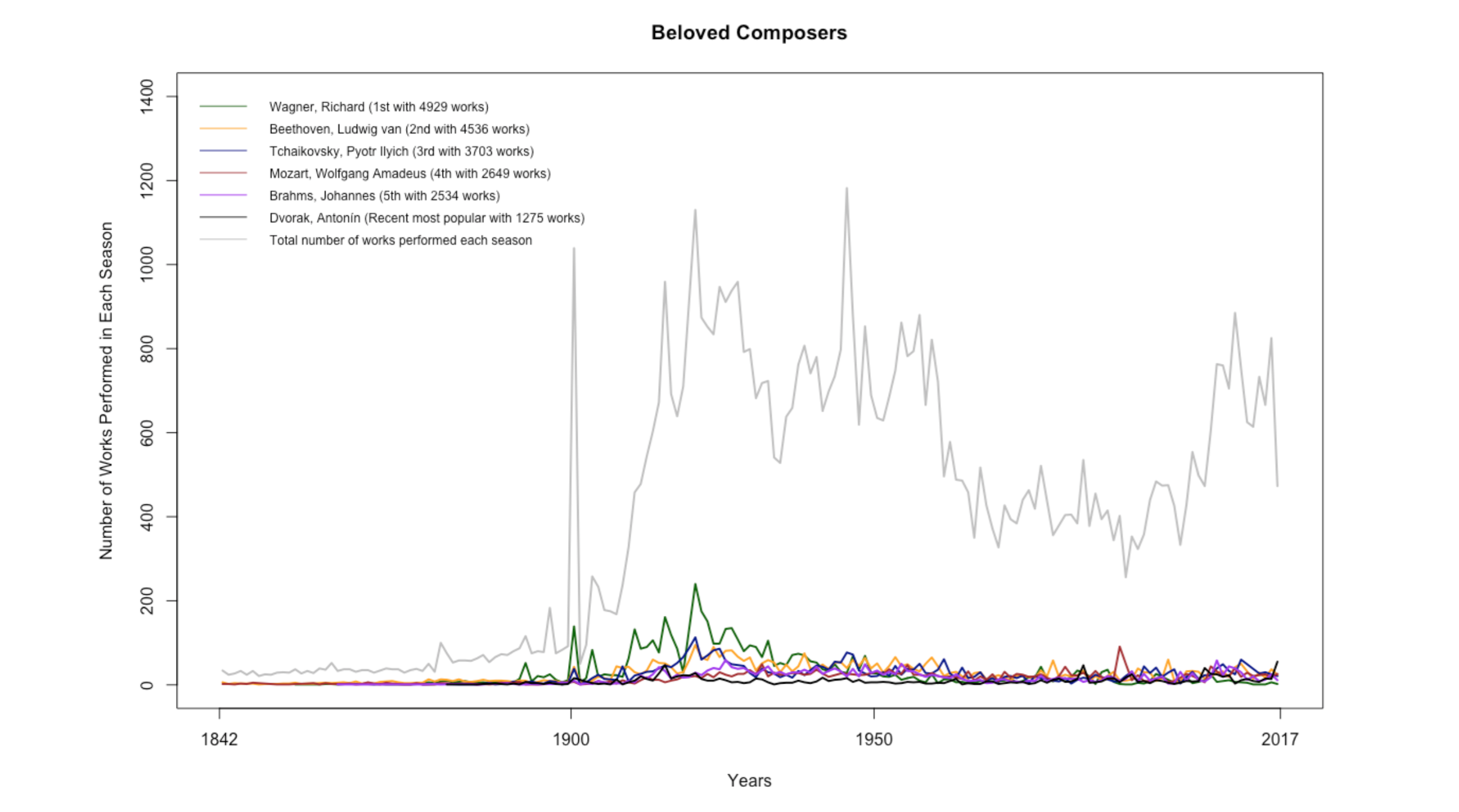
New York Philharmonic Orchestra Performance Data
For the last stats session, I explored the New York Philharmonic Orchestra’s performance history database. Since Charlie was working on the next episode of Especially Big Data on the New York Philharmonic’s Open Data movement, I thought it would be fun to dig into the data together as a team.
The performance history database is massive and has detailed information on more than 20,000 performances since the birth of the orchestra in 1842. It took me a while to navigate through the data, and I had to frequently visit Wikipedia and other websites to read about the orchestra’s history. Below are some plots that show certain trends in the orchestra:
In addition to creating stats material, I spent some time learning p5.js through Getting Started with p5.js and The Coding Train, updating the First of Her Kind poster, and reading through Ben’s massive book collection with topics ranging from data mining to graphic design. I also got to meet wonderfully energetic Girls Who Code, eat the best homemade key lime pie, and see the eclipse with pinhole projectors made out of paper and granola boxes. Seven weeks was a quick sprint, but nonetheless full of exciting work and fun memories. Thank you Fathom for the amazing summer!