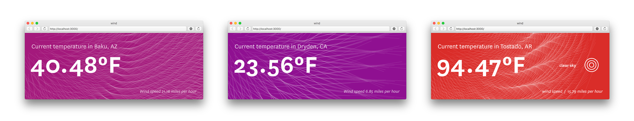
Inspired by the assignments from our information design course at MIT, I began with a weather app that uses an API call to interpret current wind conditions and temperature as rhythmic patterns.
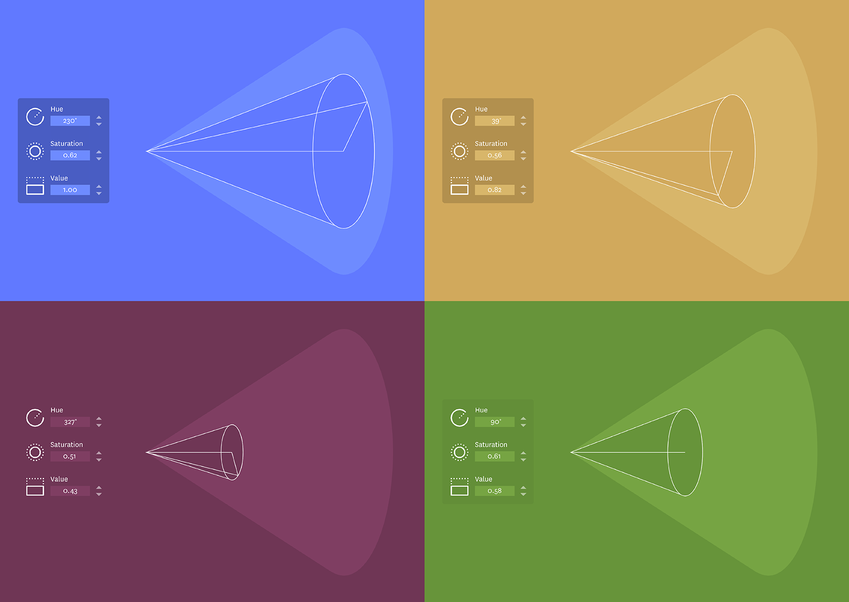
Another sketch was an attempt to visualize the HSV color model and build a color picker that navigates its structure.
Creating a simple visual tool to explain a process or system is a good coding challenge, and weather APIs are an excellent place to start because the data is observable, easy to access and frequently updated. I realized that natural weather patterns also provide great visual forms to start sketching, which got me thinking about how the lunar cycle might be illustrated in an interactive way.
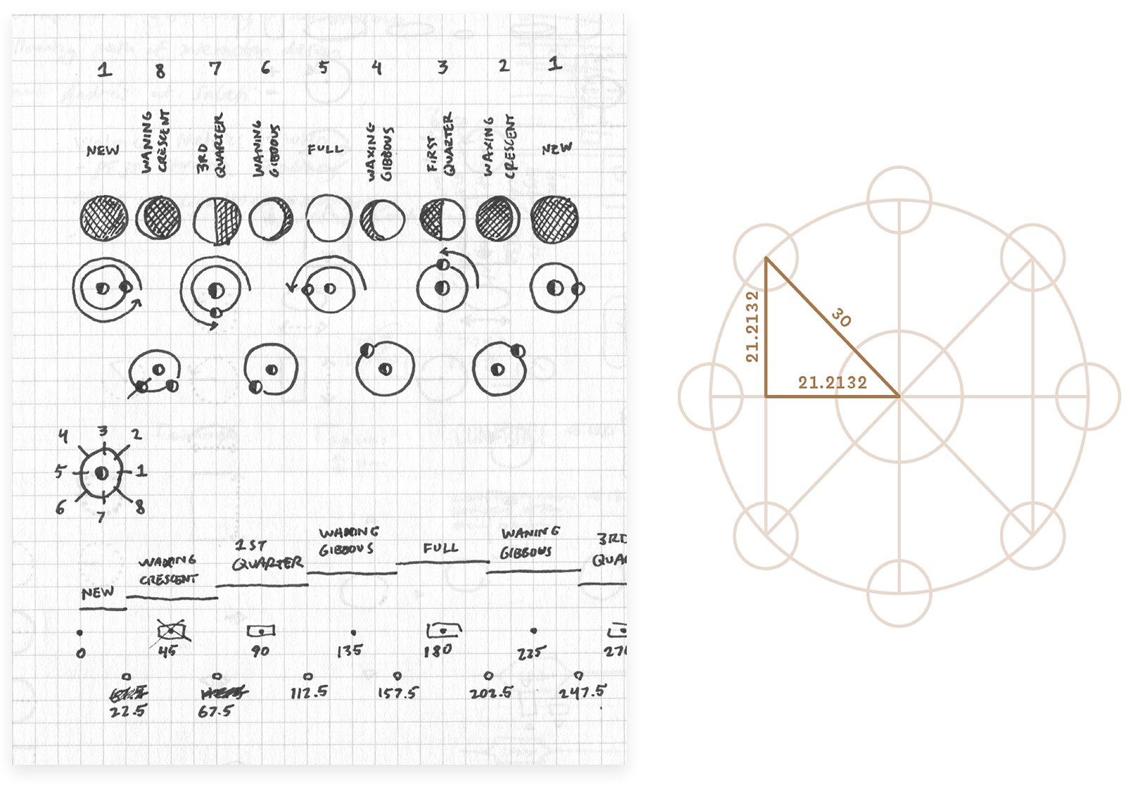
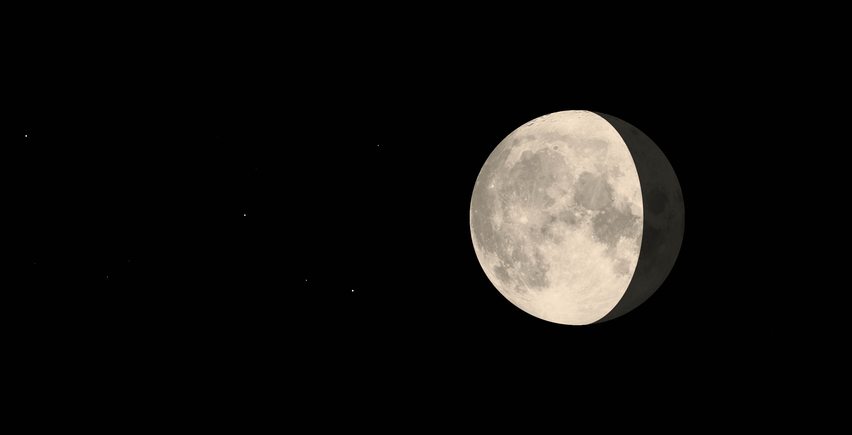
After working out some ideas on paper, I began a p5.js sketch to see how I could animate between different phases. The first step was finding a way to draw a curve that could smoothly bend between a crescent and full circle. Using the bezierVertex() function, I tried layering curved shadows on an ellipse to approximate the effect of sunlight passing over the moon’s face. The edge of that twilight zone has a surprisingly aggressive astronomical name: the “terminator.”
To test the smoothness of the transitions, I mapped the curve’s intermediate bezier handles and control points to the mouseX position. The first shadow I created had its handles placed halfway along each curve, which made it too clunky to match a circle. I drew sample ellipses in Adobe Illustrator to measure the ratio of a handle to its curve. Then I stored this fraction as a variable to smoothly bend the shape into a perfect curve at any phase.
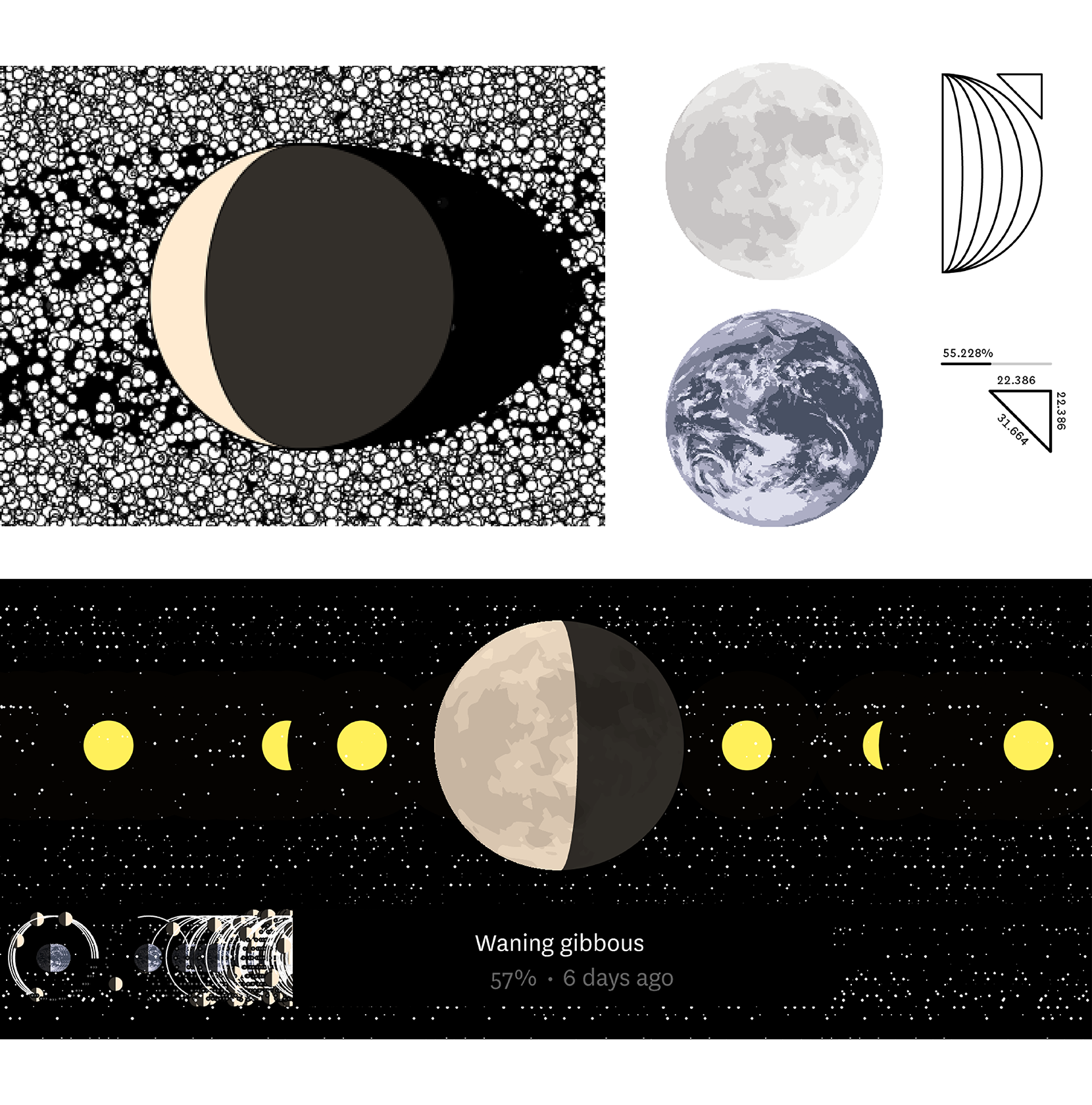
As the sketch developed, other elements became great exercises for wrapping my head around programming concepts, improving interactivity and thinking about the potential context of use. Mapping the lunar cycle directly to cursor position was a useful first step, but became a navigation obstacle as I added more pieces. In later iterations, I found that updating the cycle based on the distance dragged creates a much more natural interaction, especially with touch inputs on mobile devices.
Thinking through how to translate these pixel distances into meaningful expressions of time was also a satisfying challenge. I learned how to create arrays where I could store and update variables, such as a percentage of the lunation (that’s the full lunar cycle, or period between syzygies for the layperson). This number can be fed back in different forms: an input of 550 pixels might return “65% full”, “Waxing gibbous” and “Tomorrow” — all variables that I can then piece together to provide useful feedback.
The moon is tidally locked to the Earth, so whether you see a rabbit or a wrinkly old man, that side is always facing us. As a result, people see the same phase wherever they are, and this means the sketch can be updated accurately with a single API call per day. Kudos to Olivia and Ben for writing code to store those daily values, as well as a URL that accepts ‘moon’ with any number of o’s.
Moooooooooooooooooooooooooooon.
Take that, Google.
We’d love to hear what you’re working on, what you’re curious about, and what messy data problems we can help you solve. Drop us a line at hello@fathom.info, or you can subscribe to our newsletter for updates.