I left my job to see what else design can offer (I think I’m onto something…). I’ve been frustrated with the separation of traditional graphic design and programming. Mainstream design software is also frustrating due to the separation between layout, photography, video, animation, interactivity, and coding. My experiences at Fathom not only broke down the walls between designer and developer, but also opened my mind to other ways of tackling design through programming and computation.
This semester, I’ll be at Fathom one day a week to work on an independent study: Visualizing Data, which I plan to incorporate in my thesis.
We had a ton of fun this summer. These are some of the projects I worked on:
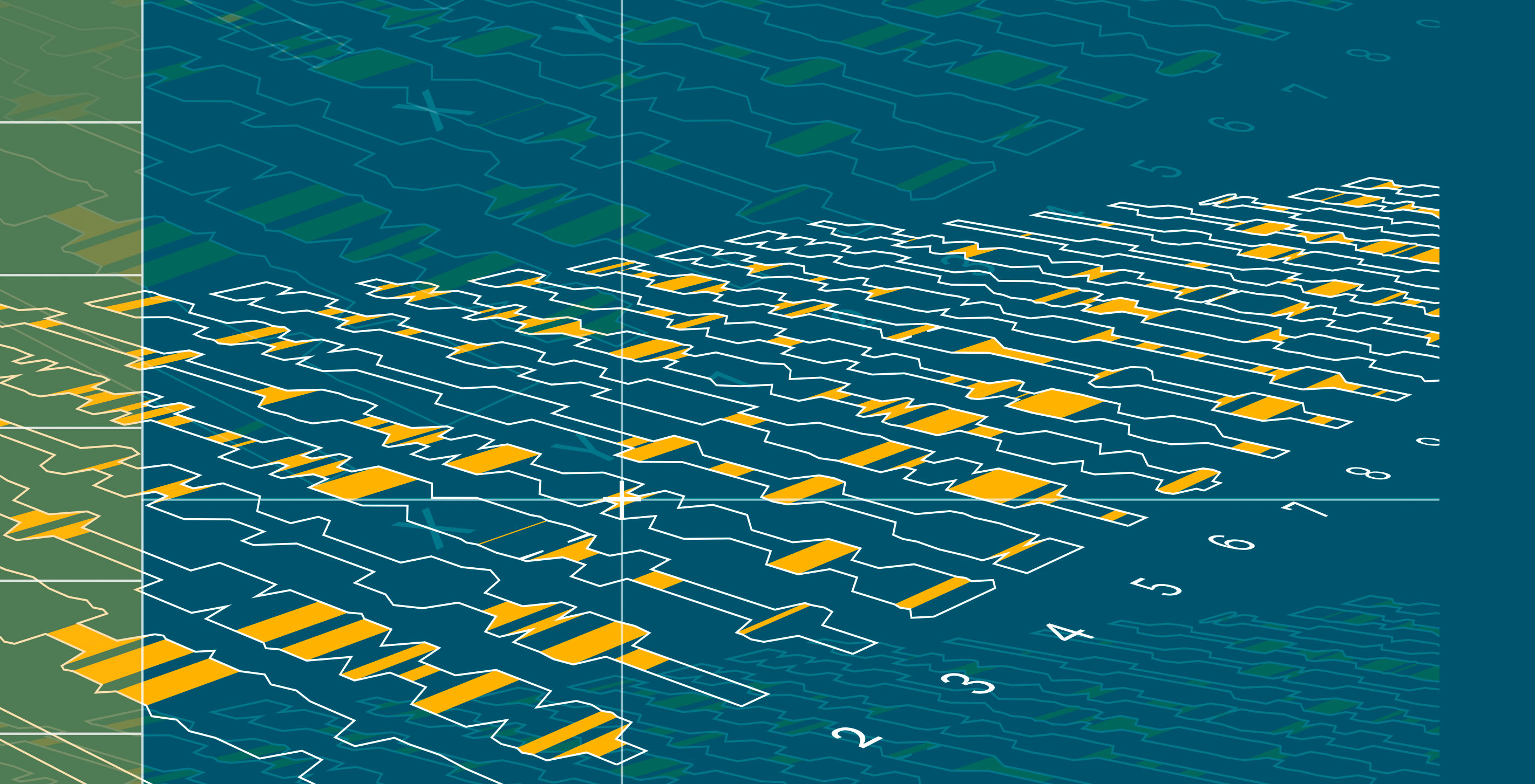
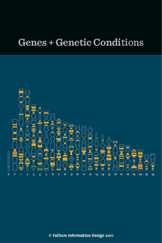
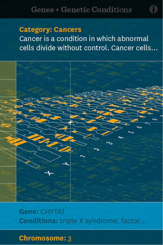
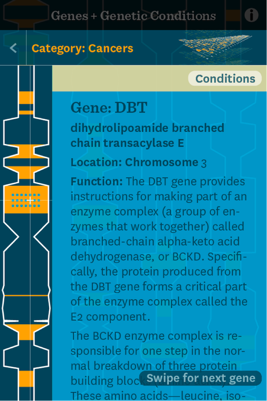
Genes and Genetic Conditions
The challenge here was to take the overwhelming amount of content on genes and genetic conditions from the National Library of Medicine and make it accessible as a mobile app for a general audience. Having little knowledge about the topic, this was rather intimidating. But I soon realized I was designing for someone like me — a layperson — and having minimal knowledge can be an asset.
Chris, Eva, Shannon, and I worked on simplifying the categories, navigation, and interaction. The goal was to make it equally easy for the user to look at a particular gene or condition as to explore the whole system of how genes and conditions relate to one another. Chris and I worked on many iterations of navigation and animation transitions.
Population density
The challenge for this project was to create a narrative of population density — show how the world population relates to the U.S. We generated this map visualization with data from the Center for International Earth Science Information Network (CIESIN). Each circle denotes the number of people in that area. Larger, darker circles show areas with less people; smaller, brighter circles highlight crowds. White outline circles mark the top twenty cities.
(The project is a continuation of work done by last year's summer intern, Lynn Kiang (now Lynn Wen). We were initially approached by National Geographic about doing a sketch depicting the story of the world's population hitting 7 billion. Ours wasn't chosen, but we decided to continue the piece because we liked it. —Fred)
I found it fascinating how the circles that represent people per square kilometer still create almost full geographical contours of the continents (and how few people there are in Canada, eh!).

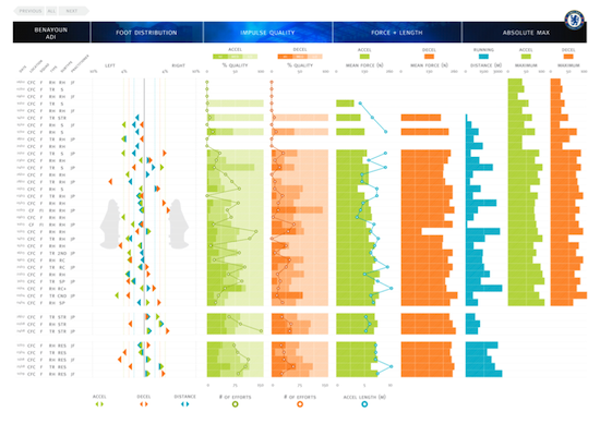
Chelsea Football Club tracks their player performance with a sensor that monitors their physical activity during practice and rehabilitation. This sensor provides an amazing data set that Chelsea turned into power point charts.
Mark and I distilled the ten individual slides (e.g. foot distribution, acceleration, deceleration, distance, and force) into one interactive overview of each player’s performance. This way, the manager could quickly scan the charts to see each month’s performance and rehabilitation trends. The charts were detailed enough to show exact performance on each day.
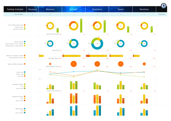
We also designed a weekly team training overview. This chart outlines the daily team recovery, strength, resistance, speed, and reactions. Both of these charts were an interesting design challenge.
Something that stuck out in my first encounter with this type of visualization work was how the negative space of the graphics played as much a role as the positive space. It felt like I was designing a new typeface with a keen eye on form and counter form.
Rag Time
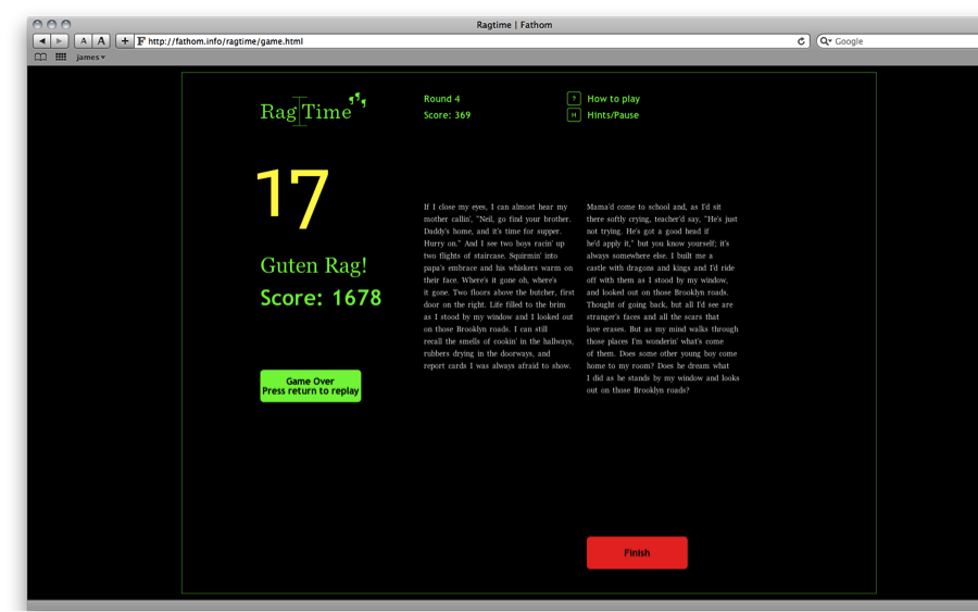
At lunch one day, I mentioned I had this idea for a typographic video game. At my old job I designed publications with lots of running text. I was constantly ragging and fixing line breaks. This is an important element of design for me. Whenever I look at somebody's design work I always check if they know how to rag.
But it’s love-hate relationship.
Sometimes I have this dream where a wall of text comes crashing down on me like huge Tetris blocks that I have to correct before they smash my face. I told the team about this dream and Chris immediately volunteered to help make it a reality. Then he went off in the corner for two weeks coding (I thanked him in the end with a bottle of Johnnie Walker).
And here it is. If you think you have what it takes to be a good typographer I challenge you to three rounds of Rag Time. Don’t be a Scheisser Rag! My high score is 1678, which is a Guten Rag!.
Guten Rag!
We’d love to hear what you’re working on, what you’re curious about, and what messy data problems we can help you solve. Drop us a line at hello@fathom.info, or you can subscribe to our newsletter for updates.