For those unfamiliar, we recently launched a project for the Clinton Foundation and the Gates Foundation titled No Ceilings: The Full Participation Project, which measures twenty years of the progress and setbacks of women and girls around the world. In addition to the series of data-driven visualizations, the desktop version contains a map populated by roughly 850,000 data points from more than 190 countries over 20 years. Though the site is responsive to mobile screen sizes, we had yet to find a solution for making the exploratory map experience work on the phone.
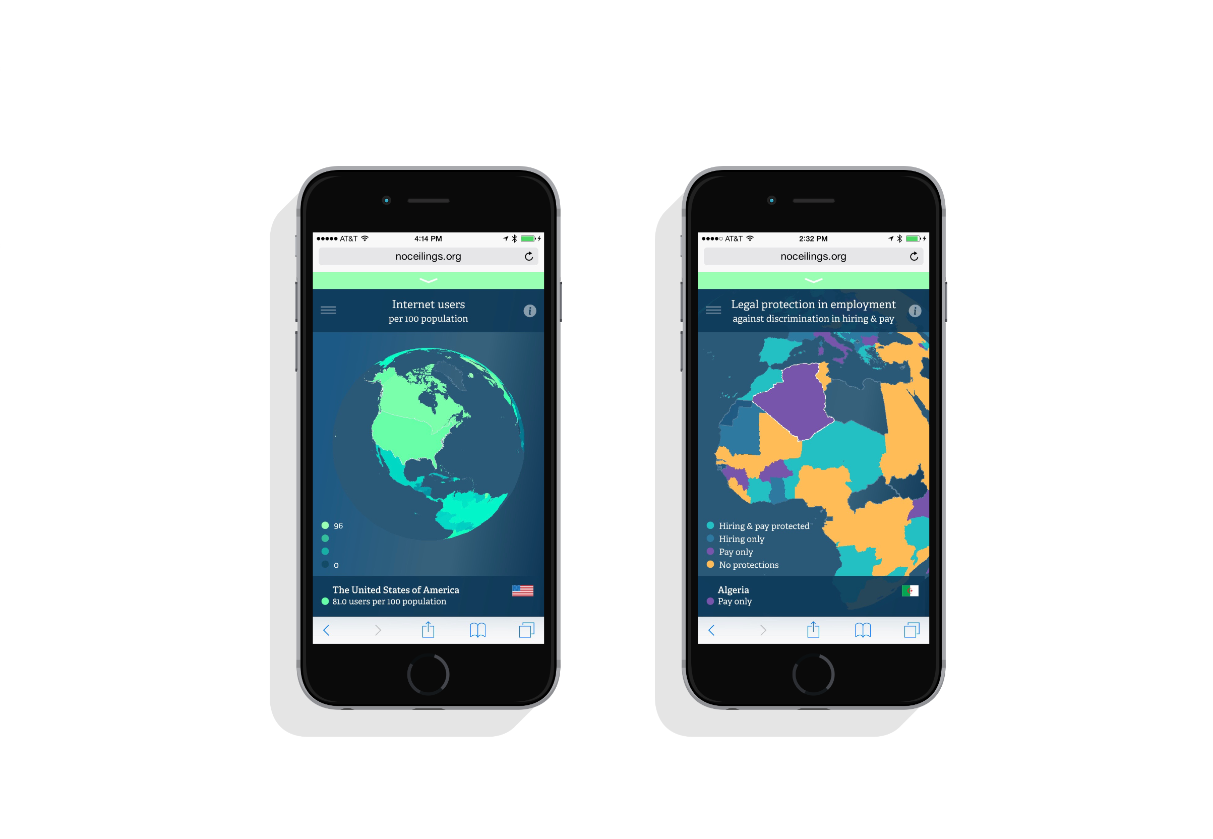
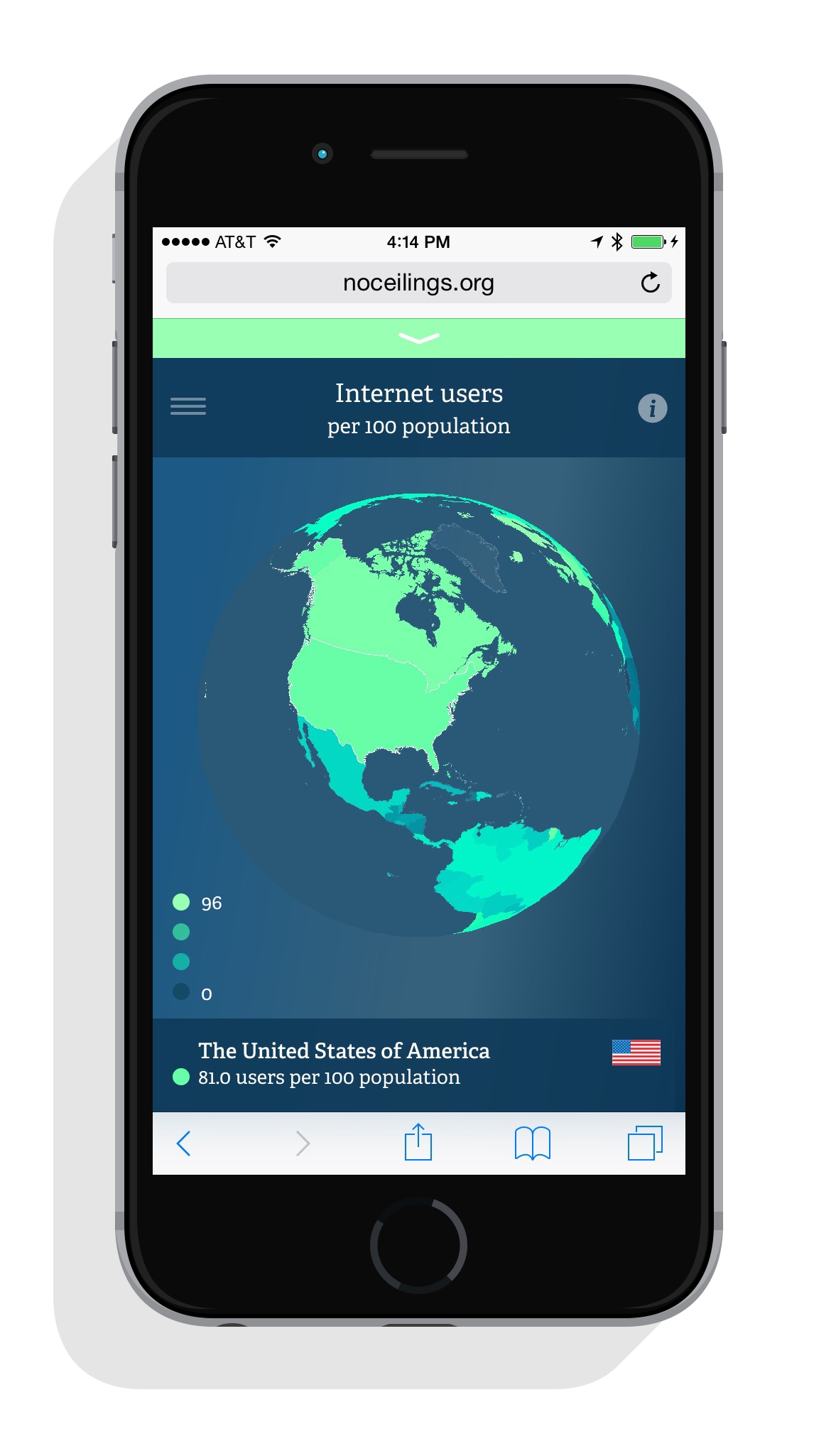
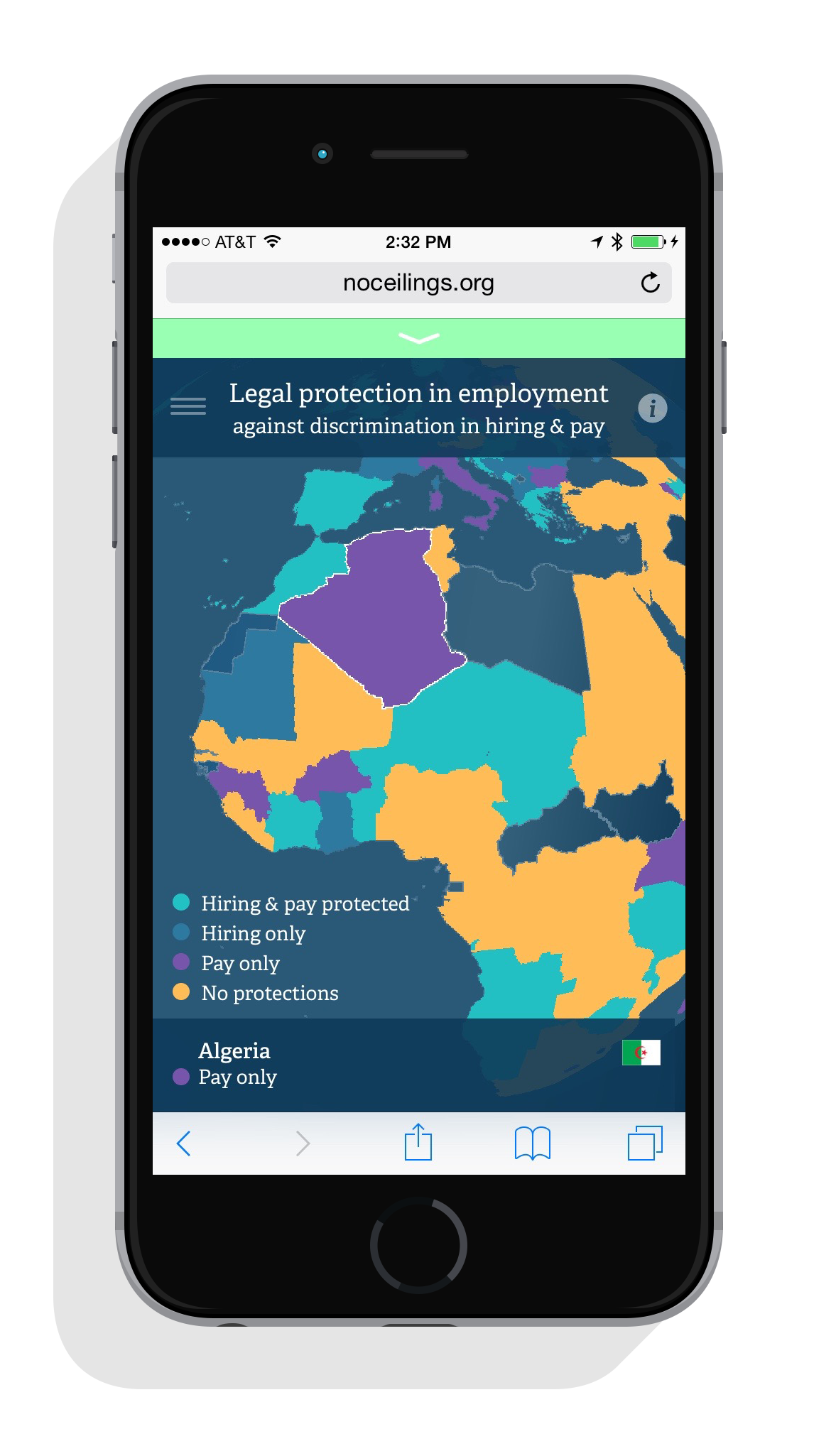
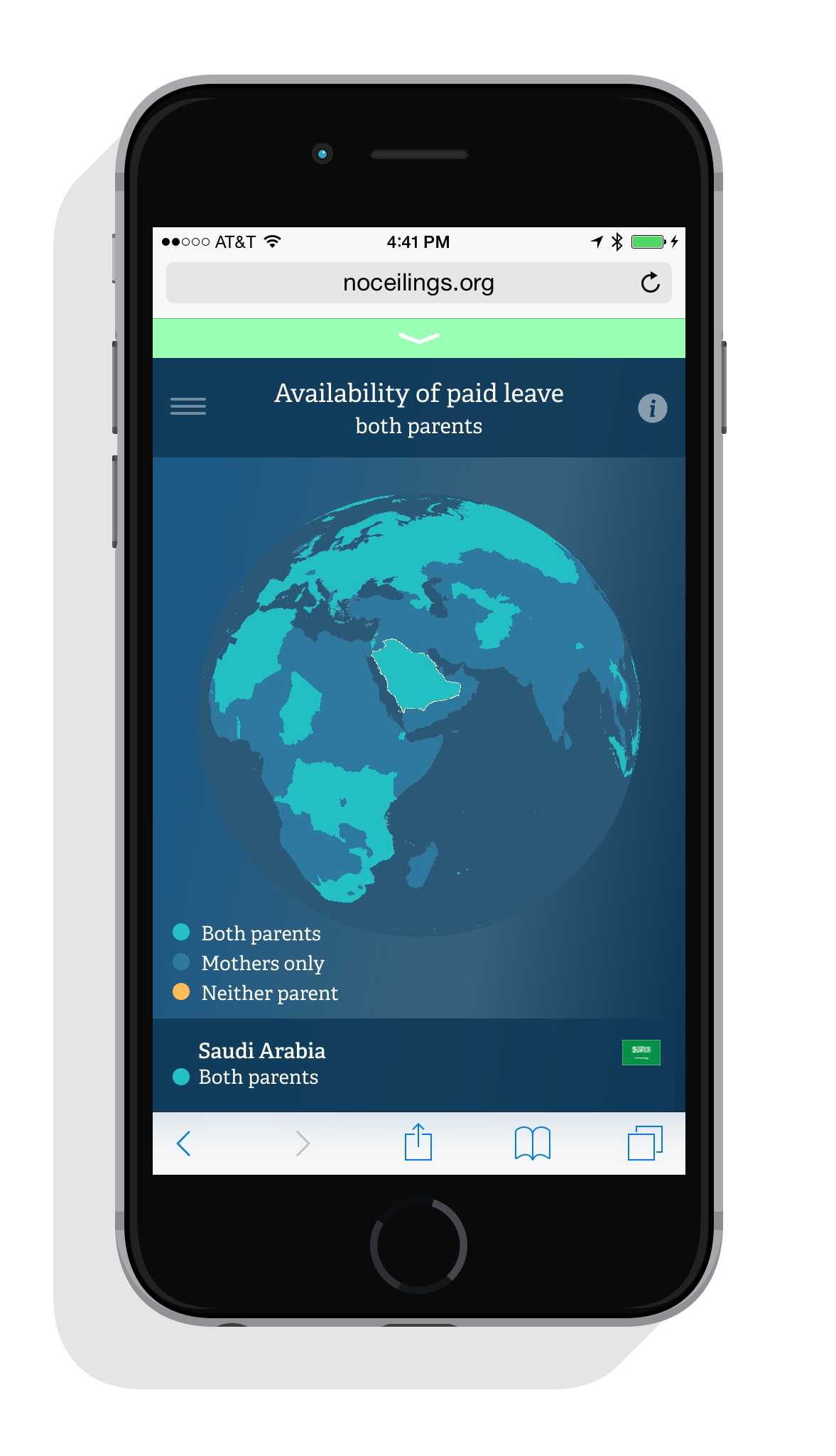
The 3D globe takes a subset of well-populated indicators from the No Ceilings dataset, and represents the information from country to country on a spinning, zoomable globe. By sliding your finger across the screen, you can rotate the globe east, west, north, or south to see how stats vary by location. You can pinch and release your fingers to zoom in and out, and swipe across the top of the screen to select from a variety of topics.
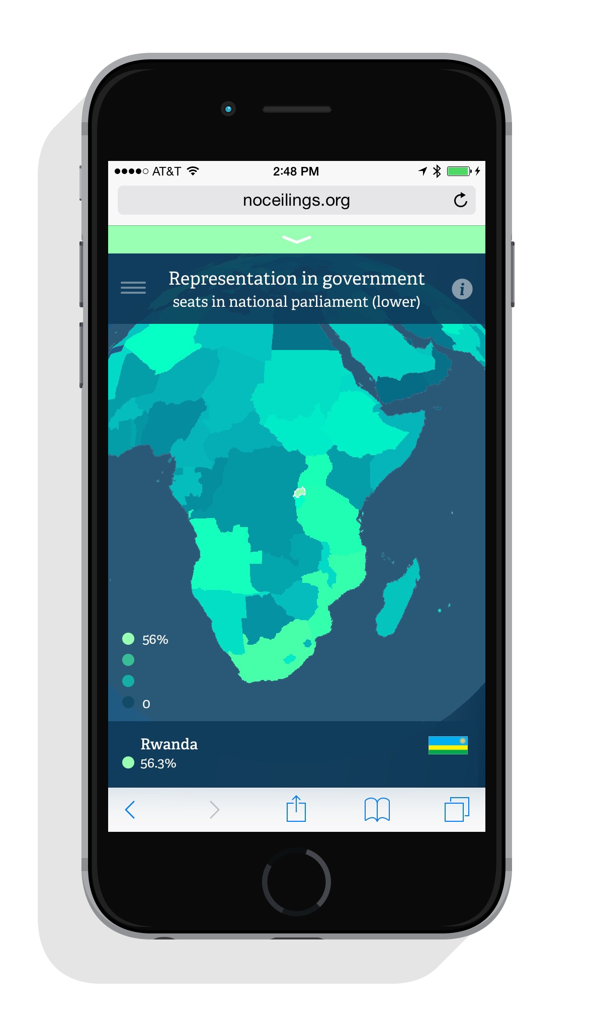
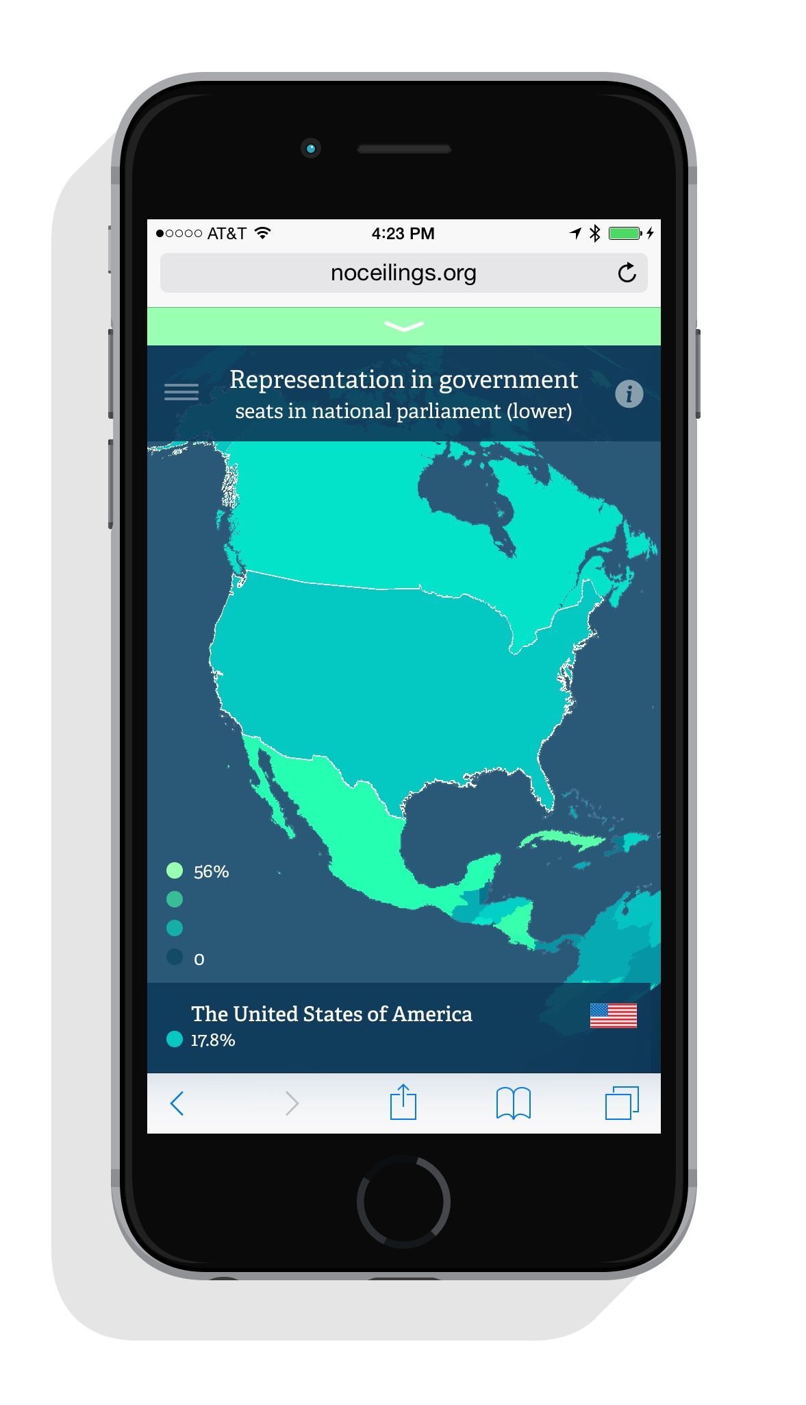
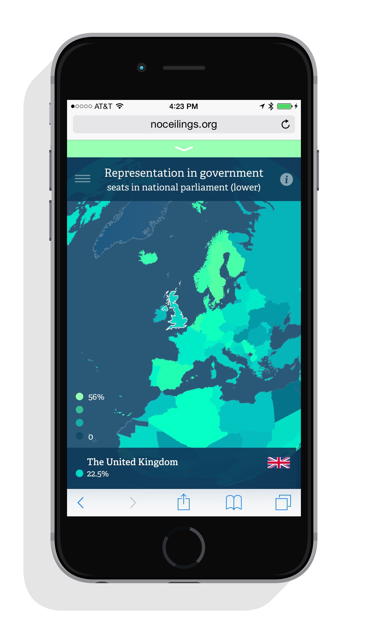
The globe uses color differently to summarize both numeric and categorical data. Looking at numeric data like, say, the representation of women in national parliament, you can see that countries with bright green coloring (e.g. Rwanda, ringing in with the all-time high of 56.3%) have higher percentages of women in parliament, whereas countries with the dimmer blue tones (e.g. the U.S. at 17.8%) show areas with less female representation. The color gradient represents the fluidity of the scale, from high values (bright green) to low values (dark blue).
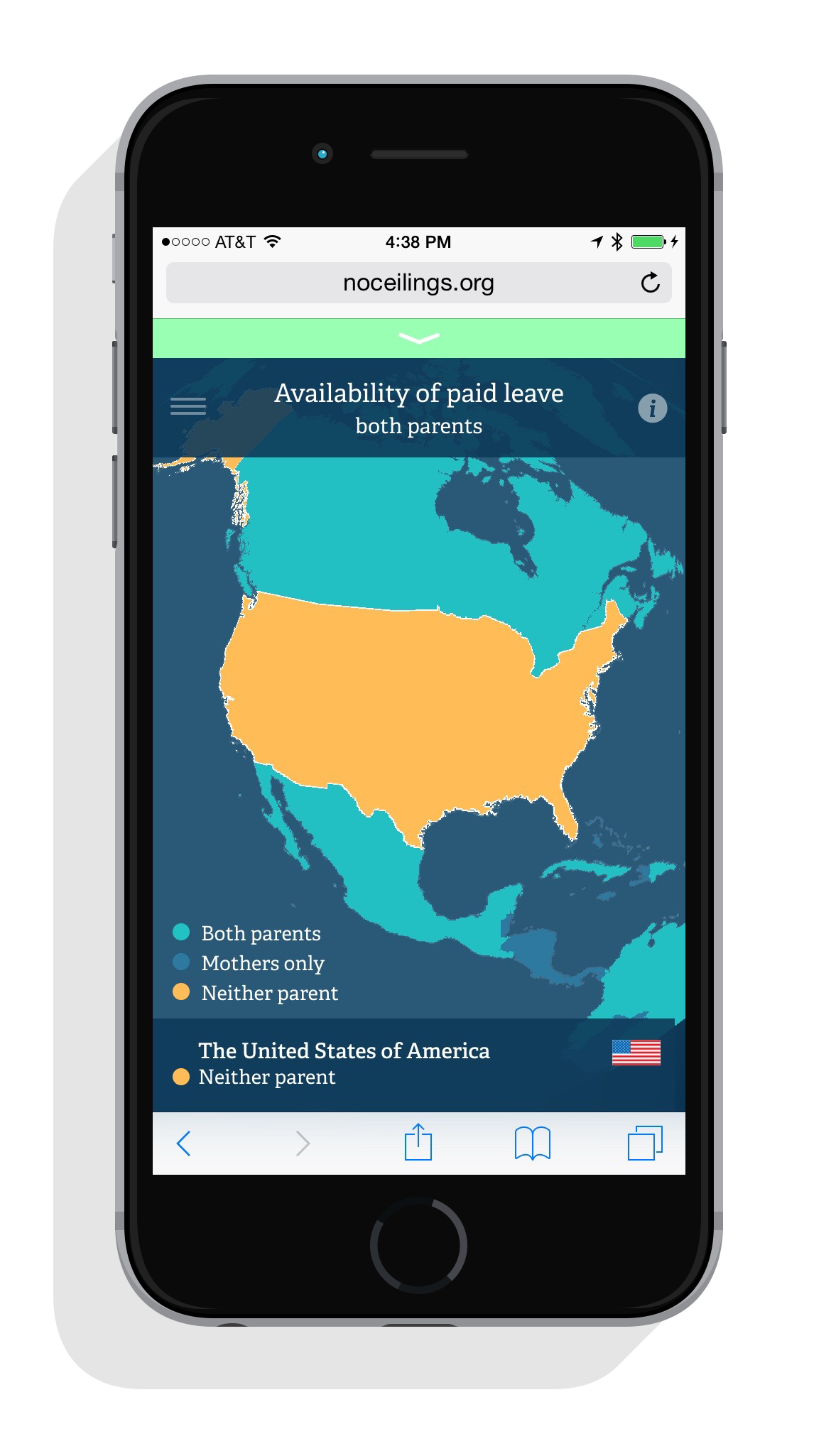
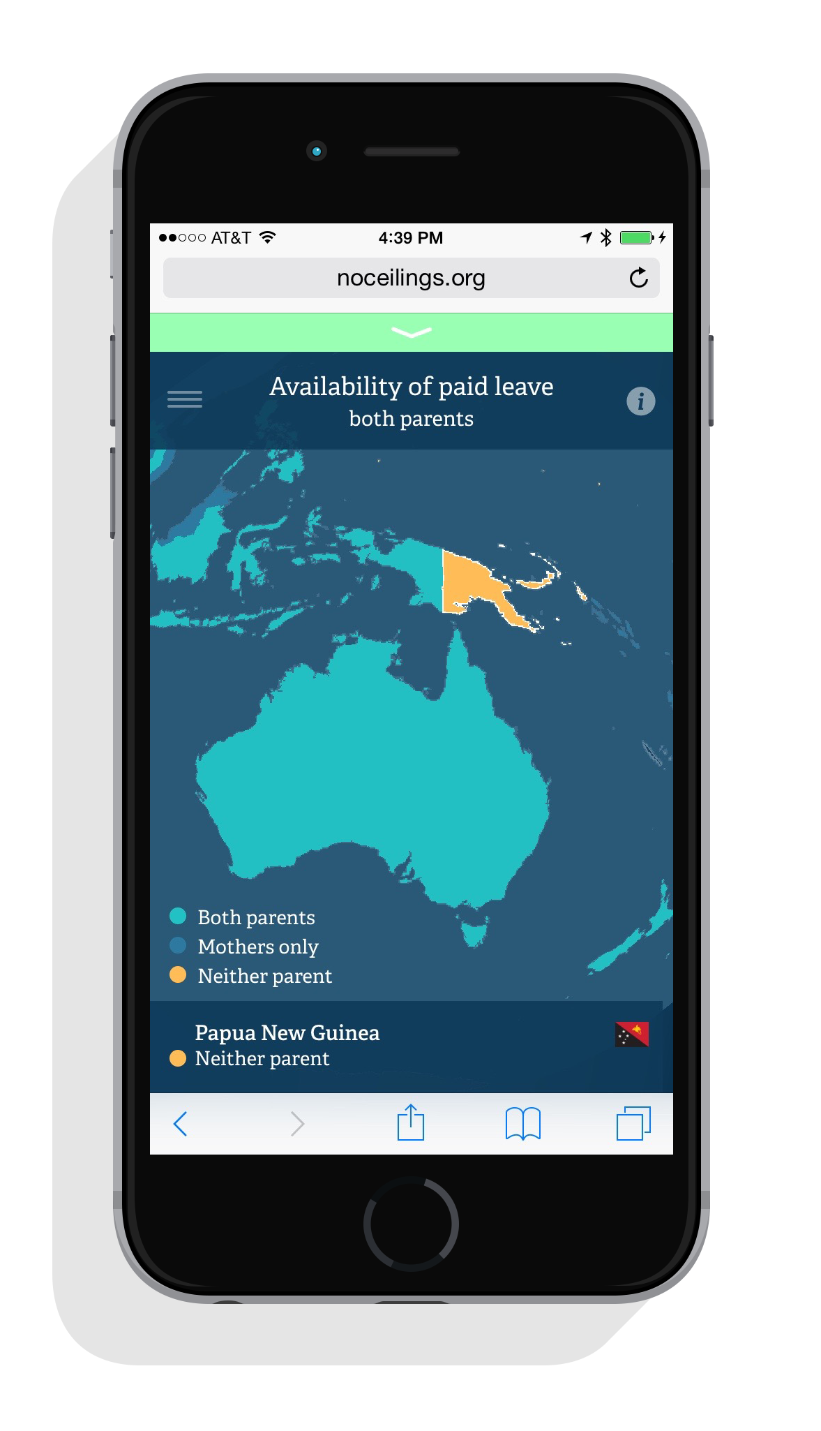
The categorical data, on the other hand, uses less of a gradient, and better demonstrates classification differences from country to country. Taking availability of paid leave as an example, countries are divided into three different groupings: those where paid leave is available for both parents (teal), for mothers only (blue), and those where it's not available at all (yellow). Yellow is used to indicate countries where paid leave is not provided for by the government, and calls attention to the lack of important legislation.
Building the map as a rotating globe with zoom allowed us to design around the narrow spatial restrictions of a mobile screen. The globe was developed for WebGL using the Three.js library. In addition to letting us project the globe in 3D, WebGL allows us to maximize performance on mobile devices with low powered processors. This keeps the globe's animations snappy and responsive to user interaction through thousands of calculations per second.
An increasing number of people use their mobile phones as a source of immediate on-the-go information, so while the available surface area and processing capacity may be smaller than a desktop computer, it's important we design and develop websites, tools, and applications that are better catered to the ways that audiences consume information. While we certainly wouldn't expect a user to explore all 850,000 data points from a mobile device, finding ways to tailor information to the mobile experience remains a priority. As devices are getting smarter, design and development need to move in parallel. So grab your phone, take a spin, and check out the progress.
We’d love to hear what you’re working on, what you’re curious about, and what messy data problems we can help you solve. Drop us a line at hello@fathom.info, or you can subscribe to our newsletter for updates.