
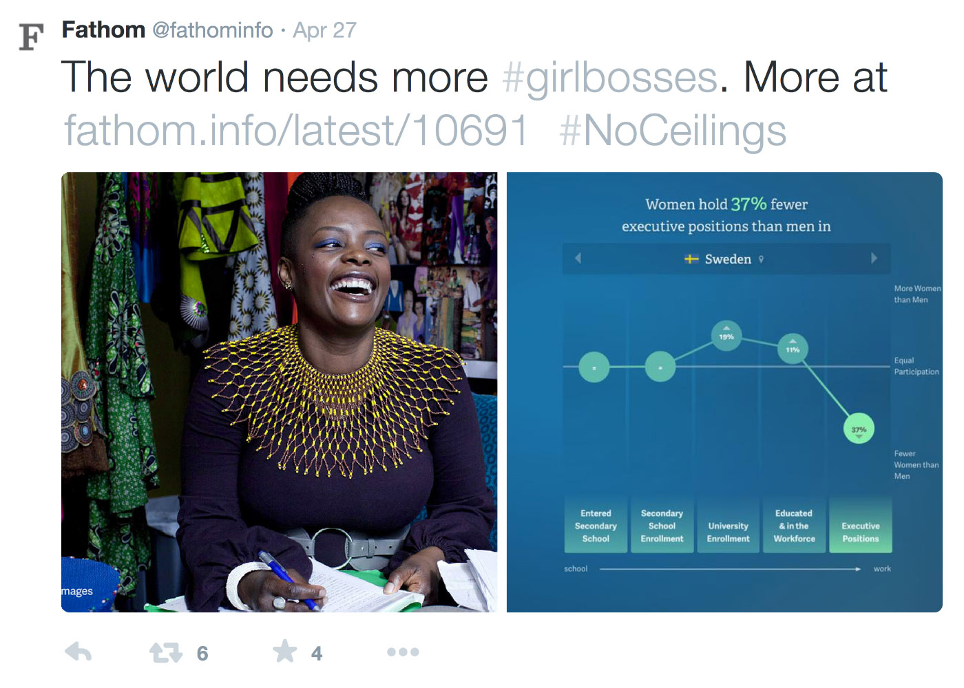
Deep linking has been active since launch. It allows viewers to share a map view of any indicator at any given year. We realized, however, that a truly shareable map must also be embeddable. That is, viewers should be able to peel off any story from the data-driven map and show it on their own sites or presentations.

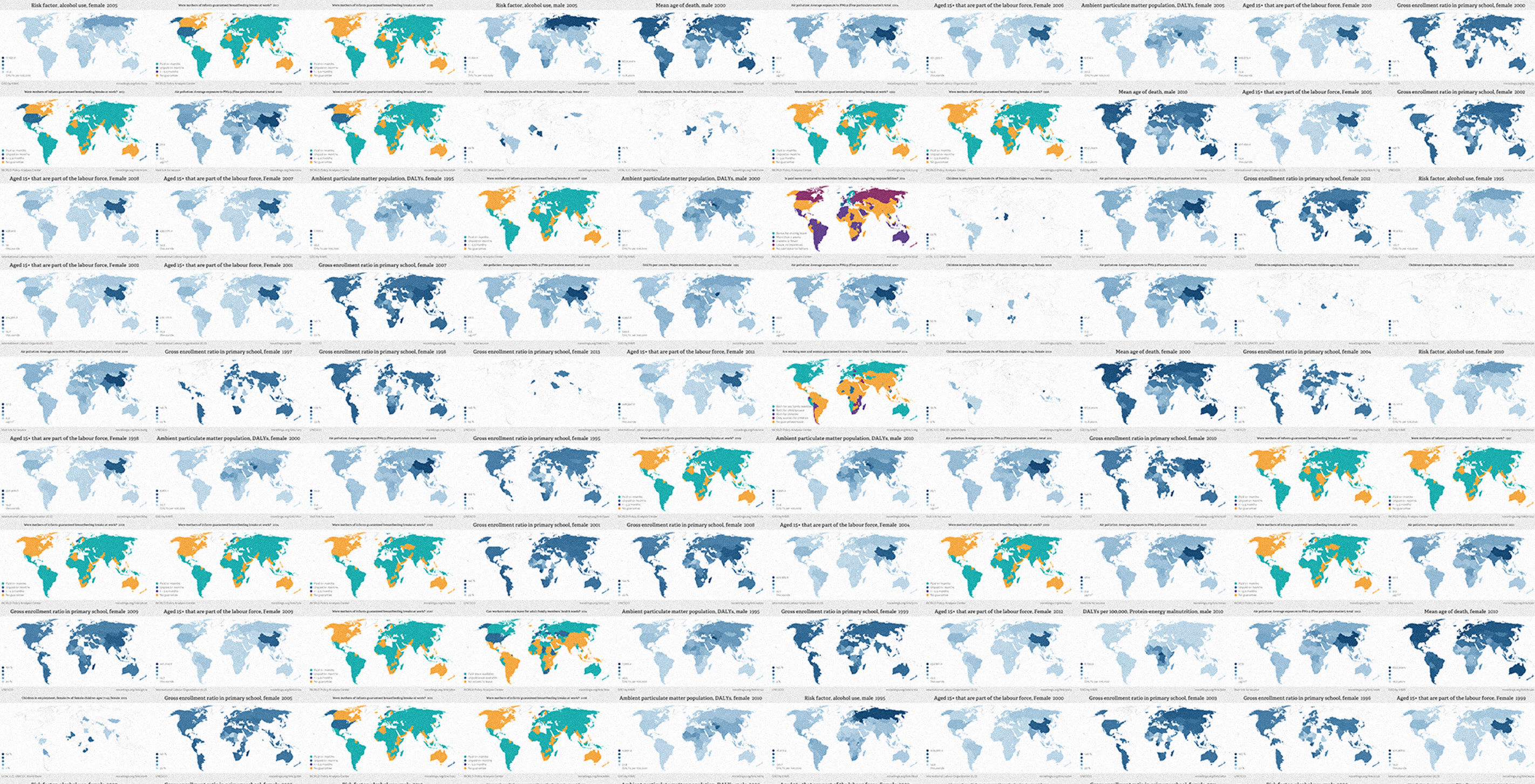
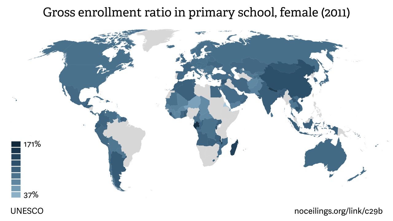
Making the map embeddable required significant design and technical work. In addition to layout and typographic adjustments, we needed to generate over 20,000 static images to recreate every map setting in both the original web colors and a new, more versatile palette. But the hard work was well worth it. The new embeddable maps include all critical information at a scaled-down size, in two color schemes. While they can stand alone on external sites, each image links to the original map from which it was shared, opening a path to the No Ceilings site for new visitors.
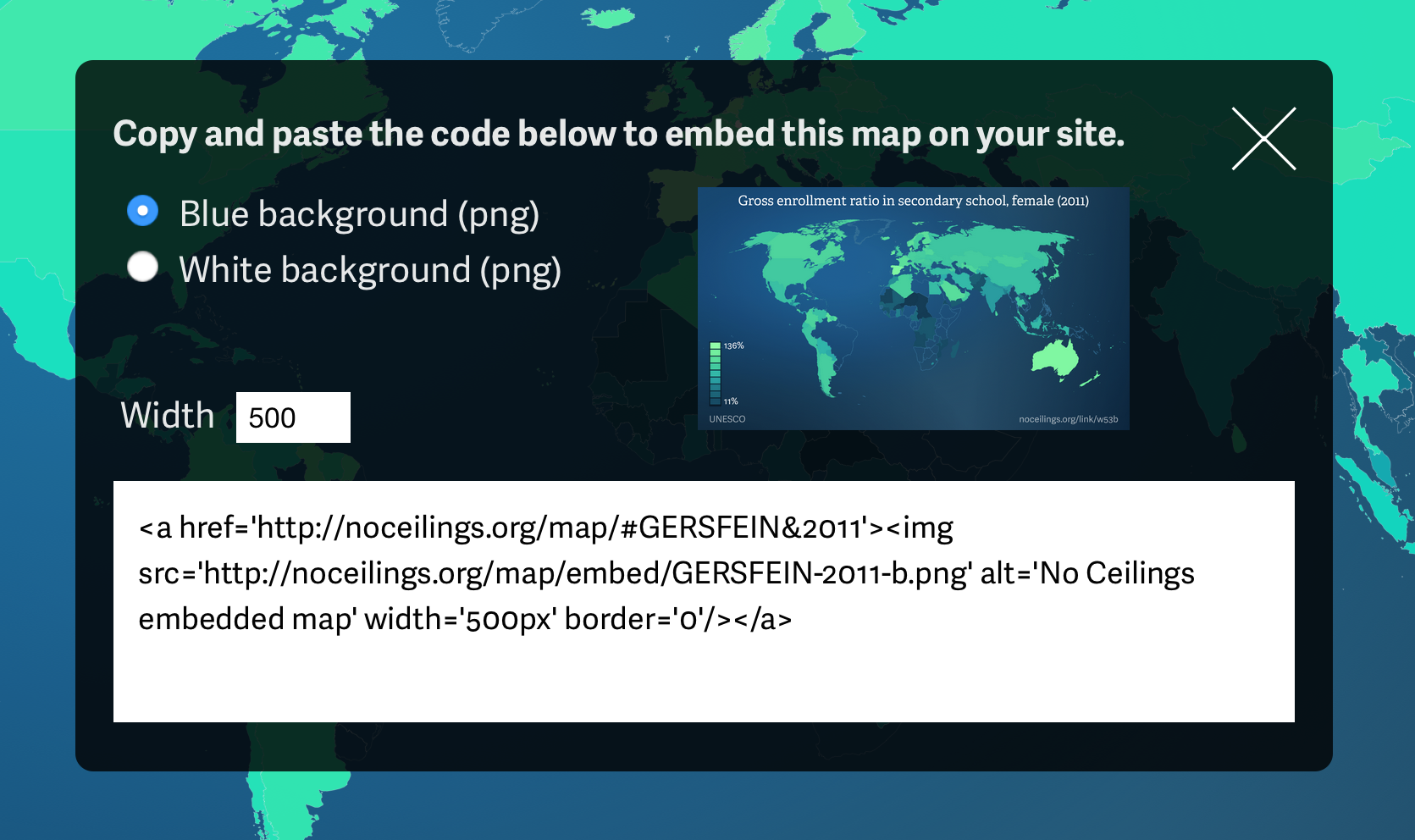
The embedding feature is a valuable tool for journalists, scholars and anyone with a blog or website. By simply clicking the “Embed” button and copy–pasting the given code, anyone can share their findings from the No Ceilings data map. So explore, share, and speak out!
We’d love to hear what you’re working on, what you’re curious about, and what messy data problems we can help you solve. Drop us a line at hello@fathom.info, or you can subscribe to our newsletter for updates.