As part of the development process of Mirador, last year we organized a contest where users were invited to submit their correlation findings in four public datasets: Behavioral Risk Factor Surveillance System, National Health and Nutrition Examination Survey, Lahman's Baseball Database, and the World Bank Development Indicators.
One key goal of Mirador is to enable users to find new hypotheses without prior knowledge of where the interesting correlations might be. In order to reach this goal, we created an interface to simplify the process of searching through arbitrary combinations of variables and defining any subsamples of interest. The interface of Mirador can be seen as a probe to navigate a very large, virtually infinite space of possible correlations. A visualization of the trajectories of search processes could be very interesting in itself since it may reveal the breadth of data explored in Mirador, and perhaps elucidate the efficacy of the user interface.
Relying on Information Theory to quantify the separation between variables in a dataset, I carried out a few experiments in visualizing the search trajectories from submissions received during the Mirador Data Competition. I found the mathematical aspect of these experiments very interesting as well. It turns out we can actually formalize a notion of distance between random variables, and use it to construct a spatial representation of these trajectories (we will look into the details of this distance function in the next post).
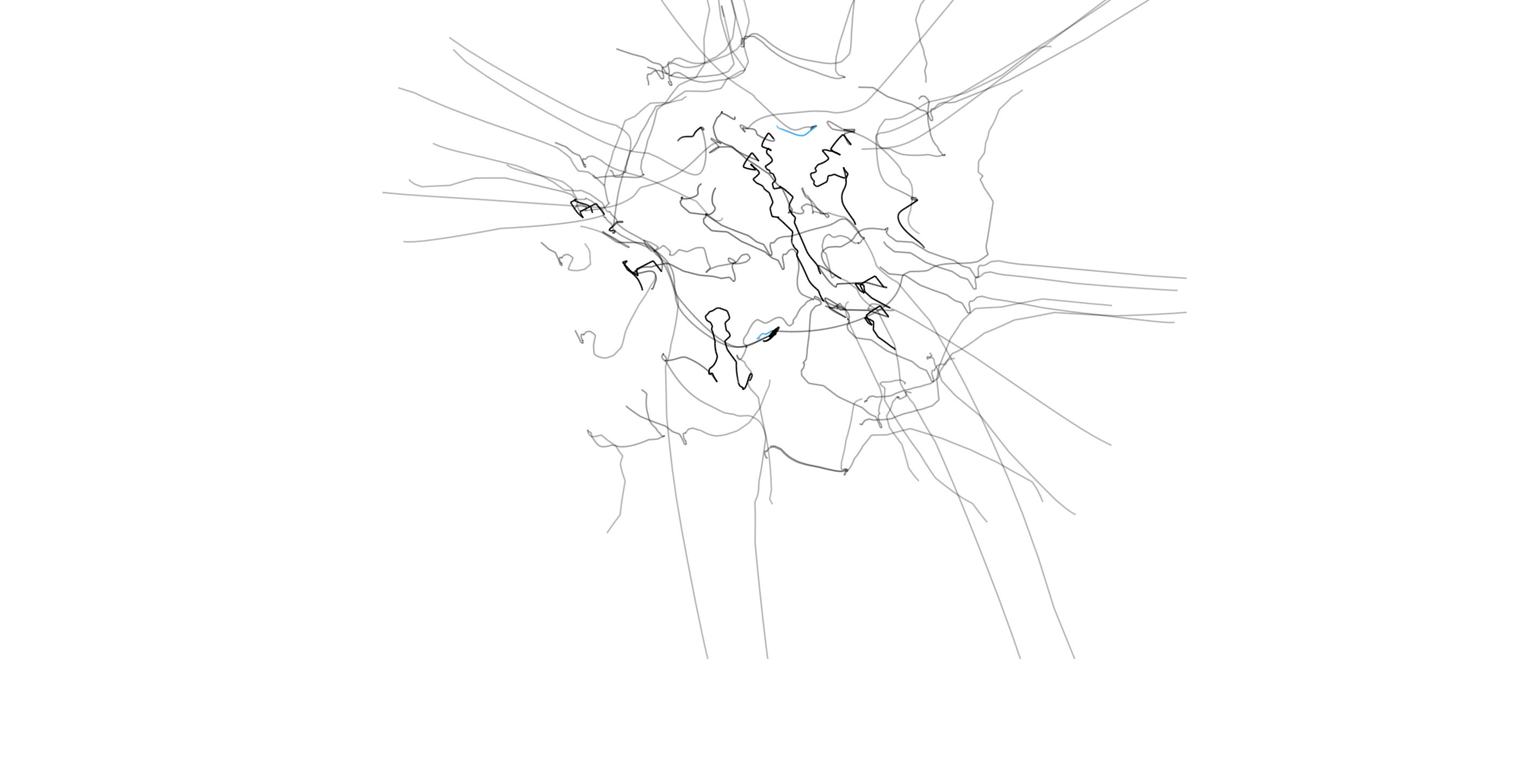
In short, each trajectory is generated by taking the variables under inspection in Mirador, and placing springs between each pair of variables so that the rest lengths of the springs are equal to the "information distance" between the variables. In the video below, the paths of the variables in a selected pair are rendered in blue, while the text at the top indicates the subsamples set by the user during the exploration of the dataset:
The full videos for each trajectory are available following these links: Behavioural Risk Factors, Lahman's Baseball Database, and World Bank Development Indicators. In these videos, the path of each particle representing a variable in the dataset disappears once the user removes that variable from the current view in Mirador. The static images below correspond to the same trajectories, but all the paths are aggregated so that the final result gives an overall representation of the entire search process:
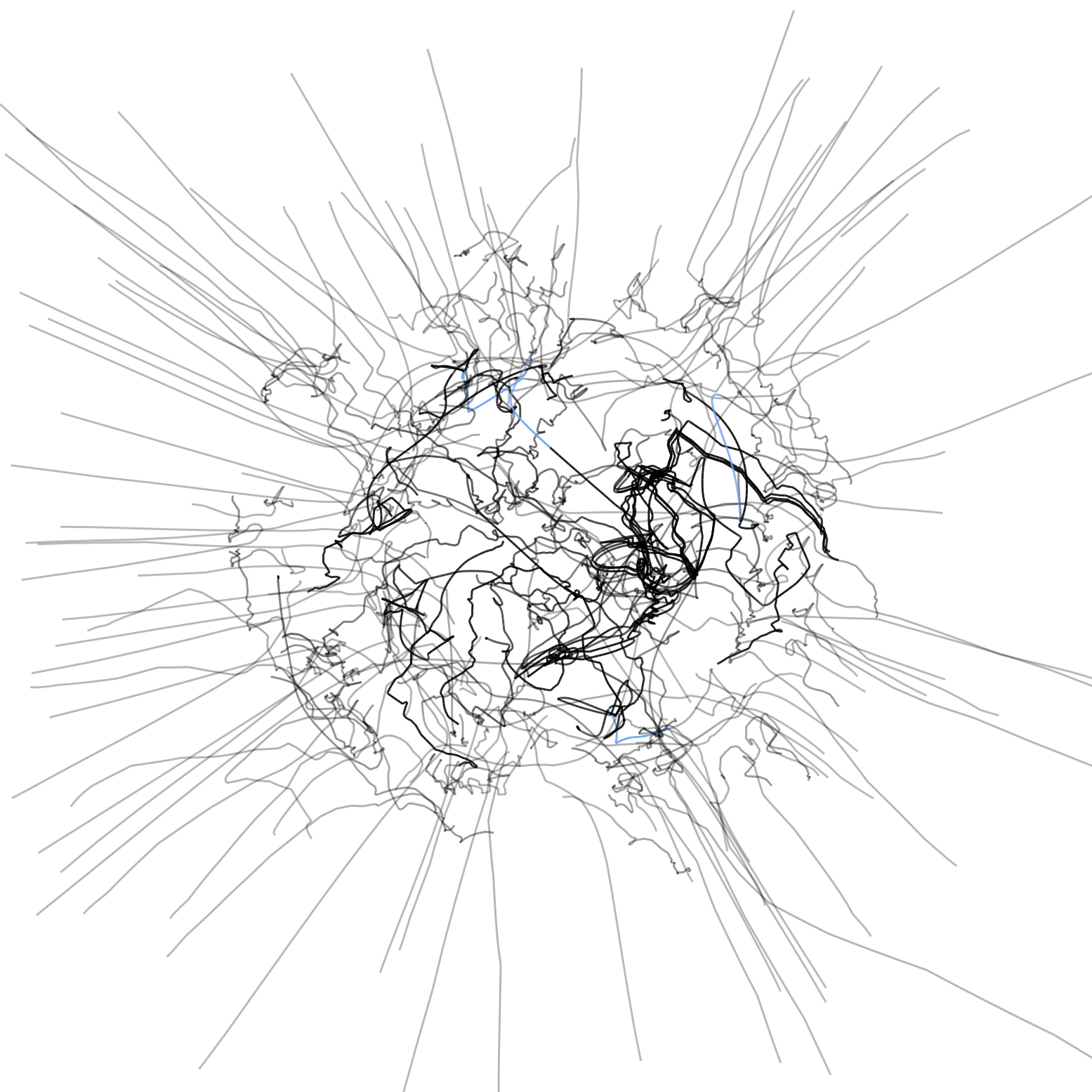
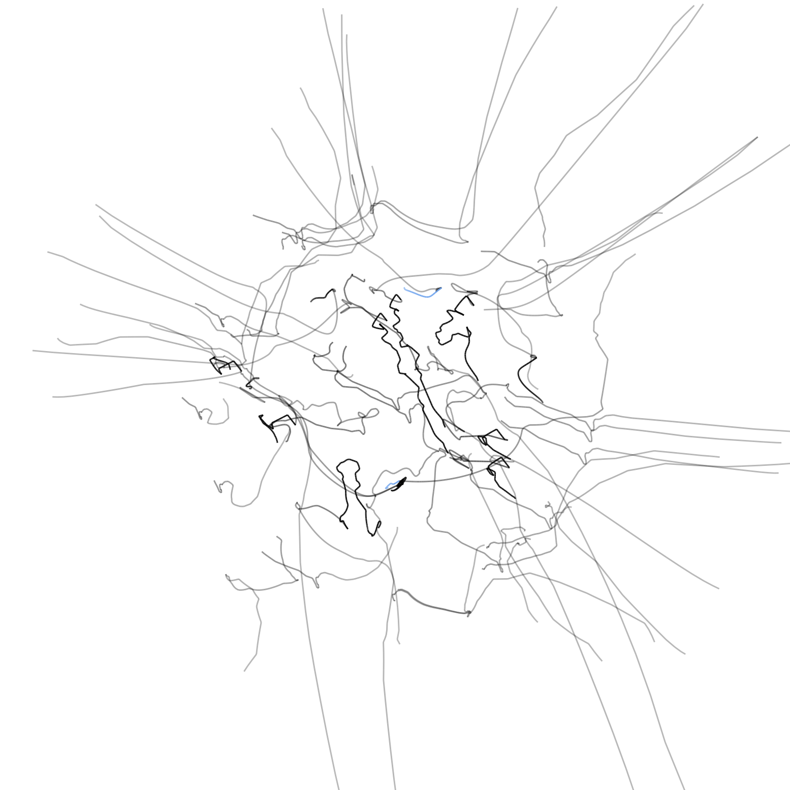
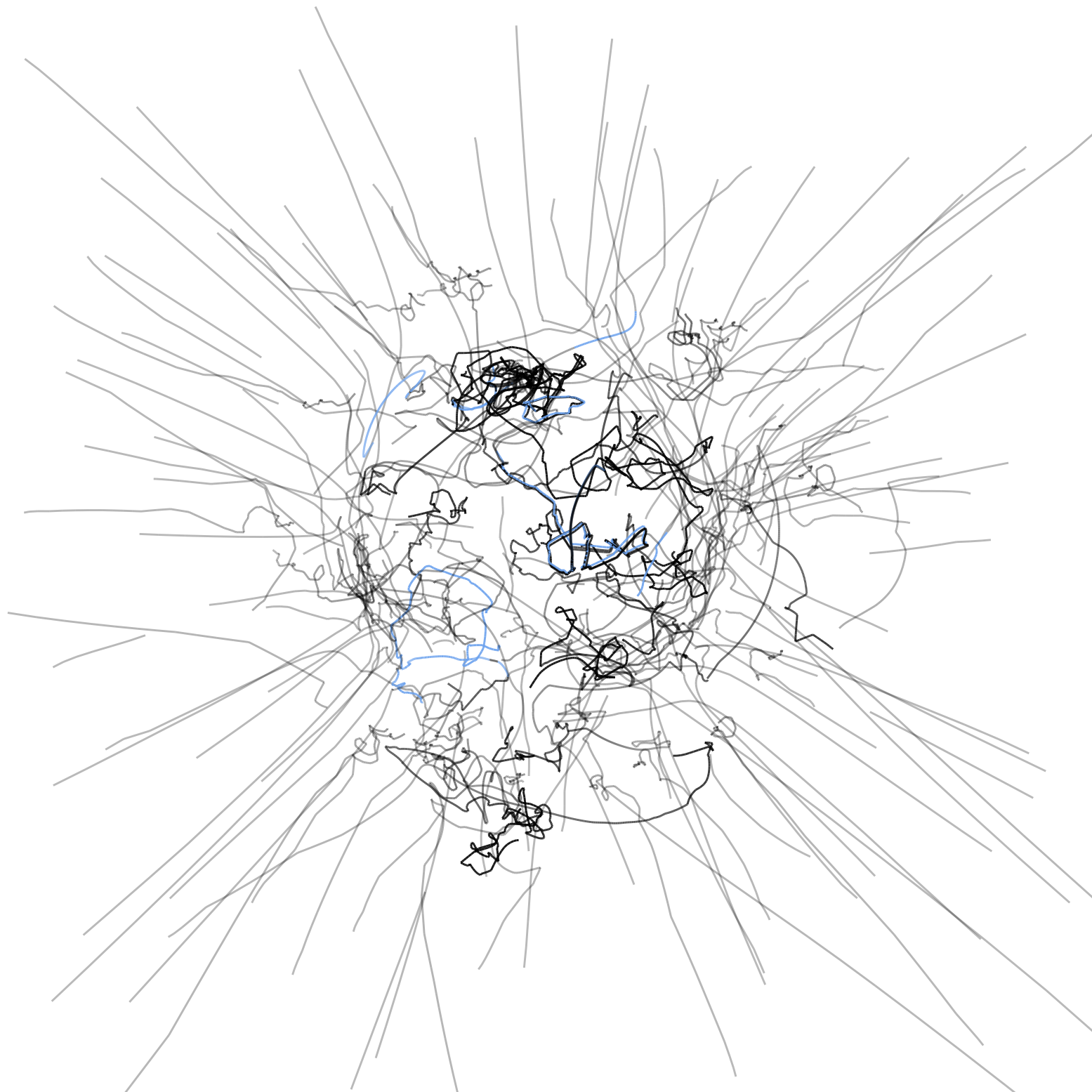
The representation essentially lets us compare how a user's perception of statistical relatedness vary with actual information distance. What I found striking from all these trajectories is that selected correlations are never the closest by distance. A reason for this could be that variables in very close proximity typically correspond to "trivial" associations (for example: age and education level). Potentially meaningful correlations exist in an intermediate range of distances that would make entirely automated search difficult, and thus require manual inspection from the user based on her expert knowledge or intuition.
While working on these visualizations, I kept thinking about the collision trajectories of atomic particles, as can be seen through a Bubble chamber:
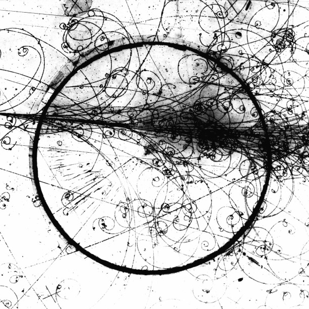
Although the images and videos came out differently (more random than I would have preferred, but still with each dataset having unique patterns), I think this is a relevant visual reference for the idea of the trajectories in correlation space. One could think of the variables in a dataset as some kind of elementary "data particles," with the search process being the laws that define the movement in this space.
In the next blogpost, I will go over the mathematics behind the information distance, with the aid of some interactive visual demonstrations implemented with p5.js!
We’d love to hear what you’re working on, what you’re curious about, and what messy data problems we can help you solve. Drop us a line at hello@fathom.info, or you can subscribe to our newsletter for updates.