
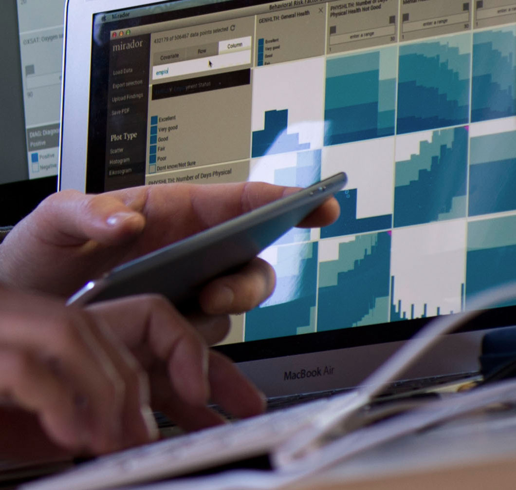
In my last blogpost, I showed some visualizations generated by usage data from our tool Mirador. These visualizations rely on the calculation of a "distance" between variables in a dataset, and Information Theory allows us to define such distance, as we will see below.
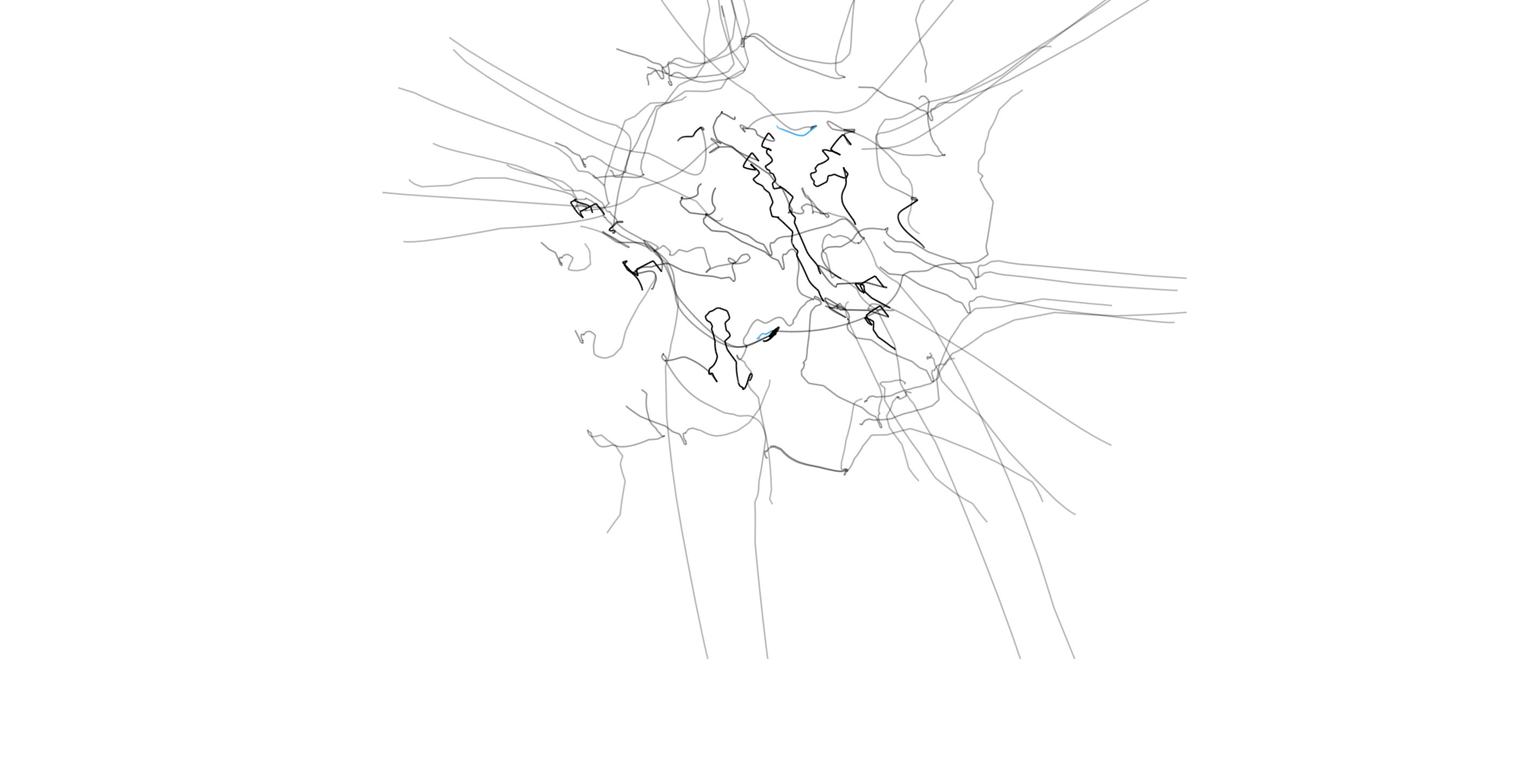
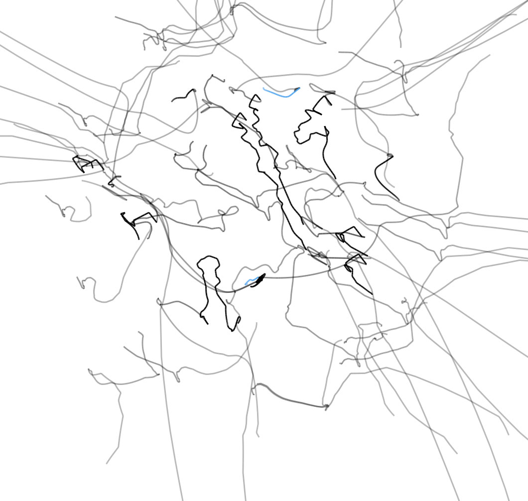
This new post is the continuation of a series of writings (1, 2) on discovering correlations in complex datasets. Some of the ideas I discussed so far have made their way into Mirador, a tool for visual exploratory analysis developed in collaboration with the Sabeti Lab at Harvard University and the Broad Institute. By visualizing "information distance" to construct a geometric representation of statistical correlation, I will describe the usage patterns within the interface of Mirador. Keep reading for the details!
We recently organized the Mirador Data Competition, where participants were invited to explore public datasets in health, sports, and global development using the Mirador tool, submit their findings, and have a chance to win prizes. With the assistance of experts in the areas covered by the competition, we chose three winning entries, and today we have the pleasure to announce them.
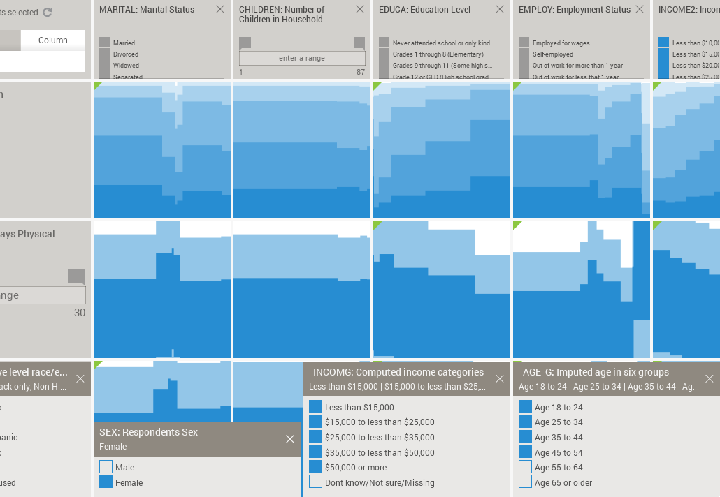
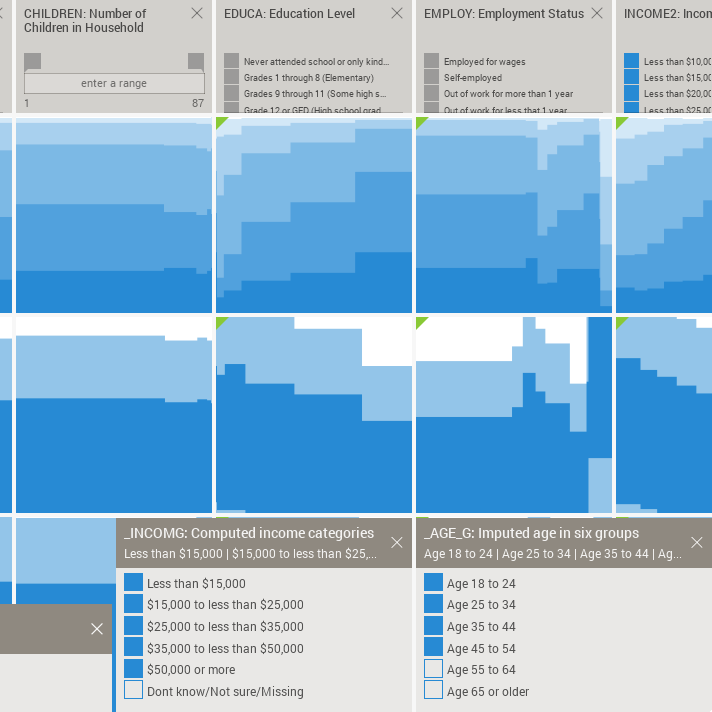
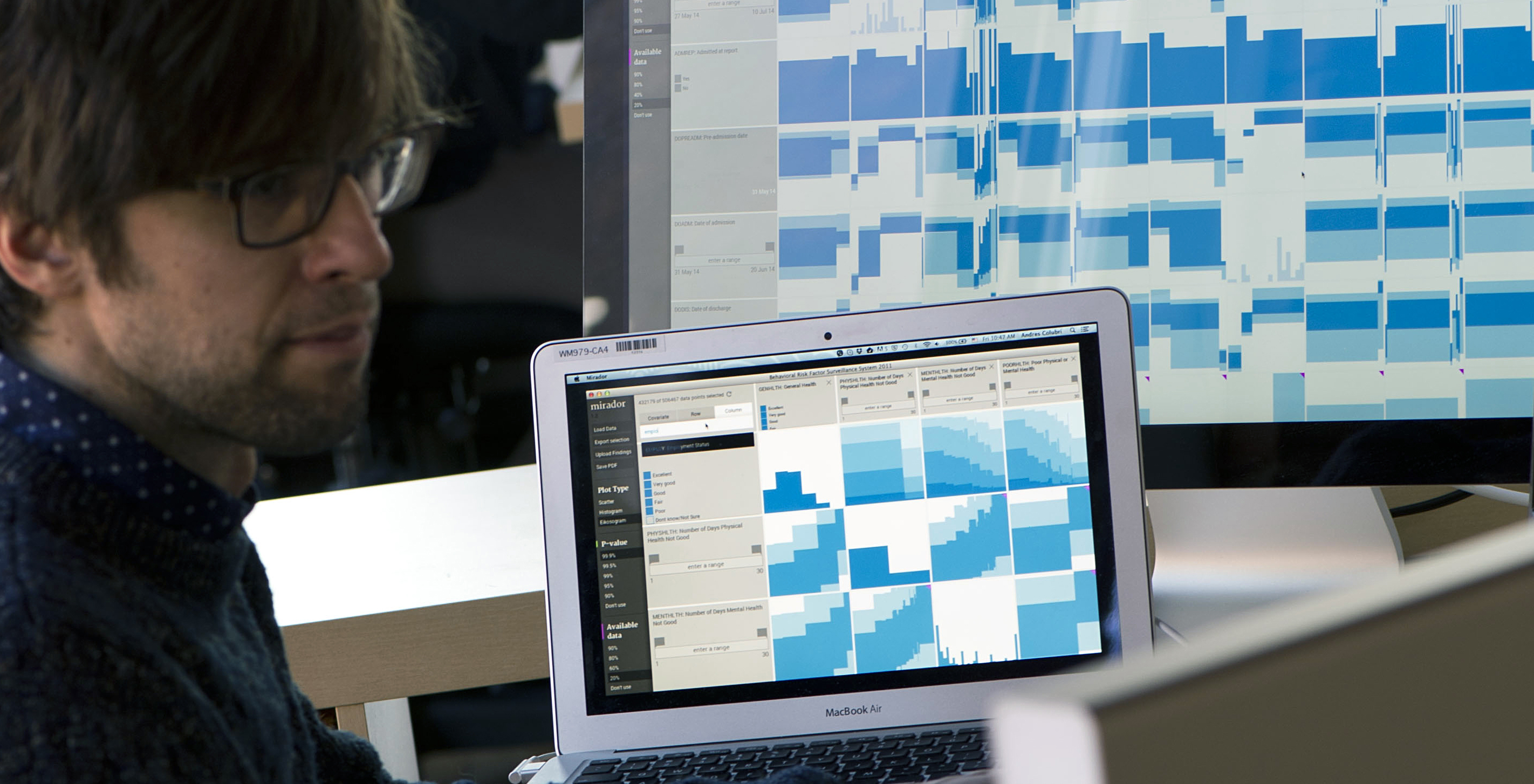
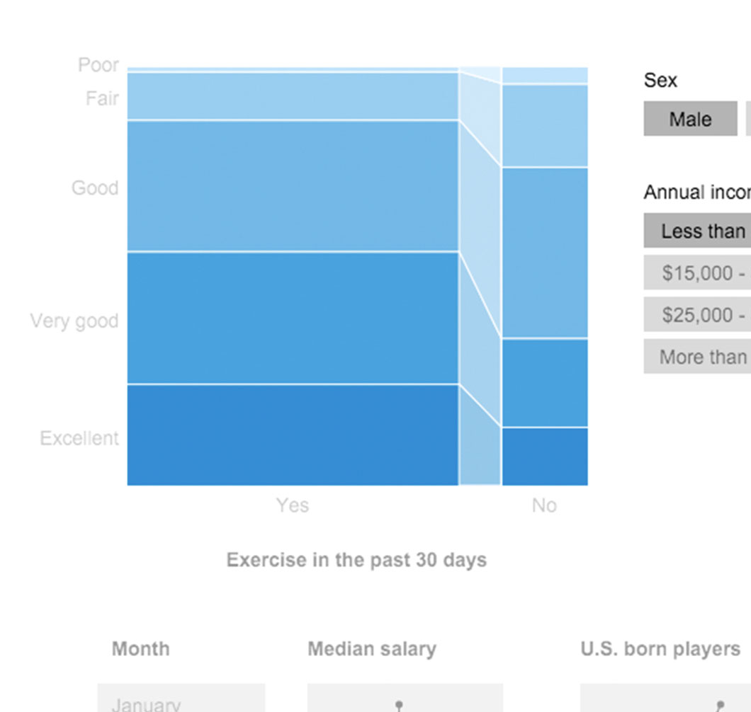
Public data is increasingly available from multiple sources: governments, economists, and research communities, to name a few. Open access is a fundamental prerequisite for civic participation and transparency, but freely-available and intuitive tools that allow users to extract meaningful narratives from the data are also crucial. That was our central motivation to develop the visualization tool Mirador, and also for the Mirador Data Competition we launched last month. The richness of public datasets is often extraordinary, and many of them are the result of the continued efforts of data collection teams, statisticians, and researchers over several years, sometimes decades. In this post, I would like to share some associations I found using Mirador on a large dataset of behavioral risk factors. These associations stand here simply as suggestive hints or directions that one can use to delve further into the data using more rigorous statistical analyses. This highlights the main purpose of Mirador as a visual exploratory tool.
Today we are announcing the Mirador Data Competition, the goal of which is to make discoveries in large and complex public datasets. The good news is we have been developing a program to help you make these discoveries, it's called Mirador.

As I mentioned in my previous post, our collaboration with the Sabeti Lab is aimed at creating new visual exploration tools to help researchers, doctors, and clinicians discover patterns and associations in large health and epidemiological datasets. These tools will be the first step in a hypothesis-generation process, combining intuition from expert users with visualization techniques and automated algorithms, allowing users to quickly test hypothesis that are “suggested” by the data itself. Researchers and doctors have a deep familiarity with their data and often can tell immediately when a new pattern is potentially interesting or simply the result of noise. Visualization techniques will help articulate their knowledge to a wider audience. This time around I will describe a quantitative measure of statistical independence called mutual information, which is used to rank associations in the data.
This blog post is motivated by the work I'm carrying out at the Sabeti Lab, which consists of the development of new tools for the visualization of health and genomic information. One of the aims of these tools is to help doctors and researchers find new correlations in their data.
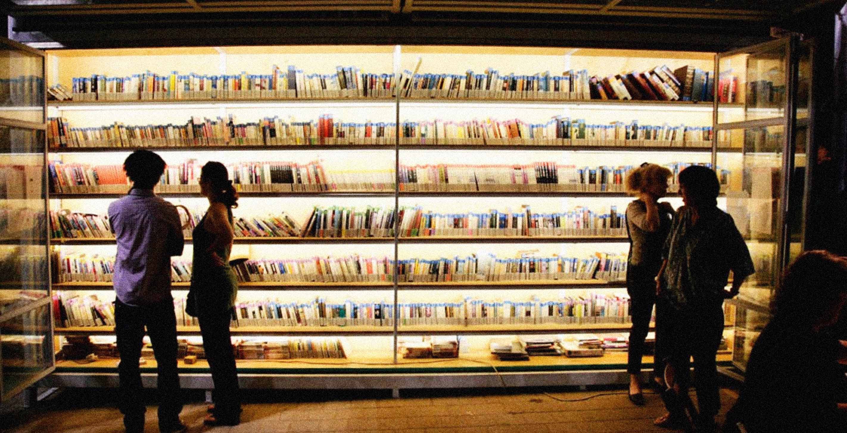

At the Remediating the Social conference a couple of weeks ago, Israeli artist Romy Achituv presented a data visualization project of the books in the Garden Library for Refugees and Migrant Workers in South Tel-Aviv. A unique element of this library is the use of emotional judgments from the readers to organize the books. This project resulted from a collaboration between Romy and me, where the main goal was to create a working prototype of a Web-based visualization of the "emotional history" of the books.