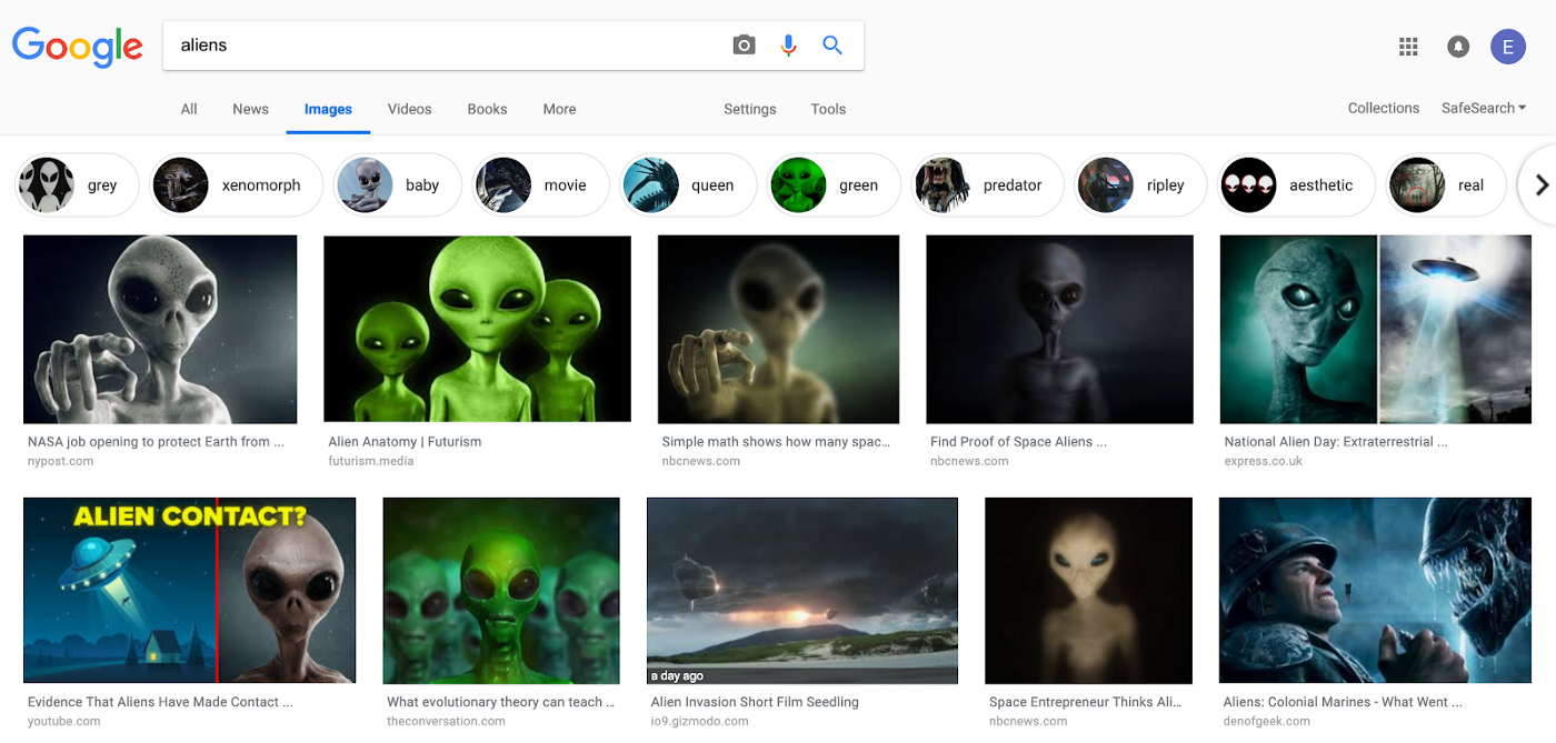
Imagine you were an alien curious to see what humans think you look like. Using a Google image search, you’d find a uniform depiction of you and your friends as green, bulbous-headed, bug-eyed, vaguely-humanoid creatures.
No one has seen an extra-terrestrial, which means that this representation was completely made up by naive humans. Someone created the initial drawing, other people copied it, and eventually the contemporary representations all converged. The narrative that emerges is a singular one in which aliens are enough like us to make them feel like a reflection of ourselves, and different enough (with those vacant eyes and skeletal necks) to make us feel unsettled when we look at them for too long.
Visual representations shape how a concept, issue, event, or person gets portrayed, and therefore, understood. Considering the convergence of visual representations is entertaining when the subject is aliens. However, it becomes problematic in trying to understand global issues like climate change. Climate change has complex causes and impacts, and yet, there are only a few visual representations, each showing an isolated view of the concept.
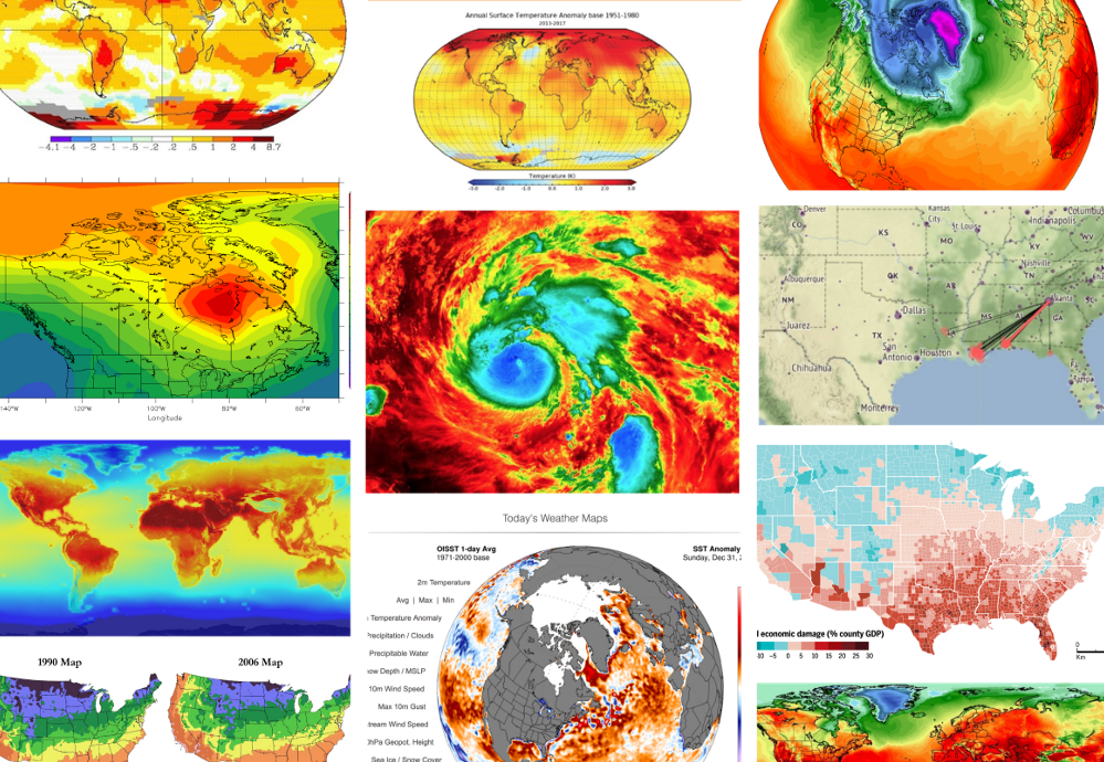
Maps, maps, maps
Of the top 100 image results for “climate change,” a strong contingent represents people’s efforts to measure and predict the impacts. These images show different things (temperature, weather, economic impact), and yet, they use a single representation—a map. Most of these images use a rainbow color scale, which is common in science, but can often be difficult to interpret.
As such, many of these graphics are more overwhelming than accessible. In failing to make the information relatable, these representations alienate most people, and leave even the engaged viewers with more questions than answers: What does this mean? What are the impacts?
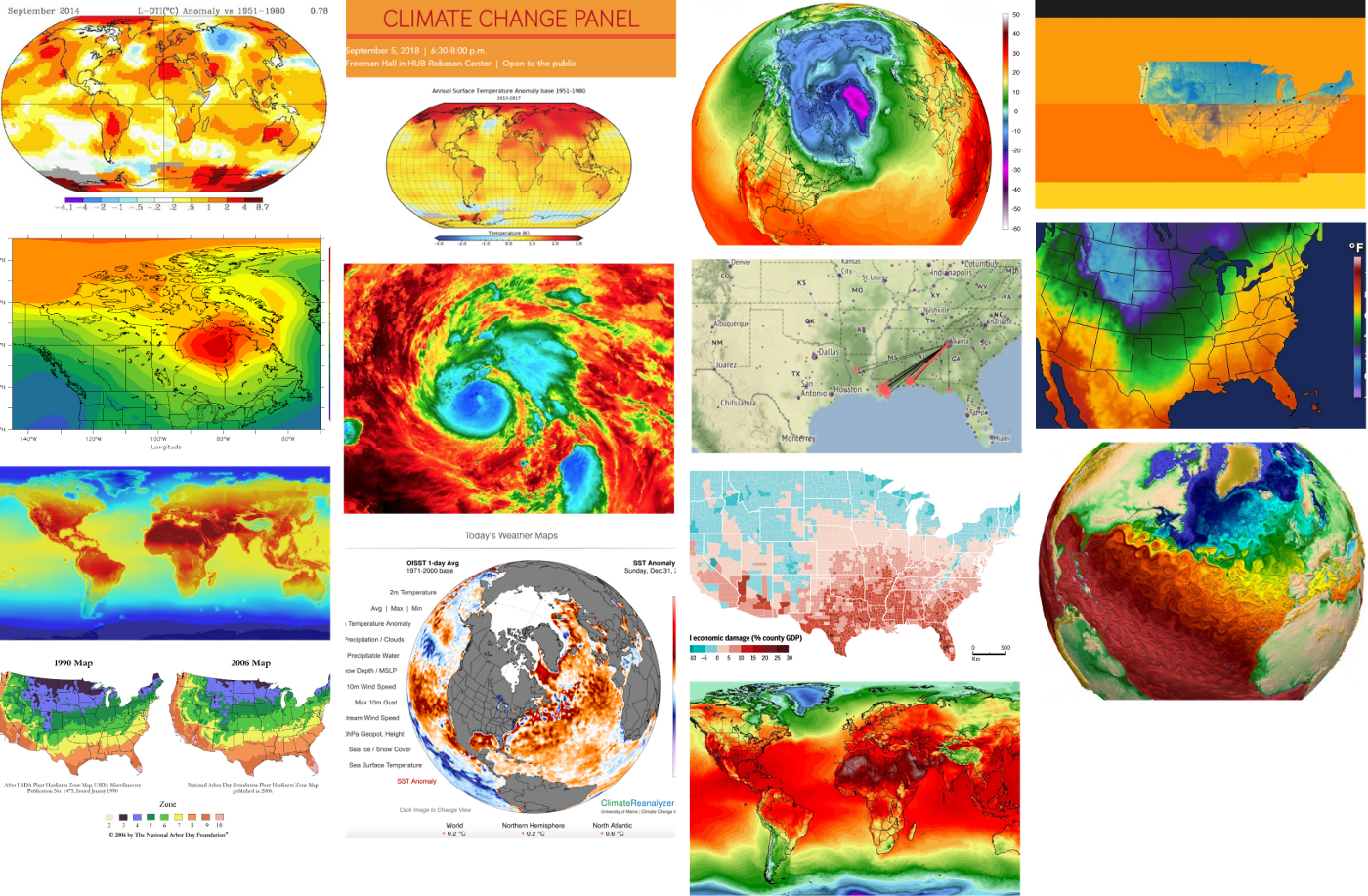
It’s important to recognize that climate change is a complicated concept to depict. Regardless, relying on the visual norms or deciding on a visual representation without considering how people want to relate to the content can be detrimental to conveying any narrative or information.
Nature + Us
Over a third of the top 100 results depict the extreme impacts of climate change by focusing on how environments are being destroyed. These images reveal the things people find the most frightening (parched land, forest fires) and those that evoke empathy (glaciers, polar bears). Unless these are the elements that surround you, though, these depictions don’t easily translate to everyday life.
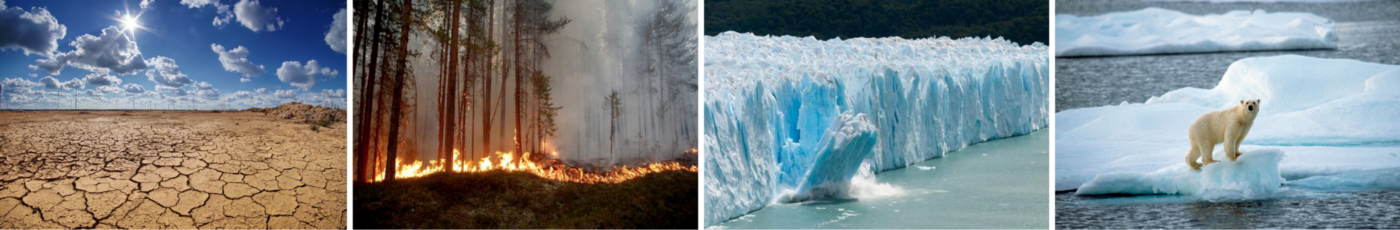
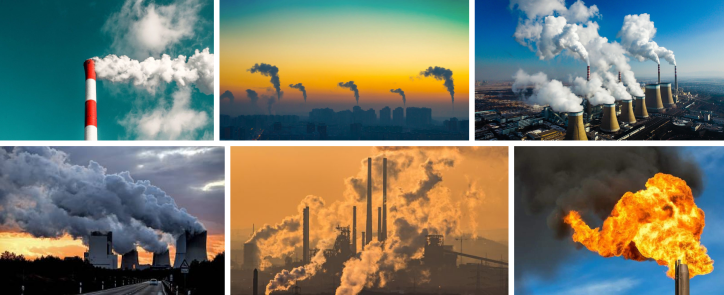
What’s included in the representation is just as important as what’s excluded. The nature imagery almost completely omits people, and in doing so, perpetuates a narrative that humans are separate from the natural world. Ironically, the images that associate human activity and climate change also exclude humans. Smokestacks dominate the latter visual representation, which further separates us from the causes and the impacts.
Only a few images make the impact of climate change relatable by listing health concerns and showing city streets flooding. But what’s still missing are robust representations of how climate change affects our communities — the adaptation and migration on both a local and a global scale — and what people are doing and can do to mitigate these effects in the first place.
A polarizing juxtaposition
In some ways, the most striking narrative that emerges comes from a collection of images that depicts the dichotomy of a lush landscape and a barren one. The stark comparison of this imagined, pristine world to an apocalyptic future — or, alternately, the apocalyptic now to the pristine future — is unhelpful, and unreasonable.
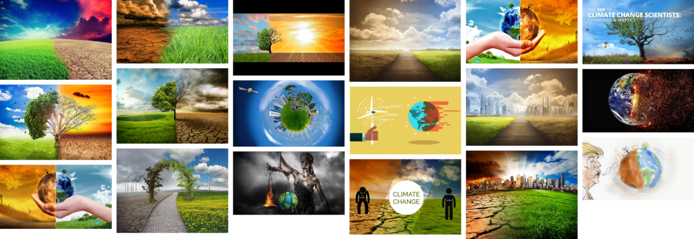
Comparisons and benchmarks are critical in understanding the significance of the information at hand. However, if the representation oversimplifies the issue, it can lock us into thinking about the problem, or in this case, looking at our surroundings and societal systems, through a lens of good and bad, without considering the nuances.
These representations hinder how we understand change, portraying it as an instant transformation, rather than an interconnected progression, both on the human scale of decades and the world’s timeframe of millennia. Additionally, these images plant the conventional constructions of pastoral “untouched” landscapes and barren lands in our minds, reinforcing stereotypes and making it harder to imagine alternatives.
Representations of climate change have converged around a few discrete depictions: maps, iconic natural disasters, pollution, and comparisons of idyllic and dismal landscapes. In following the visual status quo, these representations fail to consider the intended conclusions, the audience, and the wider narrative. Complex systems and global problems are inherently more challenging to understand than a person, entity, or event since the impacts are varied and widespread. It is all the more critical to have meaningful representations that take into account how people want to learn about and relate to the causes and impacts.