
While Shoestring was certainly not the most amazing typeface ever designed, the 12 weeks I spent hand-editing the bezier curves that formed each glyph left a lasting impression. The most minute change to the handles on a curve can change the entire personality of a typeface, moving your design from friendly to Frankenfont by upsetting the balance of a single letter.
I have been experimenting with different ways of exposing those distinctive underlying structures in type faces: contrast between thick and thin, the relationship between x-height and width, and how elements like ascenders, descenders, bowls and terminals are constructed.

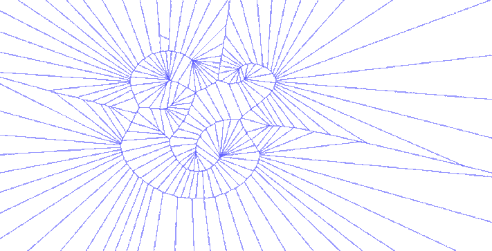
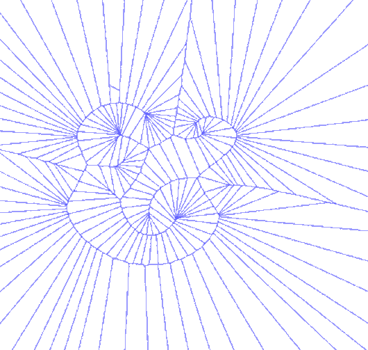
There were other explorations along this vein, using only the bezier control points, using only the anchor points, or both together. One version iterated through various degrees of detail in sampling points along the glyph, which just begged to become an animated GIF:

Sweet GIFs aside, I began to think about how the forms I was generating could be used in another more tangible process that has long interested me. The cyanotype is an antique photographic process that pre-dates our current silver chemistry but never gained great commercial success outside of architectural blueprints and that staple of the museum gift shop, Sun Print paper.
I've always liked it because the process is dead simple, the chemistry is relatively benign, and a lab is very easy to construct:

At the moment ours consists of a clip lamp with a reflector, a sheet of glass stolen from an IKEA picture frame, and a wide spectrum CFL. This simplicity makes the whole the process feel very improvisational, and in that spirit I set out to use some of the voronoi sketches as negatives for cyanotype prints.

The best part about cyanotypes is that the mistakes are often more interesting than what you were trying to do in the first place. Clip the exposure light too far away, and out come delicate, feathery watercolors. Move the light to close, and the results are far more intense.

These are absolutely a work in progress, so expect more images as I get a chance to explore more. In the interim, take a moment to check out the New York Public Library's excellent archive of Cyanotypes of British Algea, and read up on its creator Anna Atkins.
There was a short stretch of time where the Smithsonian also used the process to document their rotating exhibitions, and that archive is worth checking out as well.
These sketches relied heavily on geomerative and Mesh libraries, as well as a pre-release version of Processing. Photographic chemistry should always be handled with care, in a well ventilated area, and with the appropriate protective gear. Make sure you read up on the regulations in your town regarding the disposal of used chemistry in a safe and environmentally responsible way. Also, lets not ever look directly at UV lights, mkay?