It has been a rainy few weeks in Boston and many of us have fallen victim to the gloomy clouds on commutes to and from the Fathom office. “Expect a drizzle in the next hour” my weather app pings again. While it could’ve been a useful reminder, I was drenched nonetheless. If only I received the warning before I left home, I could’ve grabbed an umbrella on my way out. But this didn’t happen. Next-hour precipitation alerts only tell you when it will rain next, regardless of when your window of action may be. Even with the latest, location-precise forecast at my fingertips, I was still not ahead of the weather.
Constantly updating but not very useful — a pitfall of modern technology that motivated us to take inspiration from the past. Specifically, we were inspired by how newsprint weather pages provided a dense, comprehensive view of weather-related matters for the entire country in just a single page. While not all the information would be directly relevant to an individual, it was easy to learn about things happening elsewhere. Though weather pages are now almost entirely replaced by individualized smartphone apps, they incidentally offered an interconnected perspective that we so desperately need in the context of the pandemic.
As masks are no longer required, testing centers close and genome sequencing efforts decline, we are deeply worried about where going “back to normal” would take us. Isn’t it ironic that we have a much better grasp of the weather than we have of pathogens when the latter is evidently a comparable if not greater threat to our livelihoods? What would the pathogen version of weekly forecasts, flood warnings and hurricane projections look like? Borrowing constraints from newsprint, we were immediately faced with questions like “how frequently should a report like this be published?” — questions we don’t always consider in a digital product. Limited space also forced us to be more selective about what to prioritize in a way that an infinite canvas in the digital world does not.
Below are some ideas we explored when thinking of what would be useful for a pandemic-conscious audience seeking for preventative measures and actionable information.
Interaction map
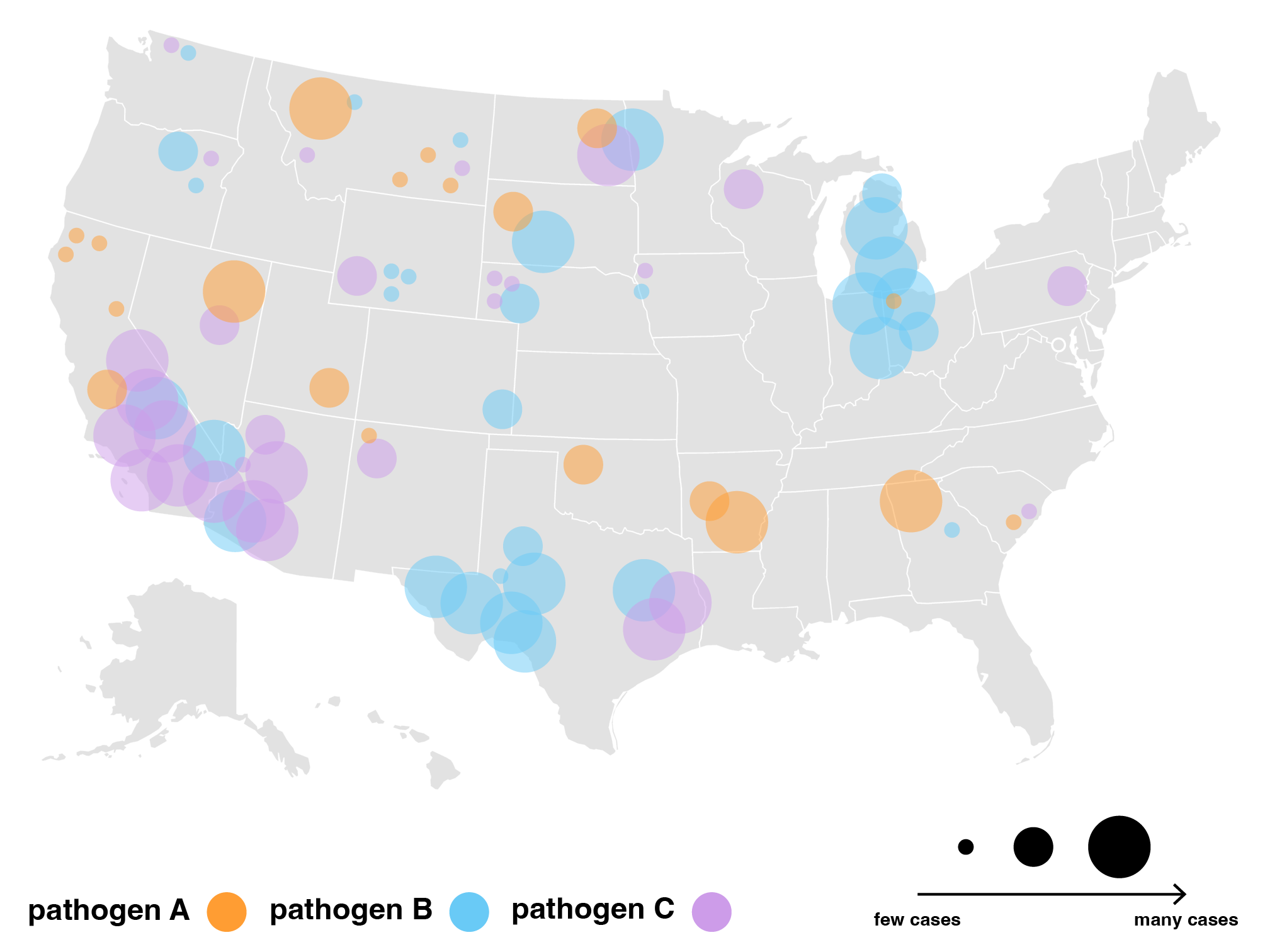
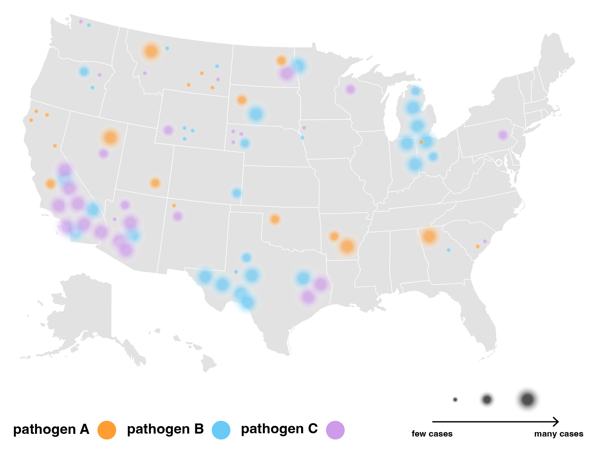
A shared motivation for tracking both weather and pathogens is to make better predictions on when and where to reinforce preventative measures. Whether it be signaling storm warnings, rerouting traffic, increasing testing capacities or initiating lockdowns, identifying risk gives us basis to act. Flood risk in particular gave us a starting point to think about how to represent infection risk. We can expect floods to flow to nearby places and gradually slow down, creating varying levels of damage depending on how resilient neighboring infrastructures are built.
On the other hand, while pathogens similarly spread to neighboring places and infect those most vulnerable, their spread travels further and gains momentum with every infected person. Pathogens can jump from one corner of the world to another overnight by plane and spread from person to person *without* weakening. For pathogens, it seems that physical closeness may not be the primary driver of spread. Rather, how connected a place is to the rest of the world, such as large cities drawing in business travellers and hosting conferences, seems to be an important driver lacking attention. This led us to wonder: how do we represent infection risk as a factor of *interaction* rather than physical proximity? What makes a place more interconnected than others? What data would we need to map out the many paths a pathogen can take?
A proxy for interactions we considered was flight activity. While flights are obviously not the only means of travel, flight data gave us a tangible framework to consider risk factors and exceptions. For example, airport hub size classifications and international rankings emerged as a measure of interconnectedness, hinting at airports that are more likely to host travelers from many destinations.
We tried representing interaction frequency where connecting airports were scaled and grouped by number of flights shared per day.
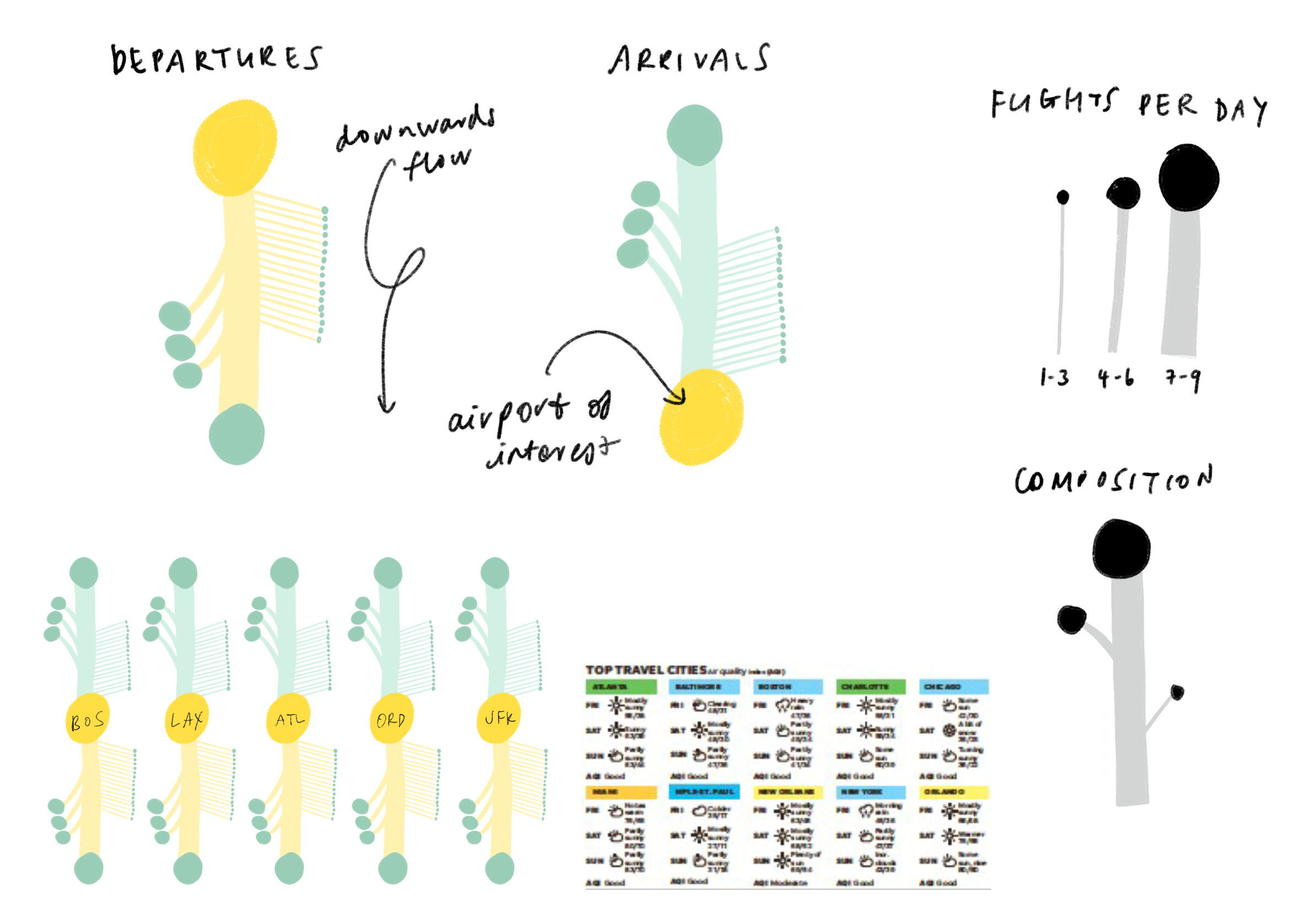

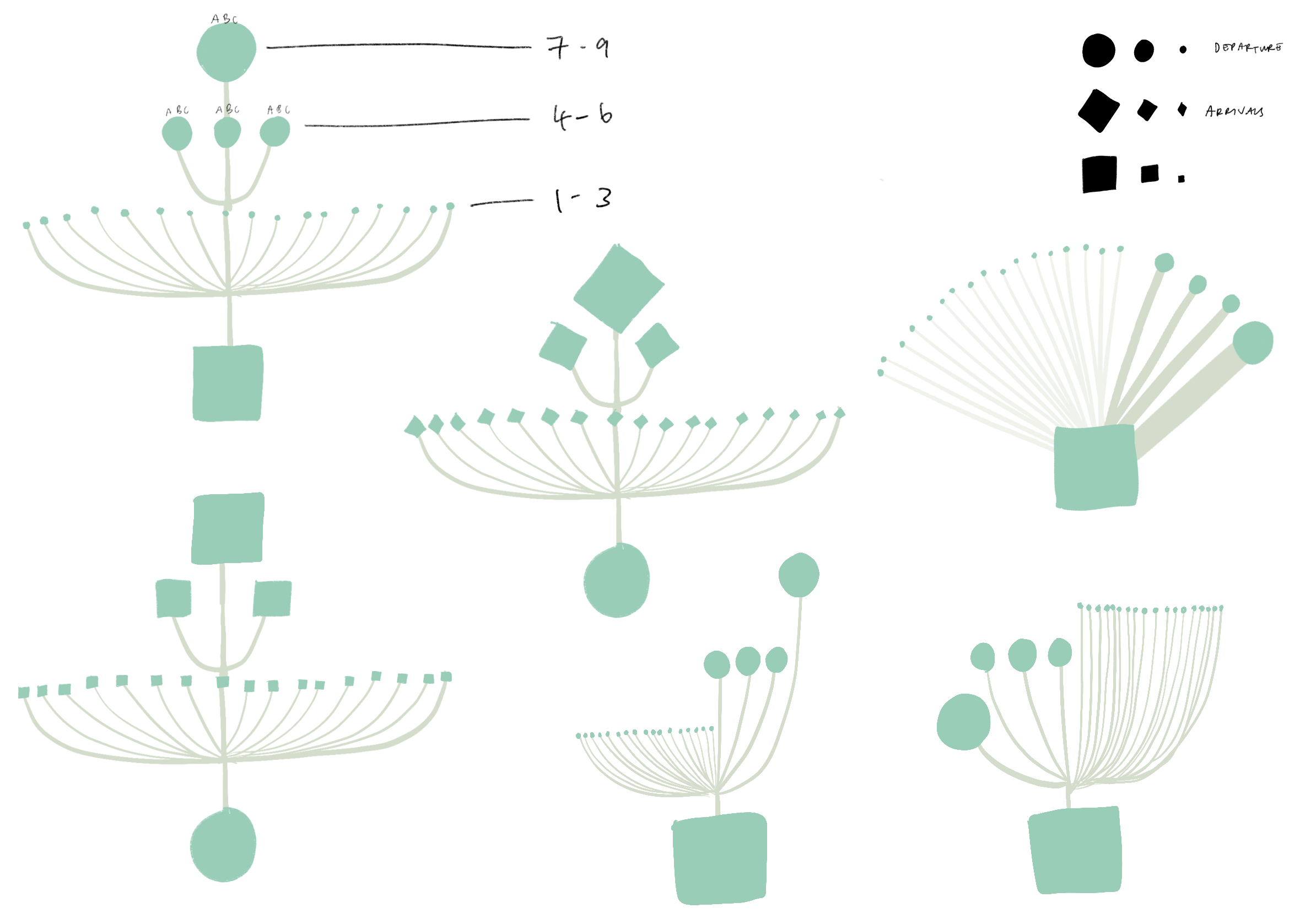
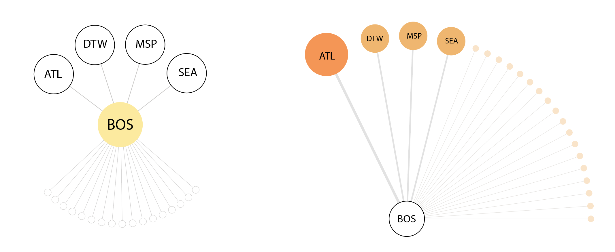
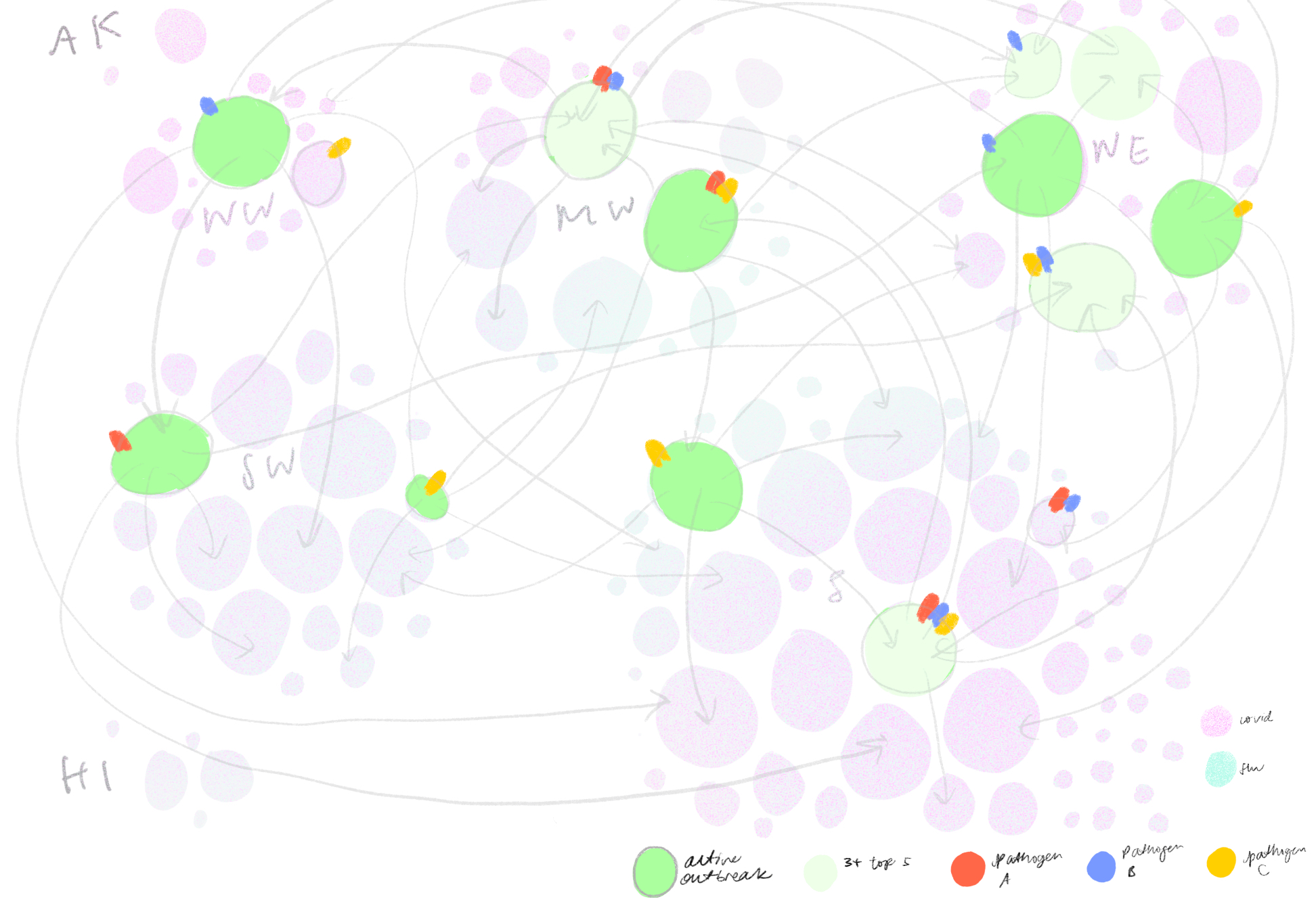
Then, we iterated on a version that mapped out the top five airport connections at a given outbreaking city, represented by its airport portal to the rest of the world, sorted by hub size in a fractal inspired descending order. This view would allow for airports that appear in multiple top five rankings to be flagged.
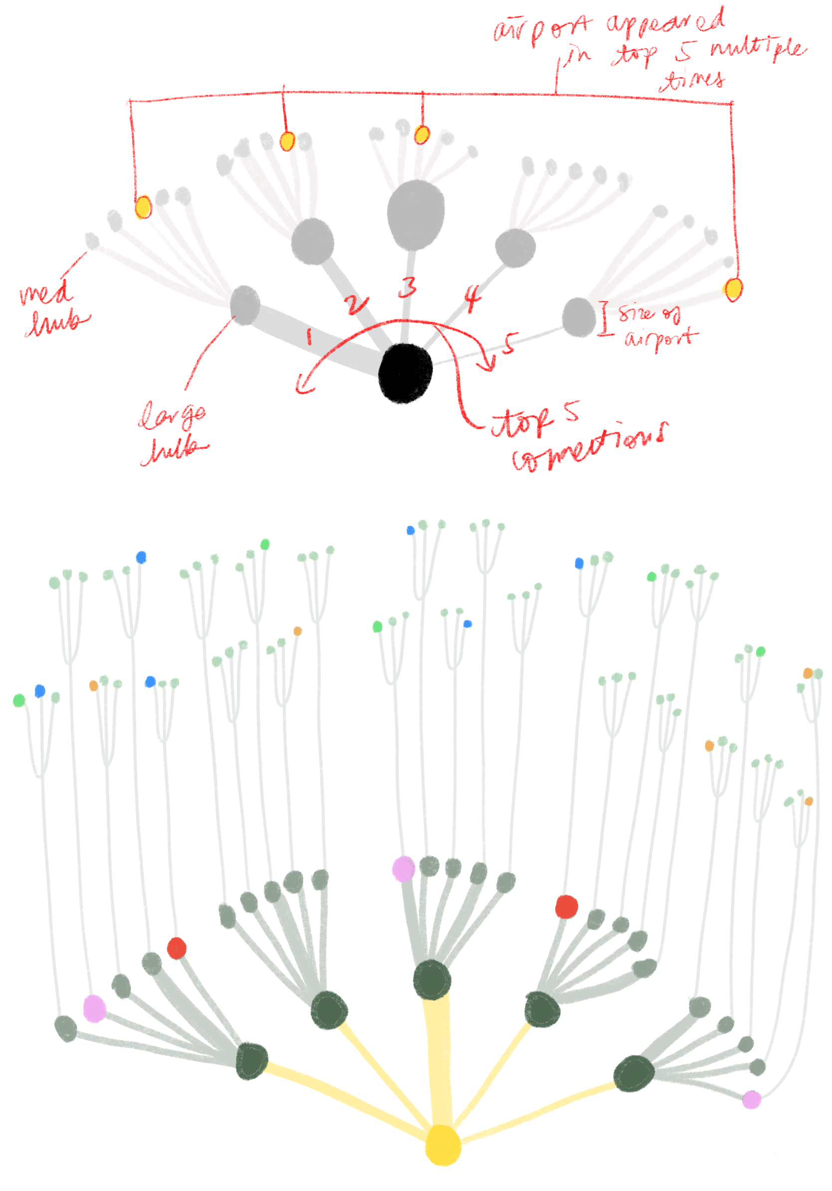
The hope was that individual airport fractal units could fit together in a modular fashion to represent all airports of major cities but we soon realized that combining more that three fractal units would become too cluttered to read. Although the fractal views indeed showed many connections, it was difficult to tell which airports are at most risk.
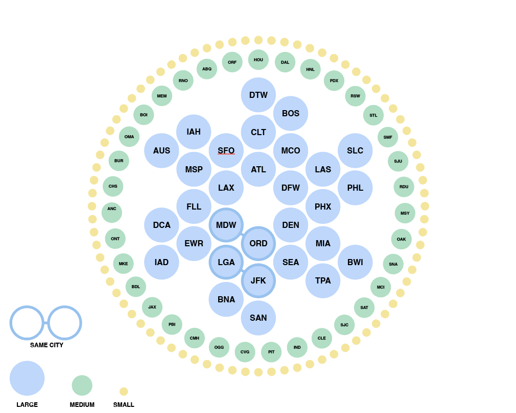
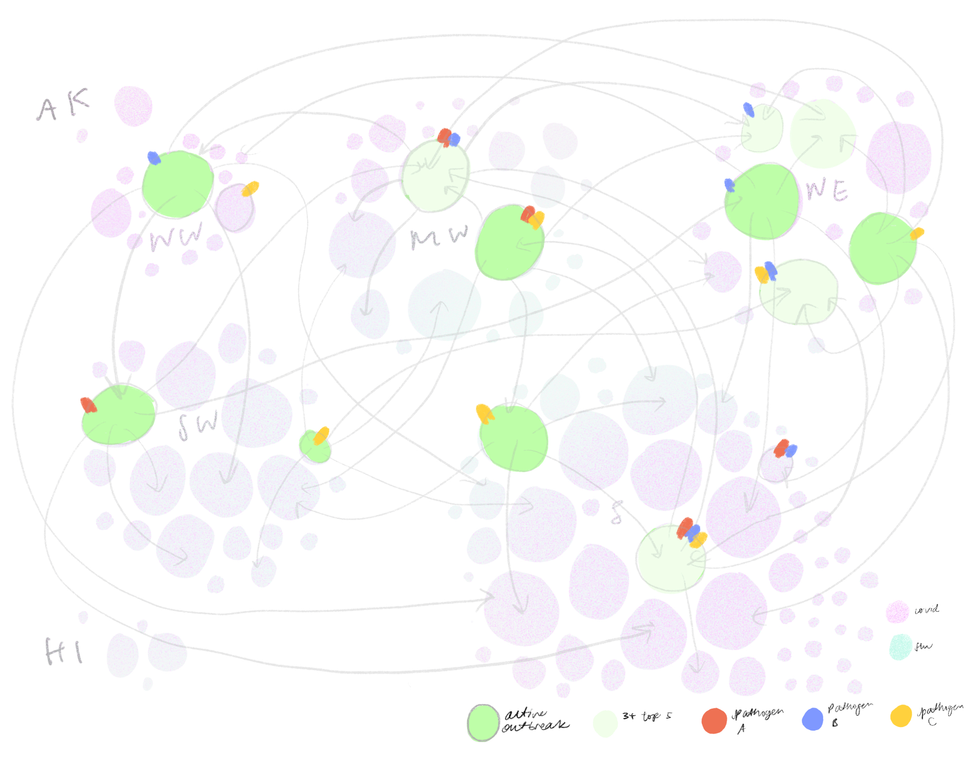
We also tried grouping airports by hub-size in concentric rings of risk, largest hubs in the middle and smallest hubs on the outskirts. On the right is a zoomed in version where the airports are sorted into states while maintaining the concentric ring layout. This visualization successfully puts airport hub-size at the forefront but took some time to grasp without any geographical grounding we were accustomed to expect in a map.
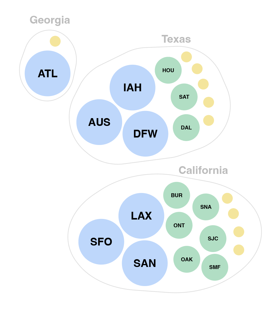
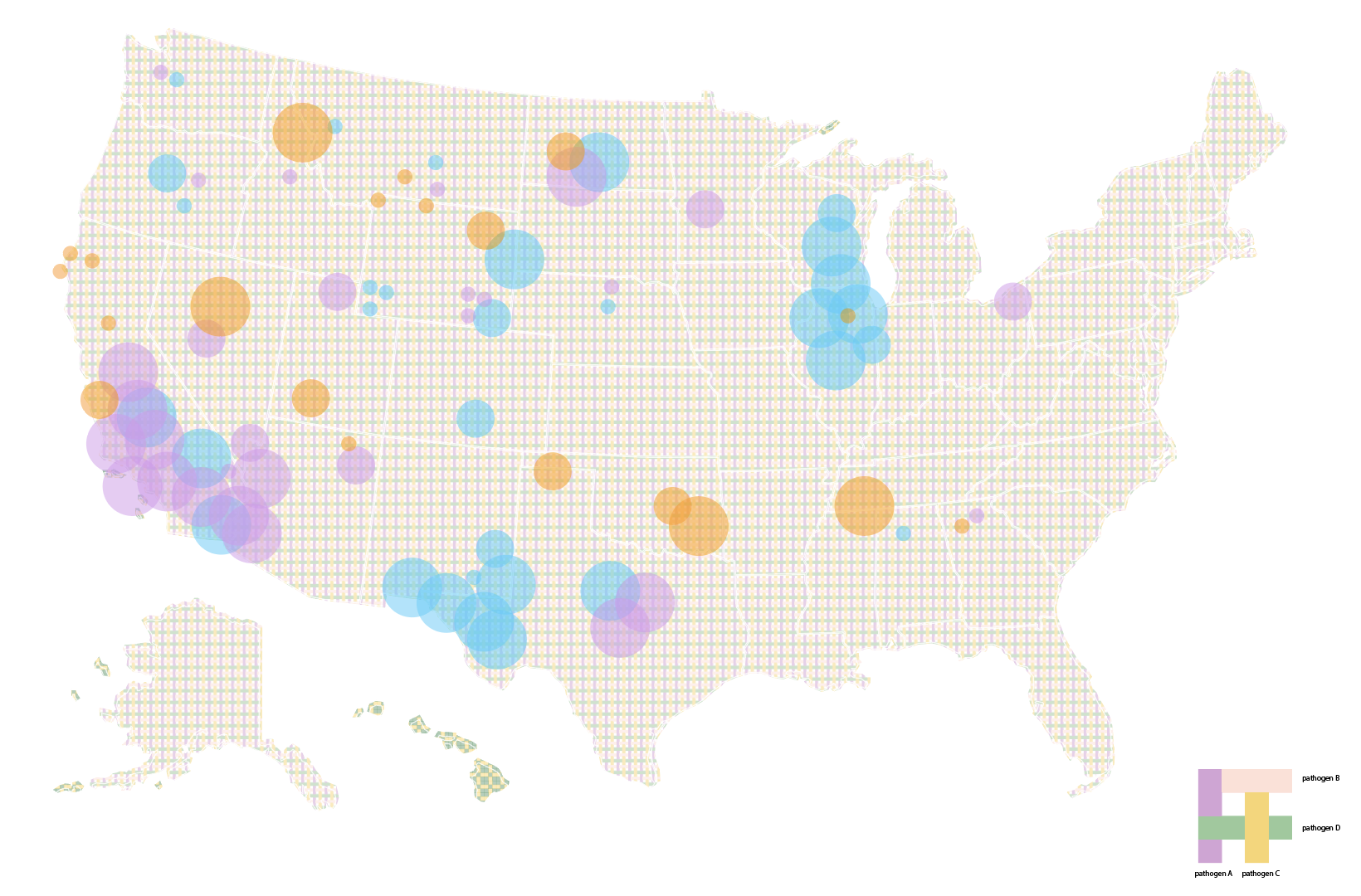
Eventually, we decided to group airports by region and hub-size, indicating active outbreaks, high interaction connections and widespread diseases. We liked how this map highlights risky airport hubs and likely pathways of spread against a background that gives us just enough geographical information about where airports are located and which regions are particularly at risk.
As we were looking through flight data, an interesting thing we noticed was that airports that were close to one another often had very few flights between them. Suppose ground transportation moved just as many people between nearby cities, we might still wonder: how does infection risk in gas stations, highway rest stops, bus terminals and airports compare to one another? Does ventilation, room capacity, length of stay make a significant difference? How do we compare and discuss the infection risks associated with different modes of travel? For future iterations, we hope to explore ways to incorporate data about other modes of transportation as well as specific occupancies, origin destinations and pathogen phylogenies to make “interaction” a more robust indicator of disease spread.
Layering information
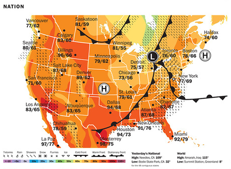
Weather maps often combine colors, patterns and symbols to represent different layers of information — temperature, precipitation, wind — occurring at the same time.
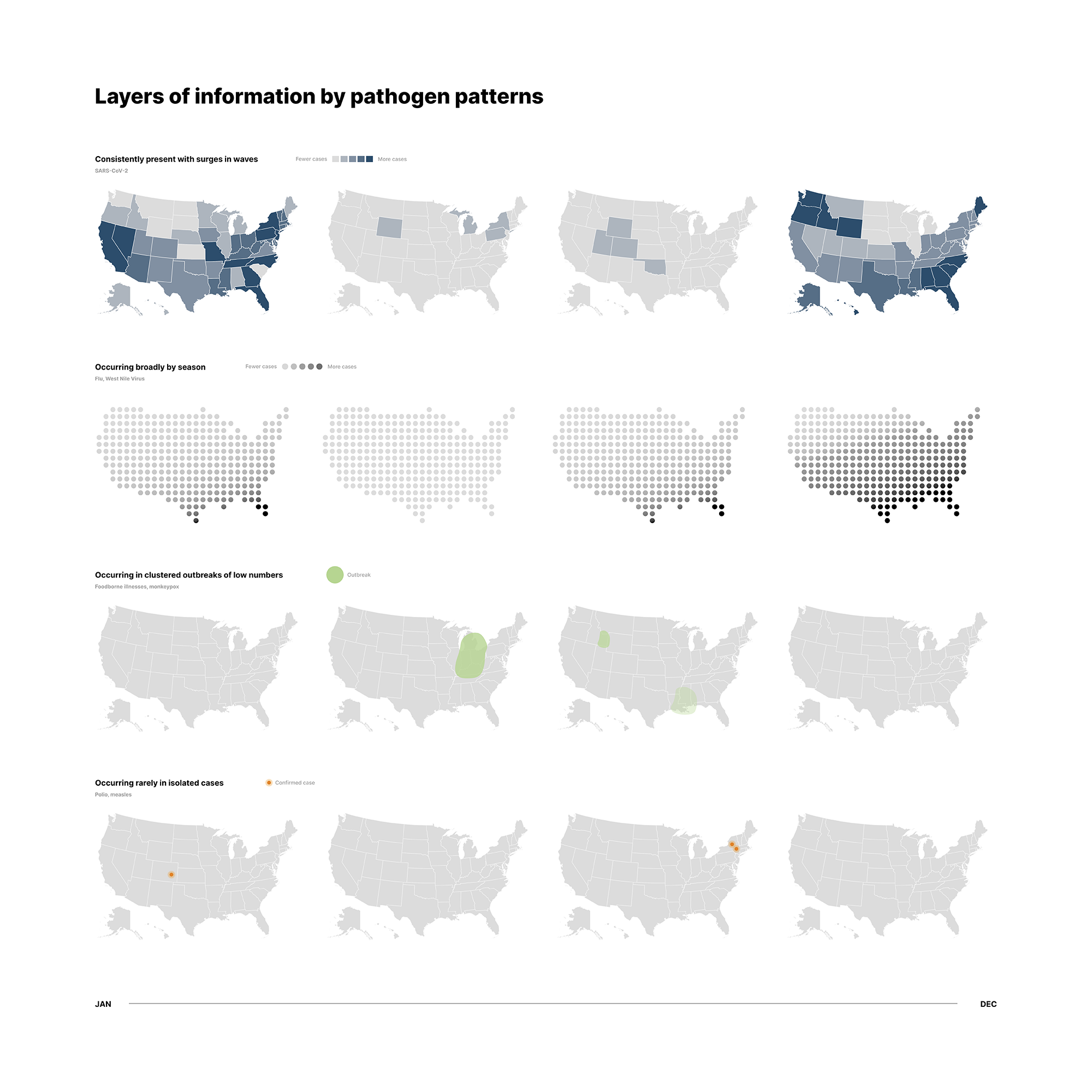
Infectious diseases are similarly faceted and have many components occurring at the same time. We have many types of diseases, cases of infection and death counts, seasonal projections, and so on. In particular, there is a need to visually distinguish between small outbreaks and widespread pandemics. If we imagine plotting ongoing cases on a geographic map, the sheer number and COVID-19 cases would drown out smaller outbreaks that are still important to keep track of.
Our first approach was to sort infectious diseases into four categories:
- Consistent and widespread (e.g. COVID-19)
- Seasonal (e.g. Flu)
- Limited outbreaks (e.g. E.coli)
- Isolated cases (e.g. Smallpox)
We assigned a different icon system to each and tested different variations. Here, we played with opacity, dot fill, grain textures and glow effects.
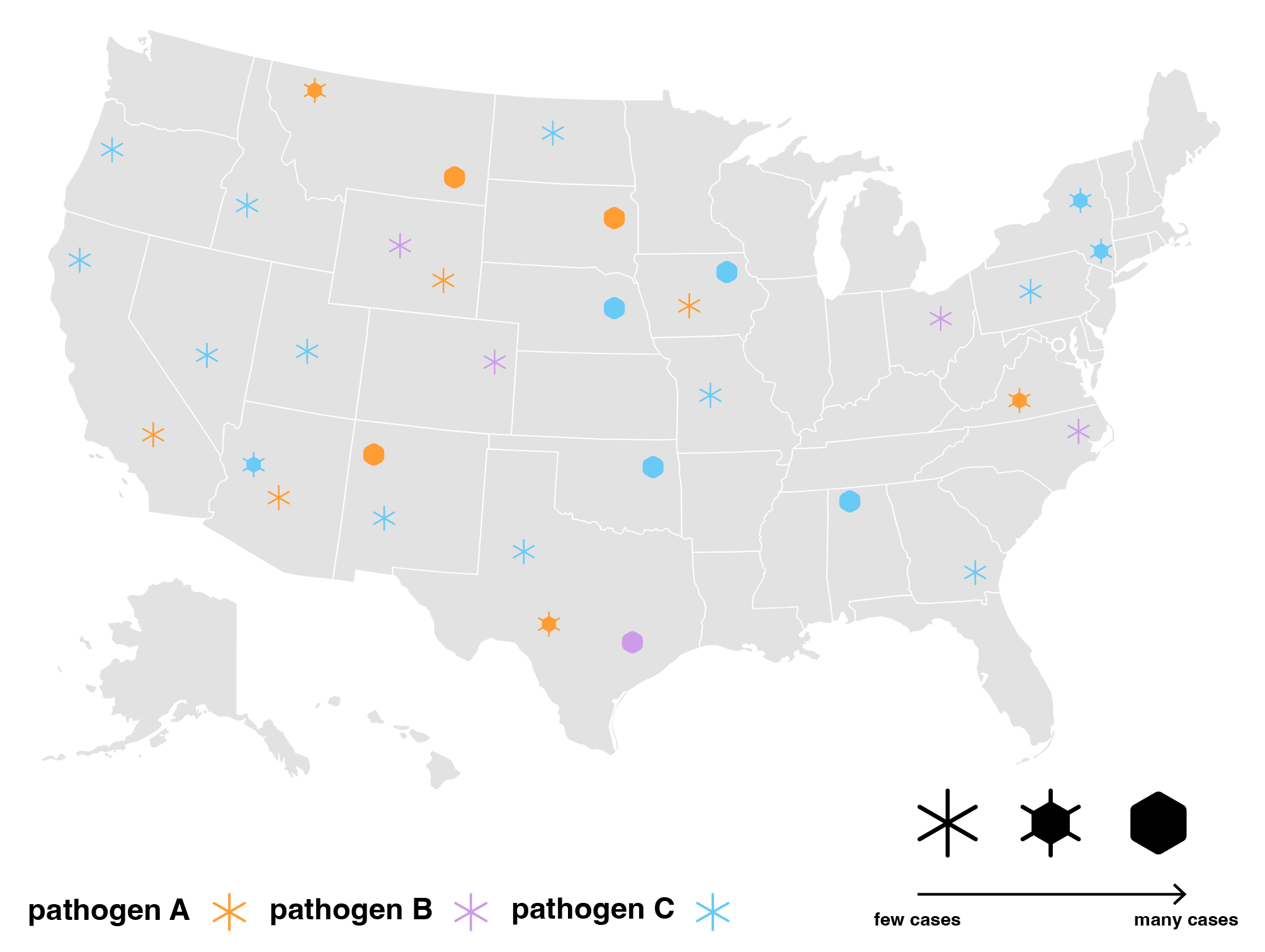
We iterated on different symbols to represent severity in limited outbreaks.
We also tried representing consistent and widespread diseases as threads woven into a tartan pattern, focusing just on how they are present in the background with no alarming changes,
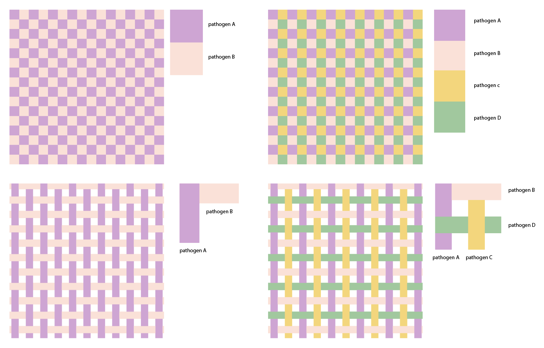
and experimenting with “thread weights” to show widespread dominance levels between pathogens.
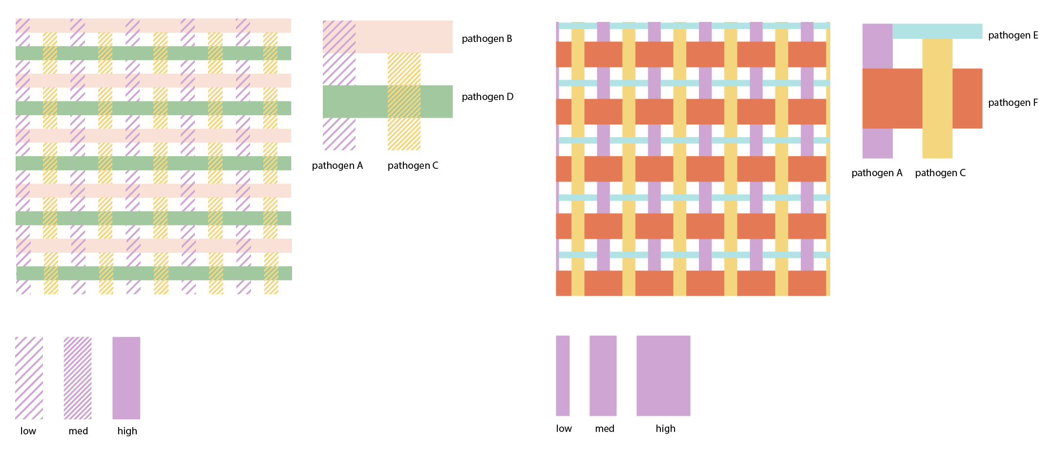
The pattern was too busy as a background after all but a fun exploration nonetheless.
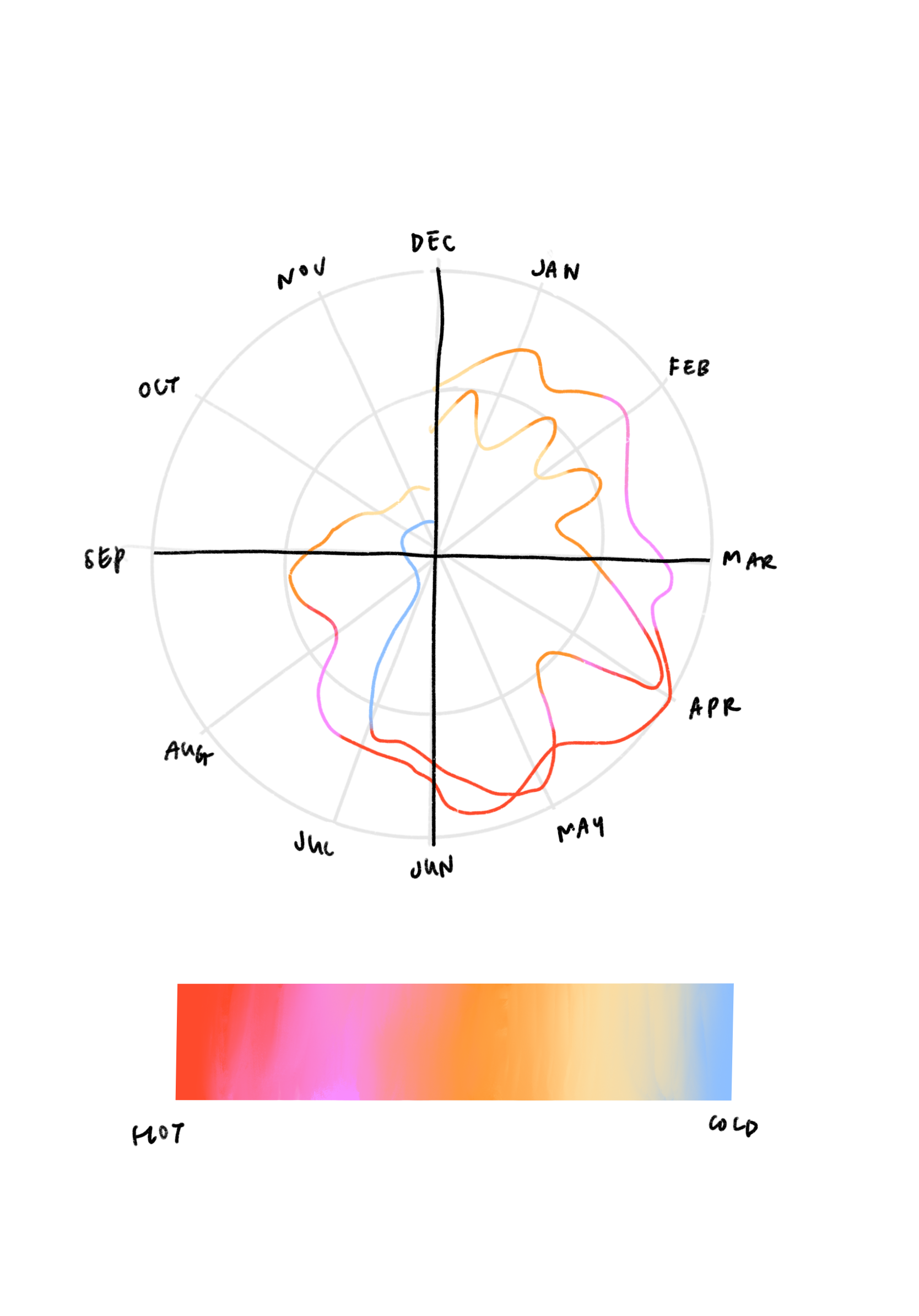
Seasonality and temperature
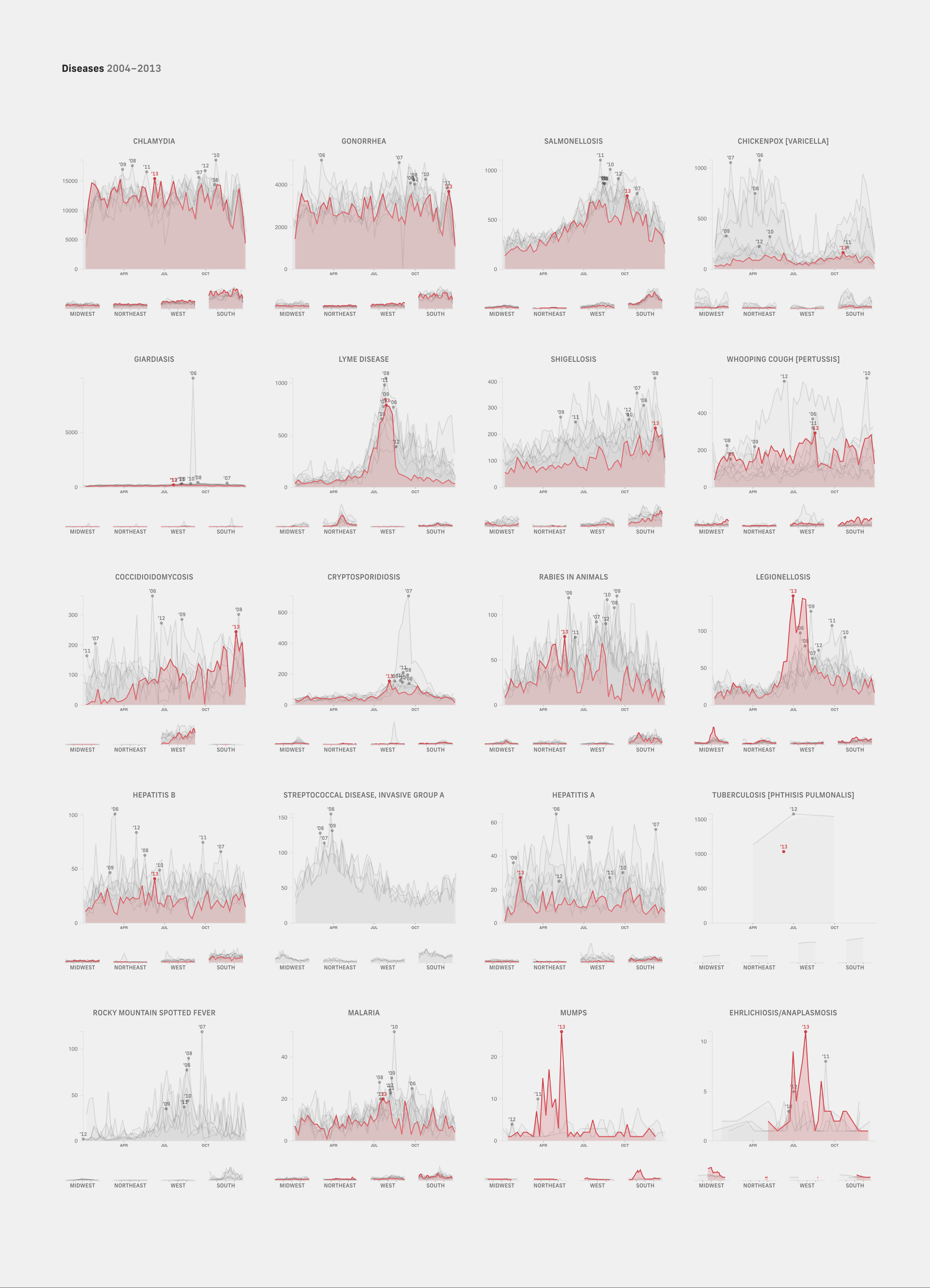
Partly motivated by the limited space, we sought out to prune out all the data that could be presented in other formats and focus only on data that would truly benefit from regular reporting. We tried grouping pathogens that shared similar drivers, one of them being seasonality. A gold mine we found was CDC National Notifiable Disease Surveillance case data archives from 2006-2013. It was fascinating to see how certain diseases like influenza followed the same curves every year, and others like chickenpox that had been in steep decline since 2009.
We briefly explored visualizations that focused on distinguishing between effects of seasonality and temperature. It was interesting to think about what disease-relevant conditions defines a season — Time of the year? Position of the earth from the sun? Optimal climate conditions for pathogen growth? Festive events and crowds? Temperature-induced behaviors?
Looking at disease case counts from a longer, historical perspective helped us find trends and patterns useful for mapping out seasonal windows for preventative action. These seasonal trends also gave us insight into likely projections and what to expect at different stages of a wave. Rather than making judgements based on day-to-day case count fluctuations, historical data gave us many more points of reference to gage how current case counts deviate from “normal”, how concerned we ought to be and what to expect next — this is much like grounding weekly weather forecasts with an understanding of broader climate trajectories.
Sporadic disease case files
While seasonal diseases are a little more consistent and predictable, other diseases lacked clear trends making it difficult to know when outbreaks warrant special attention. Unlike seasonal waves that can be understood as hitting early or late but still mostly following the same curves and rising to the same peaks, a sensible “normal” anchor for non-seasonal diseases isn’t quite as straightforward. How do we decide when a certain non-seasonal disease should be featured?
One approach we took was exploring different ways to sort diseases by transmission methods, bringing attention to diseases on the rise and their respective prevention methods.
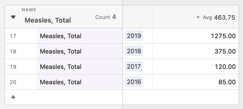
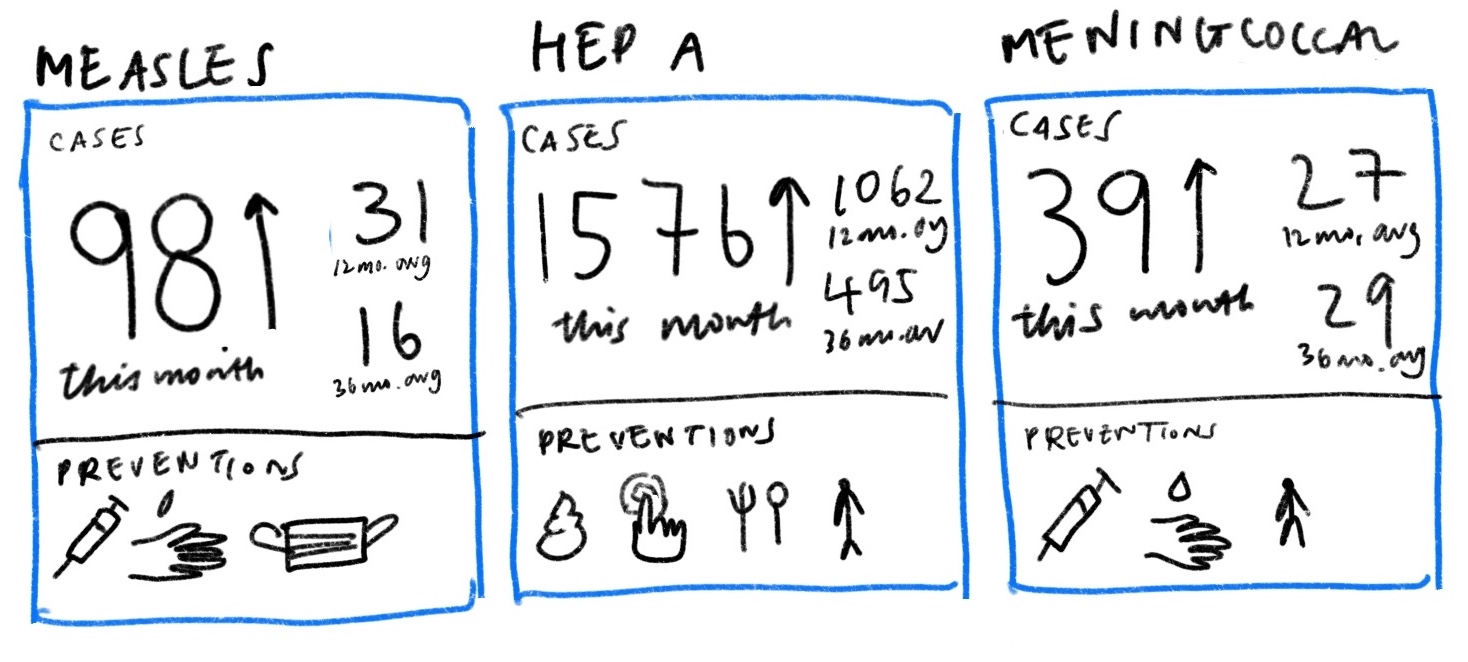
Then, we looked closer at what “on the rise” really meant. One problem with tracking percentage changes compared to the previous week is that a disease rising from one case to two cases would be a 100% increase but likely less threatening than it sounds. Without a “normal” reference point to compare current number of cases against, it is difficult to gauge how concerned we should be. Looking into the the historical data, we thought that said “normal” may benefit from being calculated differently for each disease. For example, measles is a lot more variable than meningococcal disease in the span of four years.
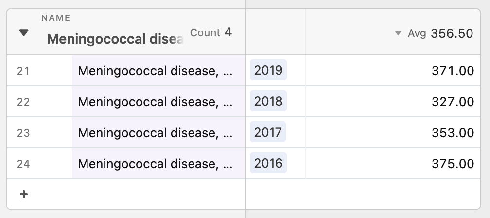
That said, it is unclear whether the 2019 uptick should be considered an isolated spike or a new normal. Therefore, depending on how regular cases have been in the past, this gives us reason to compare current case data to a multiple year average in addition to just the previous weekly, monthly or yearly average. A useful way to think of “on the rise” then may be to look at whether case counts for the disease surpasses a threshold anchored against an averaged normal appropriate for each disease.
We tried using opacity to show different levels of deviation from the norm and scale to represent raw case counts. Diseases that deviated the most from normal, i.e. those that are most concerning, were represented with darker colors (higher opacity) and did stand out accordingly, but we found that “bigger = more important” completely dominated.
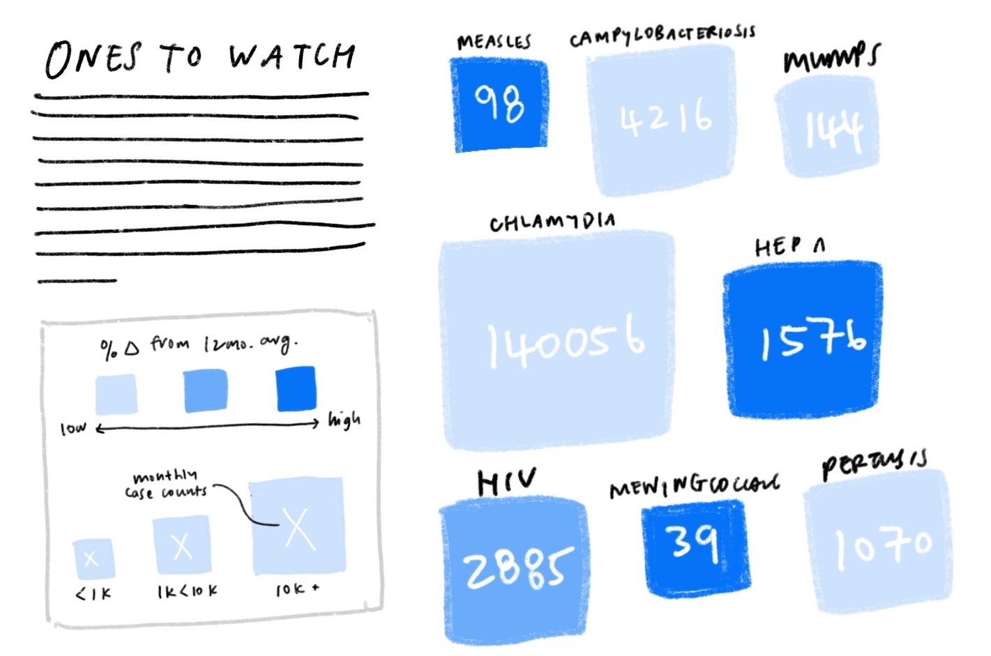
We also tried swapping the two around, using scale for deviation and color for case counts instead, but found it even more confusing. Intuitively, visual size and deviation size did not mesh well. It was difficult to separate visual size from numerical size.
“On the rise” was initially thought of as a deciding mechanism for whether a disease is relevant enough to be featured. After exploring different iterations, we found that it was also useful to include several averaged reference points to contextualize raw case counts alongside preventative actions one can take to protect themselves.
“Pathogen Weather” has been a fruitful exercise that sparked interesting discussions at the studio. We picked up many valuable insights and sensitivities along the way that will continue to guide how we approach and think about other projects moving forward. Here are some of the highlights of things we learned:
- Analog constraints can make great sources of inspiration. Borrowing newsprint constraints helped us prioritize what was most important.
- Finding metaphors can help jumpstart brainstorming. Comparing and contrasting flood risk and infection risk helped us identify what was essential and unique to pathogen spread.
- Physical proximity is not the only proxy of risk. Focusing on interaction as an important driver of pathogen spread completely changed how we approached visualizing risk.
- Percentage changes and raw counts can be misleading. Comparing weekly, monthly, annual, and multi-year averaged case counts gave us more points of reference to ground discussion about what a sensible “normal” anchor looks like.
- Not everything is relevant at all times. A useful way we framed relevance was thinking around windows of action. A useful flu shot reminder would give an individual ample time to get the shot, not too early and not too late, to be well protected during flu season.
If we have learned anything from the pandemic, it’s that our old ways left us caught off guard and deeply vulnerable. Pathogen tracking is just one of the many ways forward and we are excited for new tools and ideas that can guide us towards the disease-conscious, prevention-oriented speculative society we designed “Pathogen Weather” for. We hope you will join us in imagining a more resilient future, and that this little snippet into our thought process inspires you to think about what you’d like to see in that future!
We’d love to hear what you’re working on, what you’re curious about, and what messy data problems we can help you solve. Drop us a line at hello@fathom.info, or you can subscribe to our newsletter for updates.