But the vast majority of data that’s out there is quite human: it’s about people, or at the very minimum, exists because of a person’s decision to collect it. And understanding all that data is a defining problem of our current age.
As a practitioner, my goal is to get people excited about how data relates to them: to engage their curiosity, and for them to feel inspired, rather than overwhelmed by it. Design is the best means we have for making information useful—not just presenting it visually, but giving people ways to work and think with it. To this end, there are four central themes that we’re looking at when we talk about data and design.
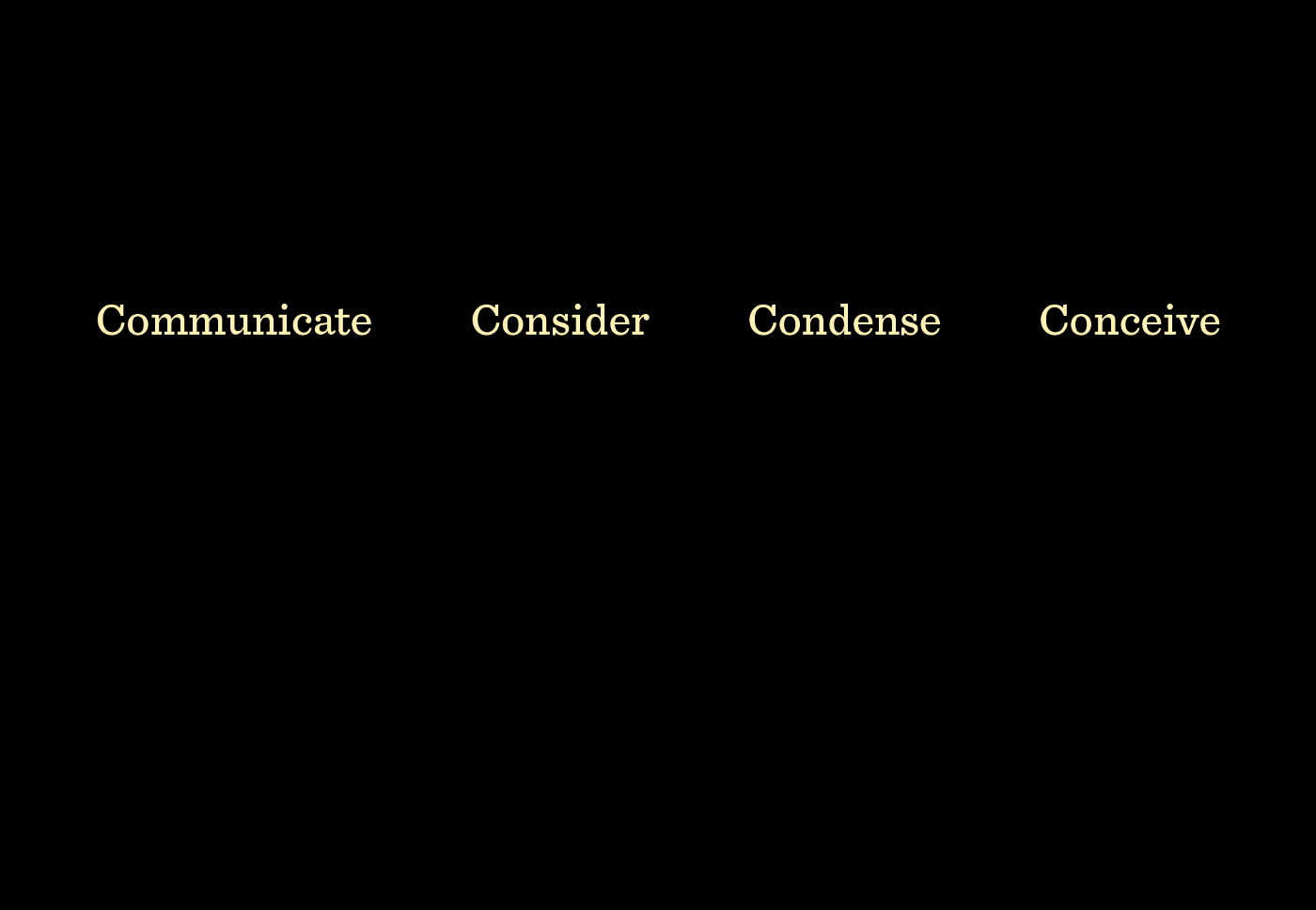
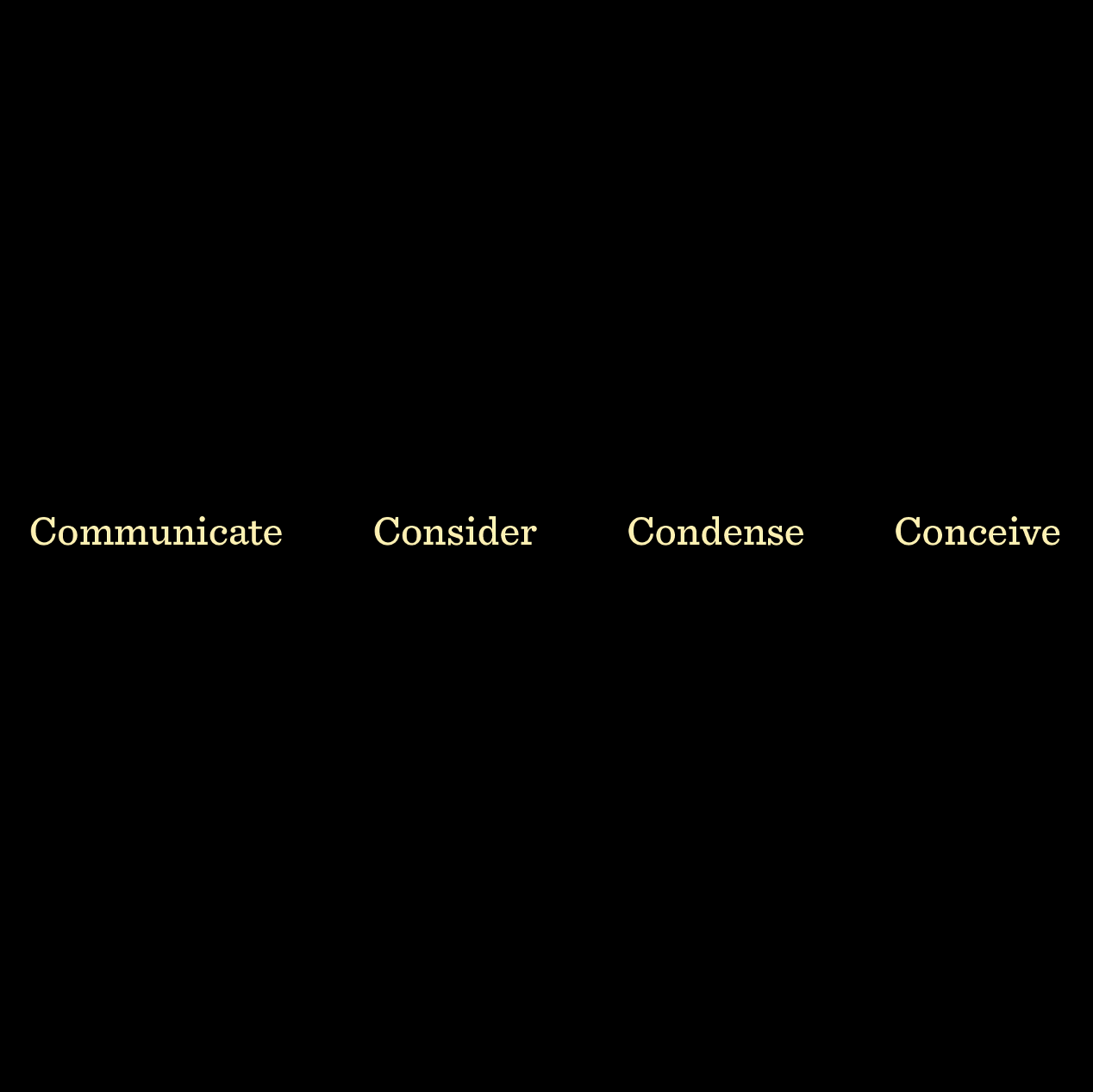
And in the tropiest of design tropes (tropiest might not be a word), I’m gonna do this with a framework of four words that all start with the same letter. Rather than making you skip ahead, I’ll list them first:
- Communicate
- Consider
- Condense
- Conceive
Seeing them listed out, I realize I should have made them all “Con-” words. But for that kind of insight, you’ll have to go with a much bigger studio.

Communicate
Communication is the most basic part: the table stakes of information design. If the piece doesn’t communicate, then it’s useless. A lot of time, attention, and effort goes into creating PDF documents that few people will ever read. In the past this was even more expensive, because the result was elegant printed reports that would go straight to someone’s shelf. If you create something that nobody uses, you’ve failed to communicate.
As an alternative, we try to approach information as something that can be interacted with: we start with a story to give people an entrance, and then provide other paths that enable users to take their own detours or explore in their own way.
In contrast to the report it’s based upon, we built the Poverty Tracker for Robin Hood as a way to first help explain definitions of poverty in New York City, and then start breaking apart those definitions to show the ways they’re inadequate. For instance, while a 21% of New Yorkers are technically “below the poverty line,” a higher number (37%) deal with severe hardships in areas like food, healthcare, housing, and others. That’s a drastic difference—and in things that most people would consider part of “poverty.”
For this kind of project, I also like to think of it as creating something for people to argue about. Instead of having conversations in the abstract, presenting known data is a way of setting up a baseline—an agreed-upon set of facts. You can take multiple sides of the issues presented, but at least it’s all there in one place, with all the necessary variables, along with the means to interact with it—and then offering the ability to filter an explore different angles.
Consider
Visualization is about connecting data in a way that hasn’t been possible before: the ability to take into consideration a large number of data points and use them in a new way.
Markus Covert’s lab at Stanford created an unprecedented “whole-cell” model that allows researchers to run simulations of a single cell. When first completed, making sense of this data involved a lot of staring at very large text files, copious use of the Find command, and for those with the background, writing Python code to do more sophisticated things with it.
Markus is unique among researchers at his level in his commitment to presenting data in ways that make it more accessible, so we set out to create a new way of interacting with it. Instead of getting overwhelmed with the thousands of nodes in the cell network, we made it easier to build pathways of interest and then see how these pathways worked under different scenarios and simulations.
Our competition for the tool was the method they’d used when first testing whether the whole cell model was working a few years ago: Markus was out of town at a conference, so members of his lab sent him a binder full of analysis and outputs via FedEx, delivered to his hotel. Paging through this volume, he could verify that the model was working, and that their long-term effort was finally paying off.
Fast forward a few years, and the tool that we built can not only be used for understanding results, but serves as a way to quickly test “But have you tried…” questions from reviewers of their journal submissions. Markus can also ask these questions himself of the work being done by his grad students and postdocs, providing a means to poke and prod at the model to look for what might be missing or find other avenues not yet explored.
Condense
One of the most fundamental roles of information design is to bring hierarchy to a set of data. What’s most important? What should people look at first? What comes second? By establishing these layers, an enormous amount of data can be put into far less space. Users can then peel back the layers as needed, as their interest widens and they choose specific avenues they want to pursue.
A few years ago, we were approached by Thomson Reuters to develop a project examining power in China. With the backdrop of Xi Jinping coming to power as part of the once-in-a-decade leadership transition that happens at the top of the Communist Party in China, they were looking for a way to explain the connections and context behind a few thousand of China’s most important citizens and leaders.
This is a remarkable project because China — the most populous country in the world, the third or fourth largest by area, and the second largest economy—is so poorly understood in the United States. Making it digestible to an unfamiliar audience also meant condensing enormous amounts of information: thousands of people, tens of thousands of connections, and a quarter million words of text. This was layered into a web app designed for the iPad, but the last thing we’d ever want is for people to use it and say, “Wow! That must be… like a quarter million words in there. This is complex!” Instead, all that complexity had to be layered together in a way that allowed users to start simply, and then dig deeper as their interests grew.
And while we made good progress from our earliest sketches of what not to do, with more time, we’d love to keep simplifying it further. It’s like the Blaise Pascal quote: “I would have written a shorter letter, but I did not have the time.”
The bottom line is that condensing is about not overwhelming people. It’s a kind of self-care thing: there’s no need to subject yourself, or others, to a complicated mess.
Conceive
A few years ago, we developed a project that allowed users to work with complex legal paperwork like credit agreements. These have million—and billion—dollar stakes, so accurately understanding a 75-page document (such as the one depicted below) is critically important.
We created this as a working tool—these aren’t staged interactions, and it’s using live data. (As a matter of course, we don’t work with “faked” data anyway.) But for me personally, its primary purpose nowadays is to get people thinking differently about how one might interact with text like this: as soon as you’ve moved to a “living” document model, everything gets more interesting. Those 75 pages are valid for a 5-year span of time: over that time, another 15–20 pages of adjustments are added. How do those adjustments interact with the rest of the text? For instance, we’re in the second month of year three, and the company in question just announced that their quarterly numbers were off: what’s your exposure to risk based on what’s seen here? More interestingly, how do you begin to share this with others? Too much of visualization is focused on a single end-user, when in fact, almost nothing ever stays with a single person—it needs to be shared and moved around an organization to be useful.
While getting ready to show this for an audience of people in finance recently, one of the other speakers muttered something like, “Whoa… that’s like… Jason Bourne. Like science fiction.” I have a long-held interest in how technology is portrayed in film, so I got a kick out of this, but when I was done patting myself on the back, I realized:
- The Bourne Identity is from 2002.
- It wasn’t a science fiction film.
- This is an actual, working piece of software.
So we’ve got a situation where expectations—the norm of office software and everyday tools—is so out of whack that this passes as the future. But it’s just paragraphs of text, folks—this isn’t a “new” type of visualization, though it does begin to depict a different way of working with the document in question.
Instead of science fiction, information design should serve as a kind of science fact. We should be doing more to point out improvements to how people interact with information.
Closing, Concluding, Crowning, or Capping it off
An oversize part of our world view about data is the concept of the spreadsheet. But here’s the thing: spreadsheets are just 40 years old. Prior to that, there was no broadly understood idea of putting numbers into a page and trying things out. You couldn’t just run different scenarios on paper—these were painstaking things that were created by hand (with all the attendant human error) over long periods of time, which meant that it wasn’t possible to simply try many different ideas.
But the point isn’t that we need dozens of startups who are rethinking spreadsheets—those already exist, and the results are underwhelming—but that we’re overdue for improvements to our tools. The lack of progress has left us with a situation where we’ve let data become dehumanized: easy to do when it looks like Excel or even Tableau. And it’s not just a matter of doing everything by hand, because there’s only so artisanal you can be with tens of thousands of data points, let alone the scales at which data is generated or collected nowadays. We need to embrace technology as a means of dealing with the reality of the mess that’s out there, but do it with a focus on design: a human-centered approach to rethinking how people will actually use, interact with, and understand the data.