
Our course was one of three offered during the Spring '16 semester as a pilot program for the Architecture department's new Design Minor, which will be formally launched in the Fall. We joined the ranks of Skylar Tibbits, Caitlin Mueller, and Jessica Rosenkrantz, who taught an introductory design course titled "Understanding Design", and Lisa Smith and Marcello Coelho, who taught "Design Objects"-- a class focused on physical objects and the manufacturing process.
Students enrolled in 4.s50 were expected to learn and demonstrate the end-to-end process of sourcing data and using it to craft a compelling visual narrative. We covered topics including programming with p5.js, data analysis, storytelling, and design concepts and iteration. It was an ambitious curriculum, and our students' skills and backgrounds varied wildly. We had both undergraduate and graduate students from the Media Lab, Architecture, Computer Science, Math, Physics, and Engineering departments. Fortunately, the common thread tying all the students together was their motivation and excitement to learn the parts of the process they weren't familiar with.
The semester was divided into four segments, each of which centered around a different project. During the first, students designed and developed a dozen different clock faces. Many were programming for the first time, while others were just beginning to familiarize themselves with the formal process of design iteration and critique. It was incredible how much this seemingly straightforward assignment showcased the diversity of the class. In addition to the archetypal digital and analog clock faces, some designs were abstract, some told a story, some were targeted to a specific audience, and some were playful and interactive. After this two week introduction to the information design process, everyone was on more even ground and ready to dive into the next segment of the course.


The second project had students create two representations of the weather-- one abstract and one literal. Building on skills and concepts learned during the clock face project, this assignment began to introduce more advanced programming and design principles. One of the design requirements for the weather project was that all representations be optimized for viewing on a mobile device, introducing the idea of context of use in a form factor that the students were all familiar with. They used data from the forecast.io API, which offered the opportunity to learn the basics of HTTP requests and JSON file formats, and to use up-to-the-minute forecast data for accurate and fully functional mobile weather applications.


For the third project, the class was asked to visualize US Census data from CitySDK. Students had the freedom to choose any subset of the data, and represent it any way they wanted. The open-ended nature of the assignment meant that the students bore the responsibility of finding their own "story in the data"-- one of the core tenets of the curriculum. To help teach this concept, Alex visited from the Fathom office to give an overview of how to use data in storytelling. Ultimately, many of the projects were reflections of the students themselves, shedding light on topics such as immigration, poverty, transportation and commuting, and gender breakdown in employment.

After spring break, we reconvened for the final weeks of class, which we called "Choose Your Own Adventure". Students worked with a dataset and medium of their choice, tying all of the concepts they had learned over the course of the semester together into a single project. They spent two weeks exploring candidate datasets, working out the technical logistics of ingesting and parsing their data, and pinning down details about their intended audience and the story they wanted to tell. The second two weeks were dedicated to creating an initial visual representation of the data. After a round of crits, students went into the final two weeks with suggestions for improving and refining their representations, focusing on advanced design concepts such as animation and interactivity, color, and typography.
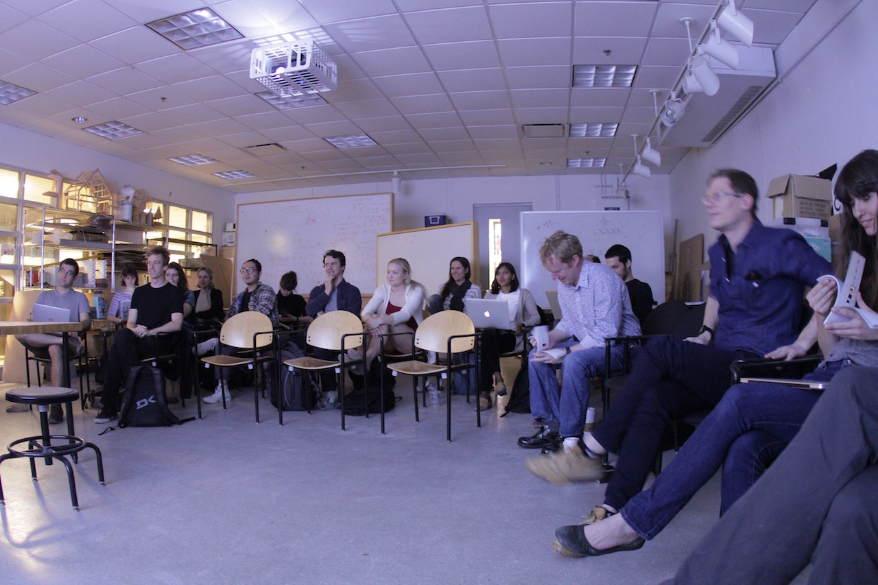
The last week of class was dedicated to final critiques. Each student presented his or her project to the other students and instructors, and a panel of guest critics that included Nicholas Felton, Dietmar Offenhuber, and Fathom's own Mark and Olivia. It was so rewarding to see everyone's hard work pay off in the final projects, each of which was uniquely representative of each student.


Equally rewarding though, was the feedback the instructors got after the final presentations had ended. Several students asked us if we would be teaching again in the Fall. If the students are up for the challenge of a series of Information Design courses then so are we, but for now we're going to enjoy our summer vacation.

