Many others have recognized the importance of open data and public participation, and had organized similar data challenges or competitions in the past to spur the interest of various audiences in data visualization and analysis. Around the time we launched our own competition, I came across the HHS VizRisk, an event organized by the U.S. Department of Health & Human Services that seeks for visualizations of behavioral data to inform personal and policy decisions. The main dataset in VizRisk comes from the Behavioral Risk Factor Surveillance System (BRFSS), a nation-wide phone survey that collects information about health risk behaviors.
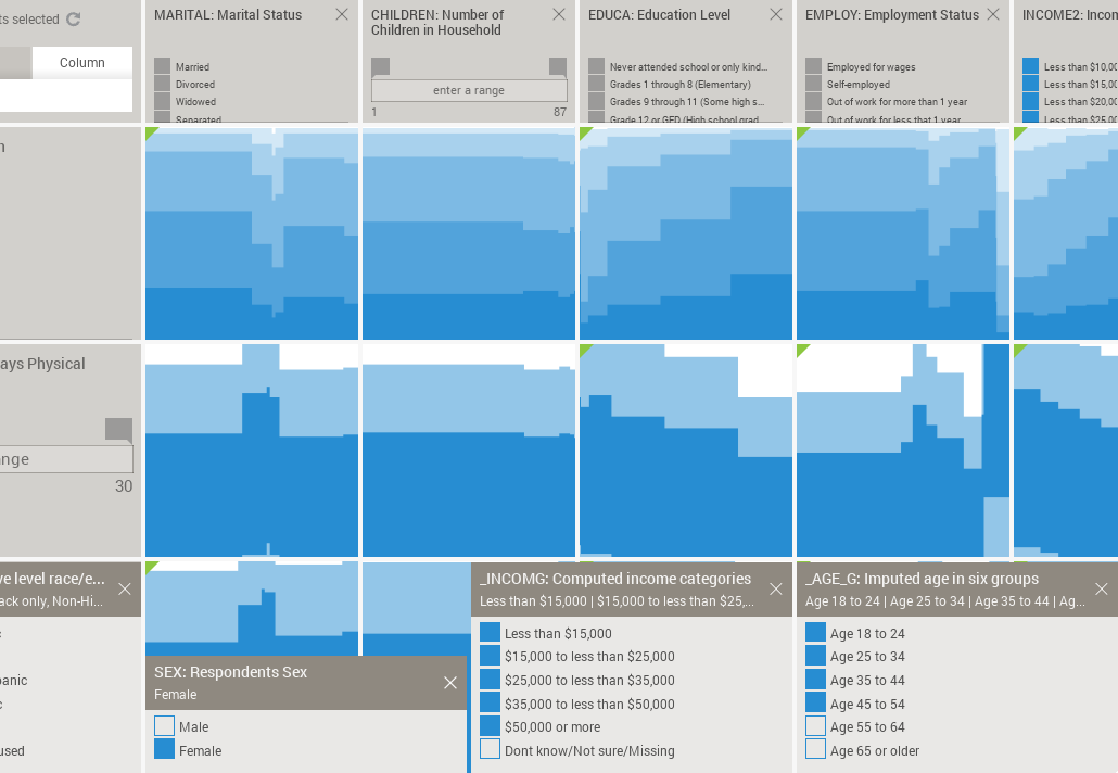
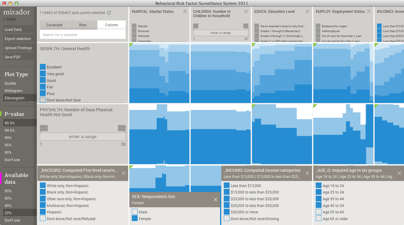
I compiled the BRFSS data made available for VizRisk into Mirador's format (which is basically a CSV table plus some additional metadata) and did some quick explorations of my own. The screen capture below shows Mirador after loading the 2011 BRFSS data, comprised of around 500,000 respondents:
The happiness of the self-employed
A variable in the BRFSS dataset that I believe is reasonable to choose as a global indicator of well being is "General Health". Respondents are asked to characterize their health status using 5 options: poor, fair, good, very good, and excellent. So, it would be interesting to look at association patterns between General Health and other socio-behavioral indicators. One association that stood out for me is between General Health and Employment status. This other variable records if the respondent is employed for wages, self-employed, student, unemployed, etc. I call this association the "happiness of the self-employed", because for the entire sample of 500,000 respondents you can see that self-employment relates with a slight increase in reported excellent general health:
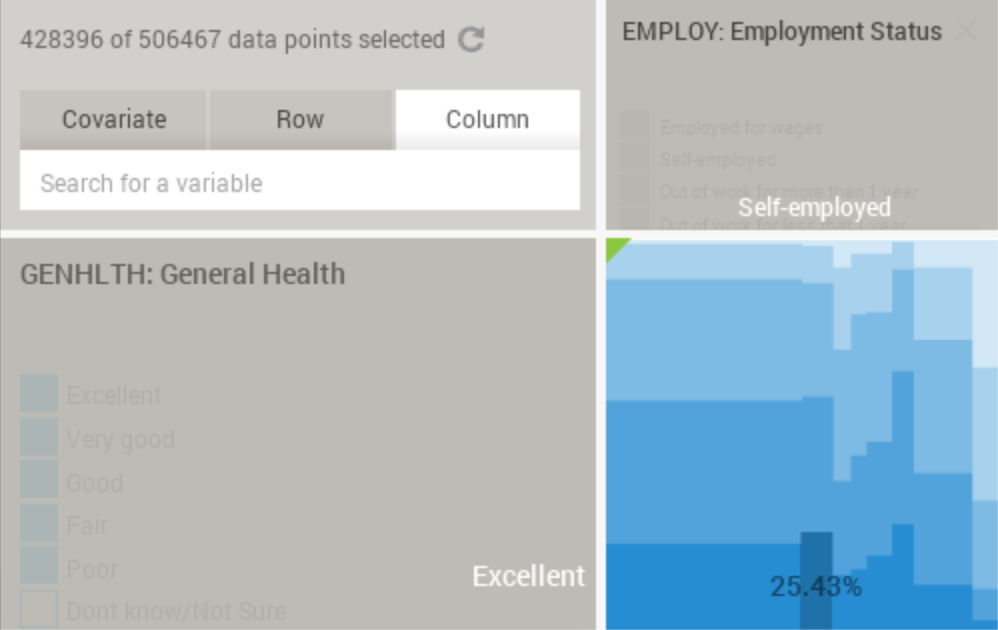
We can conclude that self-employed people are more likely to respond that they have excellent General Health, although the difference is only of a few percentage points. Before going any further, lets first make clear what this plot (called eikosogram) means: the percentage 25.43% is highlighted for the "self-employed" category in the column (corresponding to the Employment Status variable), and the "excellent" category in the row (corresponding to the General Health variable). This means that 25.43% of the self-employed respondents answer that they have excellent general health. In other words, it is a conditional probability that can be denoted in mathematical notation as:
P(excellent health|self-employed) = 0.2543
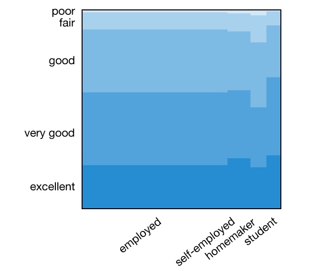
Mirador is designed for interactive visualization, so only the labels of the hovered items are shown in the interface. For clarity, I have saved the health-employment eikosogram and added the labels for some the categories -employed (for wages), self-employed, homemaker and student:
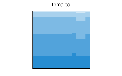
Next, we can explore what factors might effect this association. Variables such as sex, age, income and ethnic group would probably have an impact on it. It is easy to check with Mirador the effect of any of these factors. For example, the percentage of women reporting excellent health when they are self-employed in relation to employed for wages is higher than for men: 27% versus 24%, while both report similar levels of excellent health for the employed status:
Of course: correlation does not imply causation, but it is worth noting nonetheless. Since we can easily adjust by other socio-economical factors, I searched for a combination of factors that maximize the "happiness" among self-employed respondents.
Age and income have a large effect, with middle age individuals in higher income brackets reporting excellent health among those self-employed. After fixing the covariates in those ranges (age: 35-54, income 35k+), I started looking at the association among different ethnicities, as classified in the BRFSS data: white, black, asian, hispanic, pacific islander, native american, and other/multiracial. What I found is that the highest levels of excellent health for self-employed respondents occurs for the asian ethnicity. The difference between employed for wages and self-employed is quite substantial for this group, approximately 25% versus 44%:
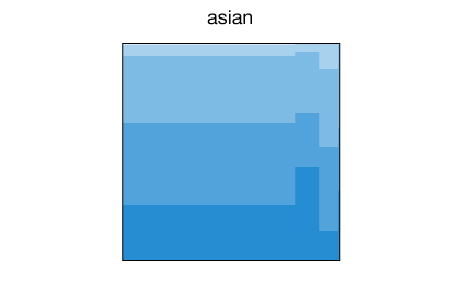
What can we conclude from this pattern in the data? Again, correlation is not causation, but we can wonder if this pattern is due to cultural or economic factors. It is not possible to say from the data, but at least we have a tentative hypothesis we can test further. We also have to be careful with the fact that when control by several factors (age, income, ethnicity), then the sample size decreases dramatically, which makes our conclusions weaker. For example, the number of respondents in the Asian, 35-54 years of age, income higher than 35k, subgroup is of only 2,086. For a visual illustration of the so called "curse of dimensionality," check this interactive web app.
Better growing old alone... if we have enough money?
Another factor that clearly affects "happiness" is the relationship status of individuals. BRFSS includes a Marital Status variable with several categories, but in order to keep the plots simple I restricted the visualization to Married, Divorced, Widowed, and Never Married. The eikosogram between General Health and Marital Status looks as follows:
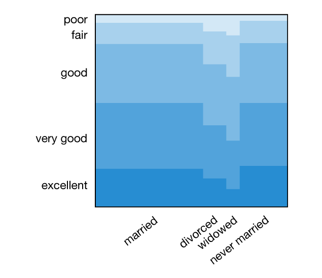
The health levels are suspiciously high among the never married category. However, this plot was generated using the entire population sample, which covers all ages starting at 18. By differentiating between age groups and also gender we get a better representation of the change in health patterns among subpopulations with different marital status:
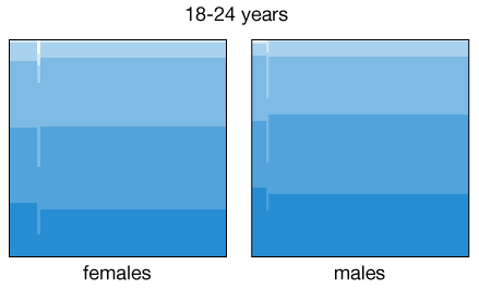
Some of the patterns are expected or known, for example health levels decrease as people age, and the fraction of married women up to 34 years of age is higher than that for men. In addition to that, the fraction of men in the 25-34 age bracket reporting excellent health among non-married individuals is higher (in fact, similar to those married) than for women. Is this a manifestation of the social pressure acting on women to get married before their mid-thirties? Again, we cannot draw these causal conclusions from the data, but at least we can use the visual patterns as a guide for more detailed analyses.
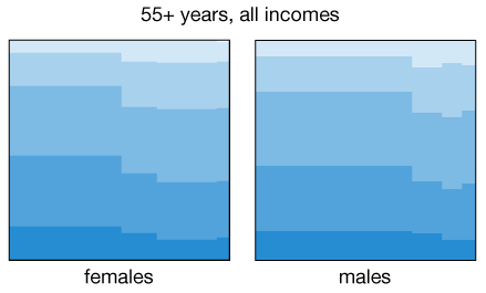
It is also not surprising to find that income levels having a strong correlation with health. But perhaps more interesting is to see how the association between health and marital status dramatically changes its direction when discriminating between high and low earners. When we aggregated all the data for people 55 years or older, we saw in the previous animation a marked decrease in health among individuals that ended up single, either due to divorce, death of partner, or simply by not getting married. But if we now restrict the analysis to people with income levels above $50,000, then there is no longer a decrease, specially among divorced individuals:
Conclusions
I think that these "non-rigorous" findings are a good illustration of the usefulness of exploratory data analysis as a first step. By quickly defining cross-sections of the data and controlling by multiple factors (always within the limits of what the sample size allows) we can use interactive visualization to guide our intuition and find new tentative hypothesis.
If you are interested in exploring the BRFSS and other similar datasets with Mirador, remember that the Mirador Data Competition is still open until next week, and you can win some prizes by submitting your findings!
Finally, over the past months I compiled a list of several publicly available datasets that I included in this public list. Feel free to add more links to the list.
We’d love to hear what you’re working on, what you’re curious about, and what messy data problems we can help you solve. Drop us a line at hello@fathom.info, or you can subscribe to our newsletter for updates.