The Official Poverty Measure (OPM) was constructed in the early 1960s, and does not account for the changing allocation of expenses (Americans today spend more money on housing, for instance), the geographic variation in cost of living, or the range of income sources families use to meet their daily needs. In short, the earning and spending patterns of the typical American family have changed dramatically in the last 50 years, and the poverty line hasn't kept up.
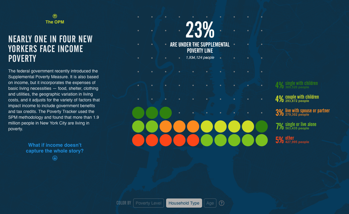
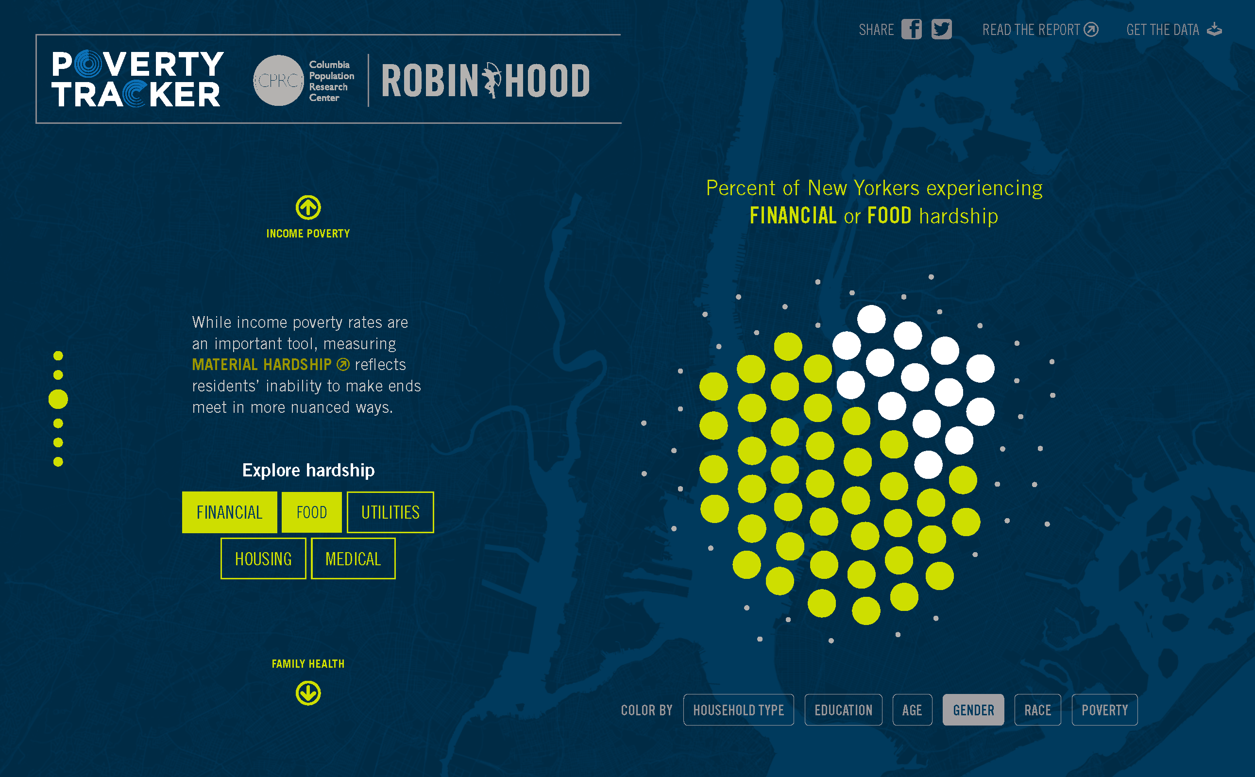
The Census Bureau recently developed a revised measure of poverty, the Supplemental Poverty Measure (SPM), which accounts for the array of goods purchased by the modern family (food, clothing, shelter, utilities, etc.), the variation in cost of living across the country, and the range in pre and post-tax sources of income. The revised poverty line is $32,516 for a family of four in New York City. Using the more recent SPM, nearly one in four people are living in poverty in New York City, and even that doesn't capture the total number of people who suffer from different forms of disadvantage like severe material hardships and health challenges.
The numbers in the Poverty Tracker emerged from a survey developed in partnership by Columbia University's Population Research Center and Robin Hood, which gathered information from about 2,300 residents from the five boroughs, many of whom were living in poverty. As we dug further into the survey data, it became increasingly clear why the Census Bureau created a new metric: poverty and distress in New York City affects significantly more people than the official measure suggests.
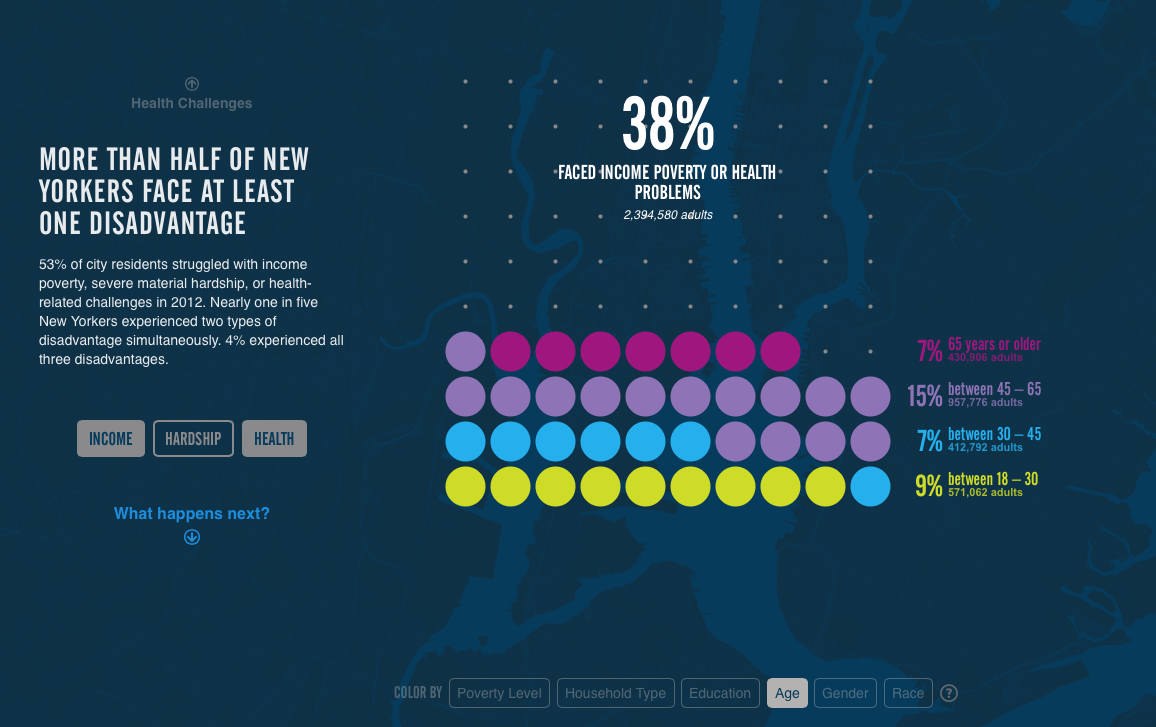
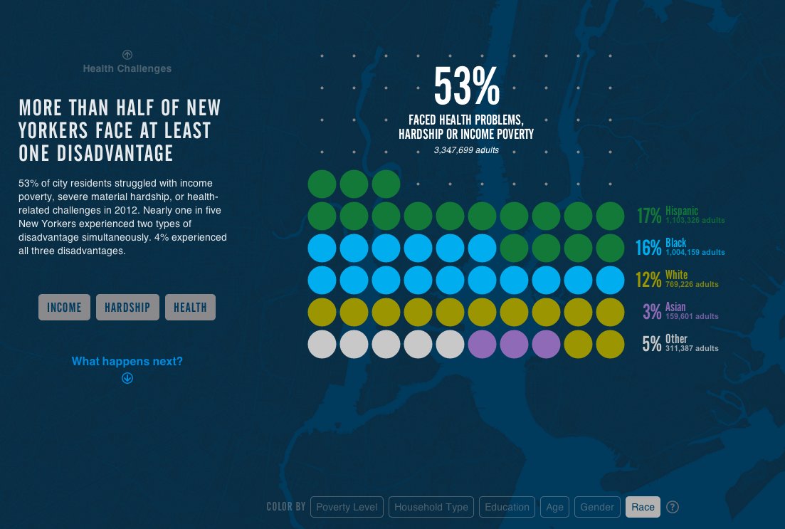
We quickly learned that different demographic groups are disproportionately affected by poverty, severe material hardship, and severe health challenges, and not always how you might expect. More than two million New Yorkers faced severe food, financial, utilities, housing, or medical hardships—regardless of whether they’ve received a full college education, have a family with children, or even earn incomes above the poverty line. By examining the data in different cohorts-- those being income, age, race, gender, education level, and household structure-- we were able to convey which groups suffered the most from different types of disadvantage. It was eye-opening to look at some of the specific questions brought up in the survey, so we incorporated some of them into the site to give people a more tangible idea of what it means to be living in poverty in New York City.
After we had figured out which slices of the data to include in the Poverty Tracker, we explored various design representations and layouts to give the numbers a more human feel.
Jose Luis experimented with different grid densities to see if we could better embody the number of affected New Yorkers, but we found in the end that larger dots were the most readable (we came to this realization only after Jose had been seeing dots for days).
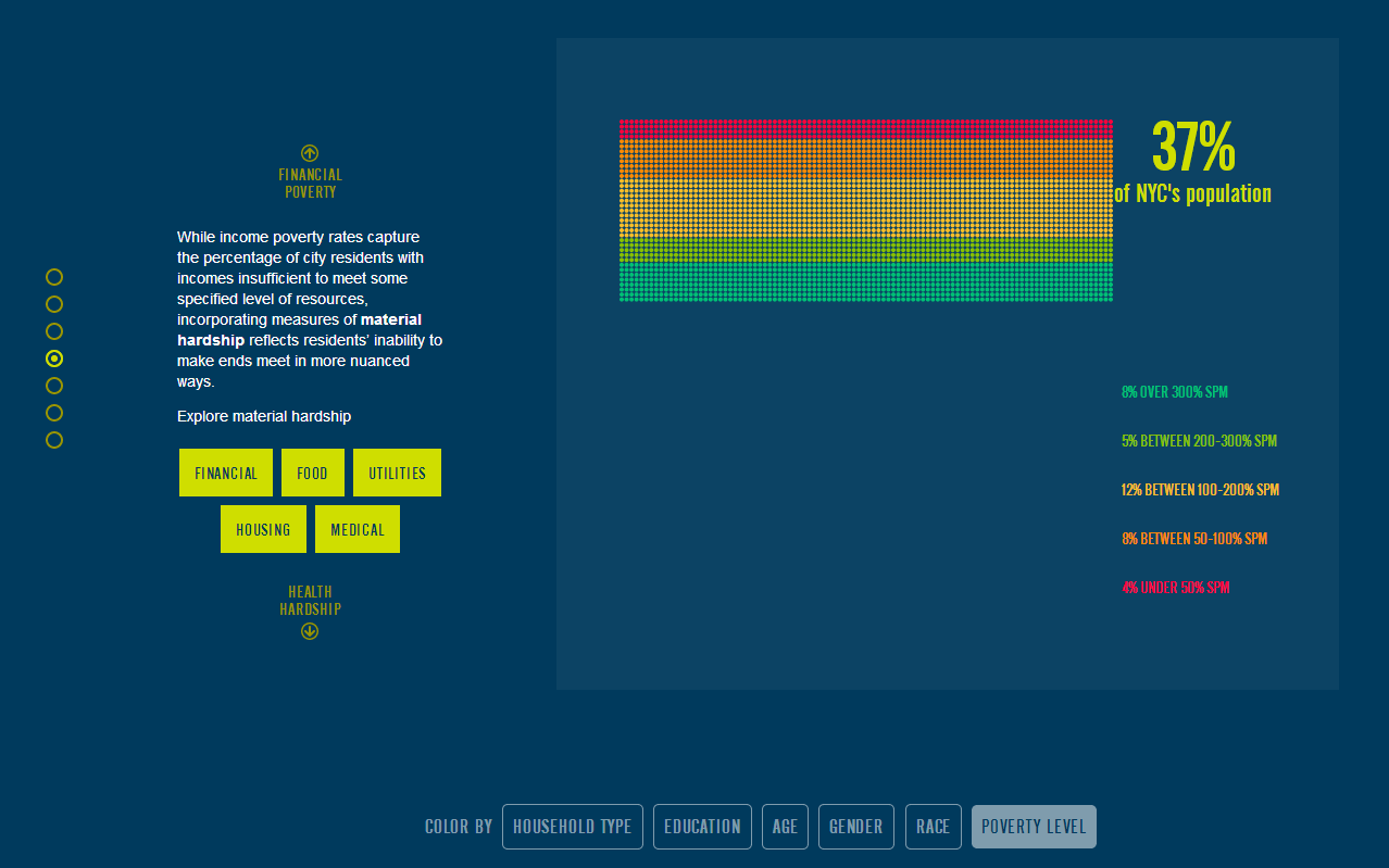

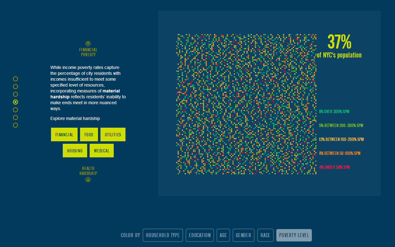


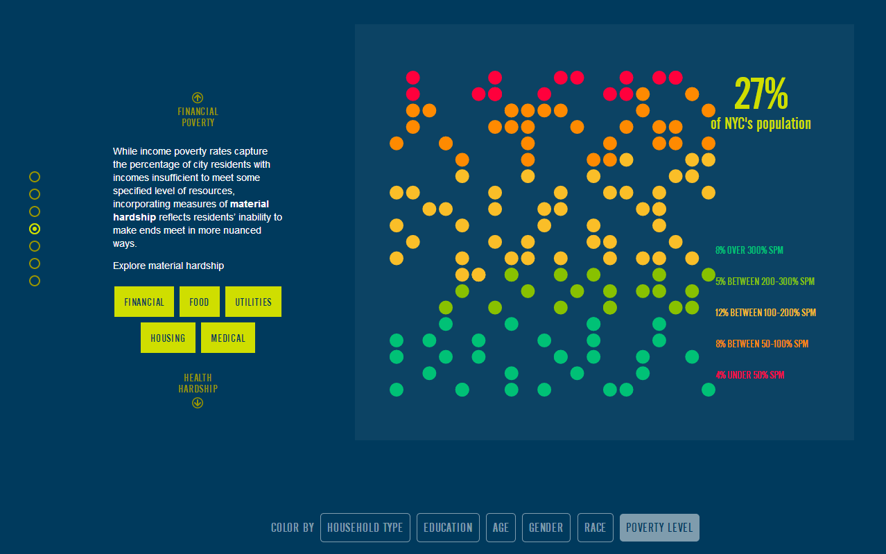
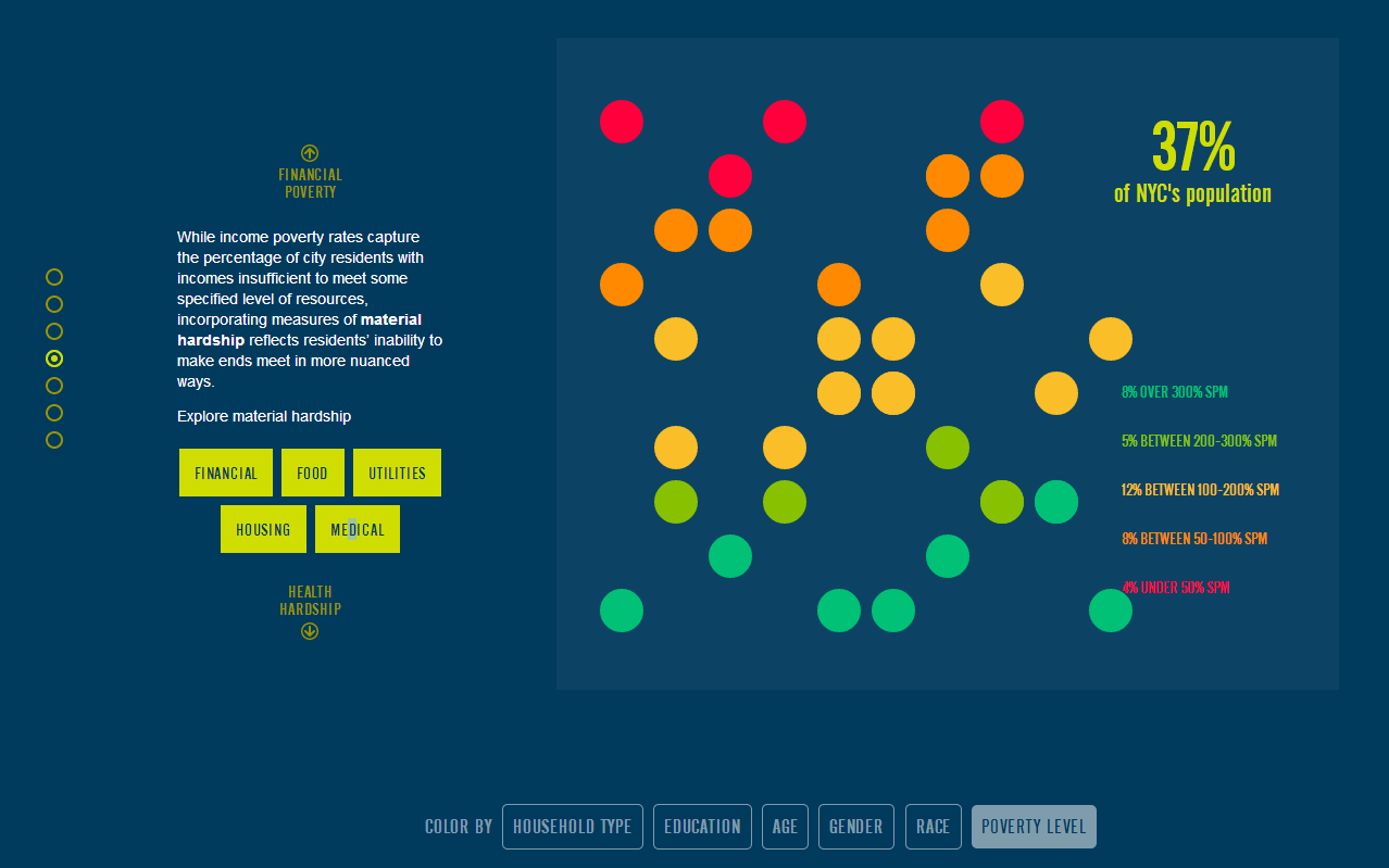
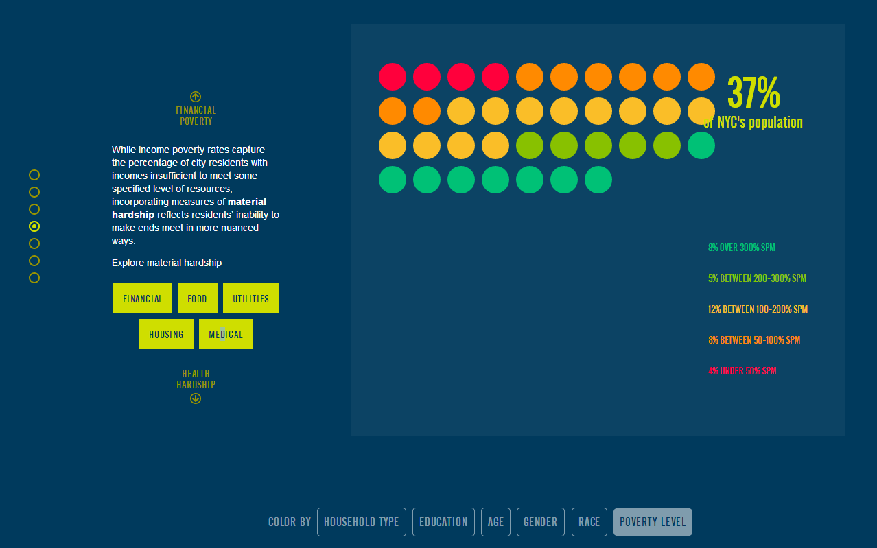
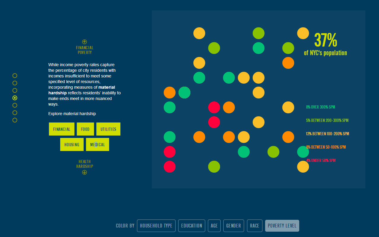
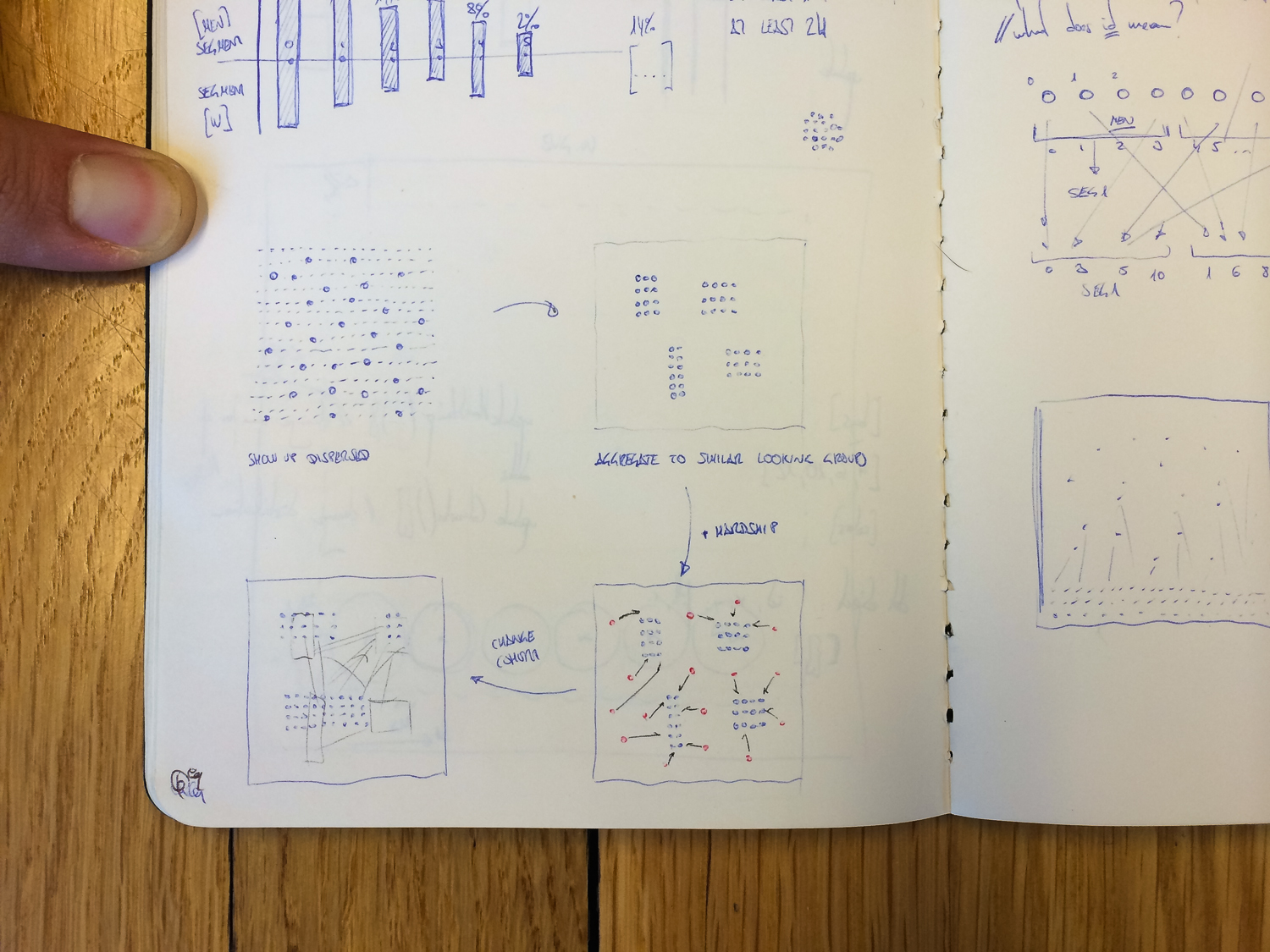
We decided to use color to define groups both within and between the cohorts, making it clear that each toggle revealed a different narrative for each demographic. As users scroll down the site, we designed the 10 x 10 grid to remain static so that no matter how the data is divided, the user can see different breakdowns of the same pool of people (New York City residents) throughout the entire narration of the site.
We were glad of the opportunity to communicate the realities of poverty in New York City, a place sometimes more associated with advantage and economic prosperity. In the US, we have a tendency to focus on aiding the poor in faraway countries, at the expense of ignoring the disadvantaged in our own backyards.
We’d love to hear what you’re working on, what you’re curious about, and what messy data problems we can help you solve. Drop us a line at hello@fathom.info, or you can subscribe to our newsletter for updates.