We’ve been working on a series of projects for Nike throughout 2013 to understand the similarities and differences that define the movement of the Nike+ FuelBand community. Studying minute-by-minute activity of users around the world has been fascinating, and hopefully we'll be able to share more of those results at some point. While Nike's dataset is incredibly vast, we saw highly personal narratives begin to emerge. After wrapping our other projects, we began exploring our own individual data.
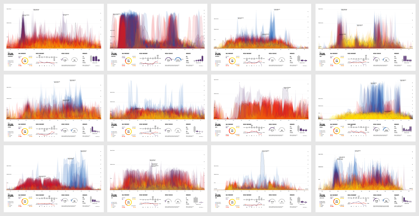
We used Nike's public developer APIs to start poring over our own information, as well as that of our families and friends who could be convinced to share their activity data. We experimented with representation through a series of Processing sketches that were passed around the studio. This helped us confirm the various kinds of patterns we saw in the anonymous data, but also to identify how the working dad, the mountaineer, the gym-rat, and the city slicker all have distinct patterns, routines, and lifestyles. Different accomplishments, interactions, events, and even prototypical days emerged in the presentation of our data. We were also struck by how people responded to seeing an image of their activity, and were able to use it to describe their daily routine, a standout week, or staying up all night with the arrival of a new baby. The cadence and intensity of how each person moves is incredibly personal, yet we rarely have the opportunity to see those patterns for ourselves. What began as a series of indiscernible daily plots soon shaped into a reflection, or a portrait, of our own personal movement for the last year.
As 2013 wrapped up, we shared a poster we'd created with Jenny Campbell at Nike, who set in motion the idea of implementing this across the entire FuelBand community. And so, lo and behold, today we launched a platform to help Nike+ users commemorate the individual stories of their own year in NikeFuel.
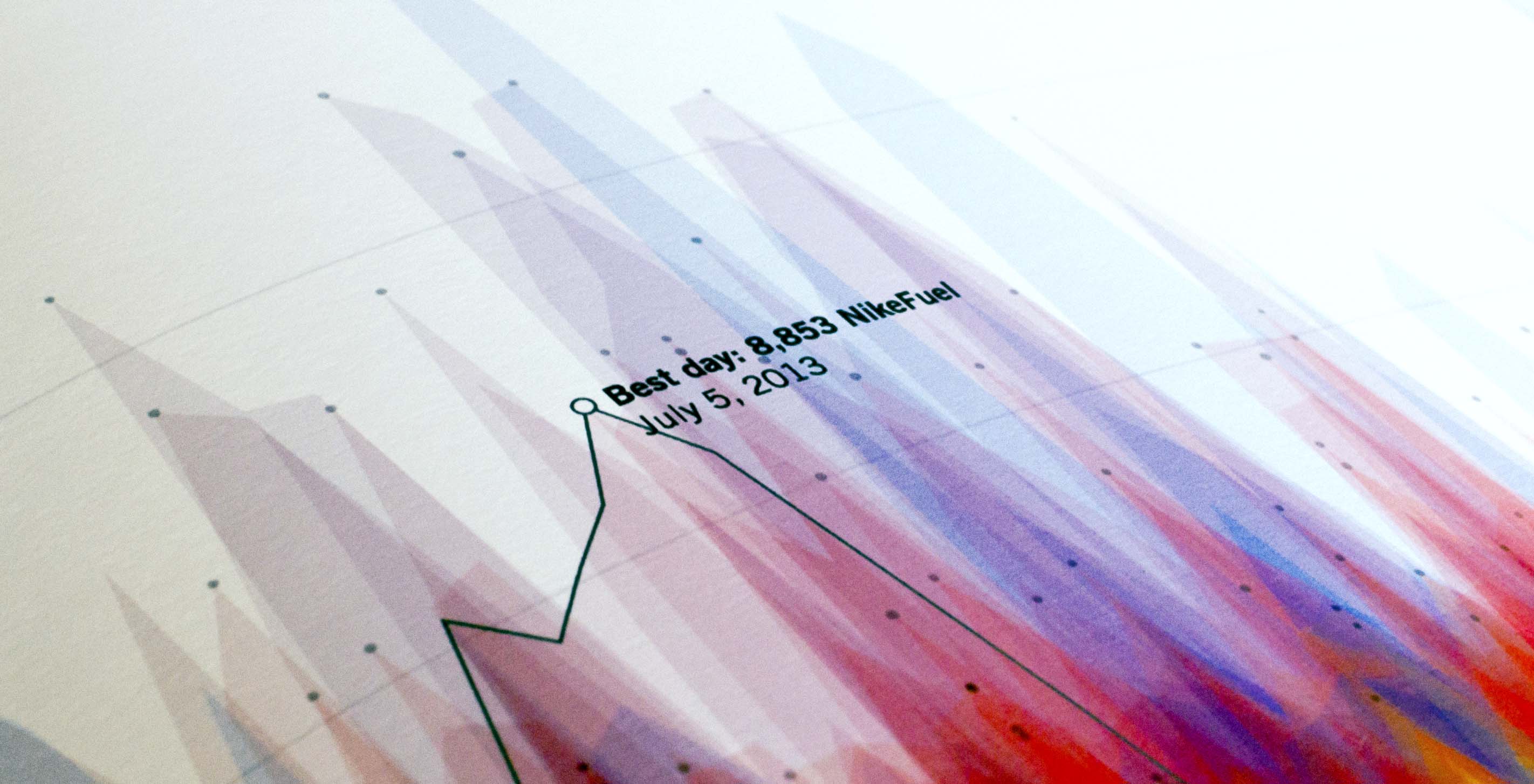
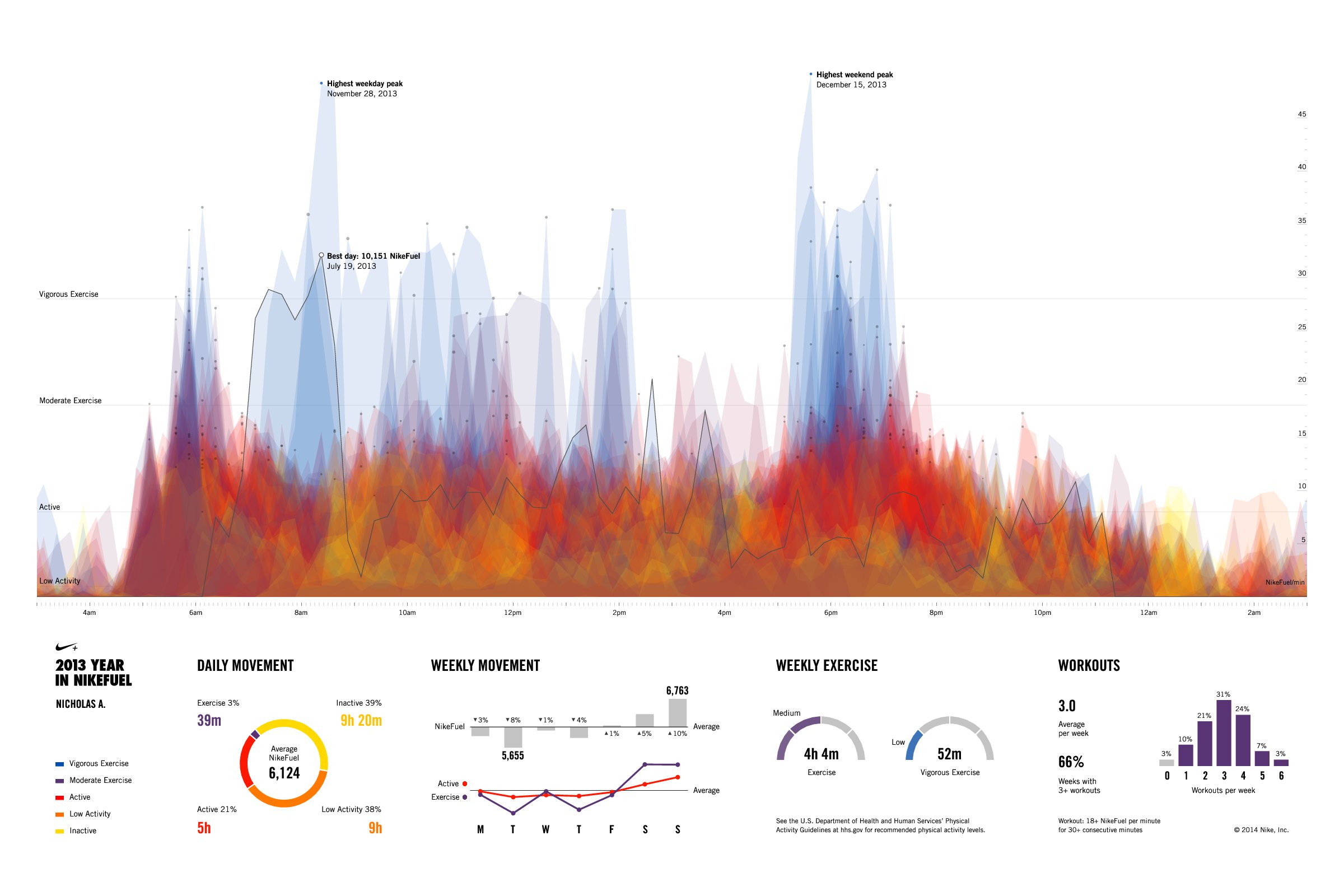
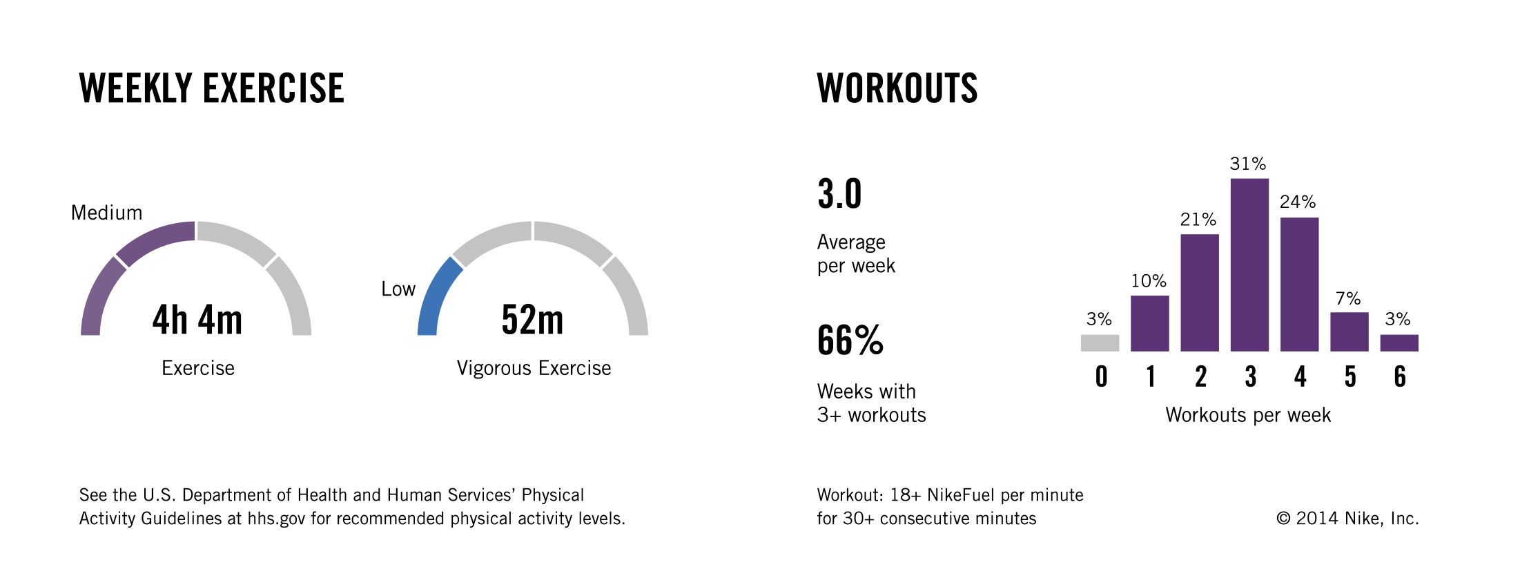
The top of the image is meant to be striking but unique, and as a poster, suitable for viewing on the wall and at a distance: it should be evocative but also true to the data. For a closer look, the area at the bottom focuses on breaking down the actual numbers and the details of movement as recorded by the FuelBand.
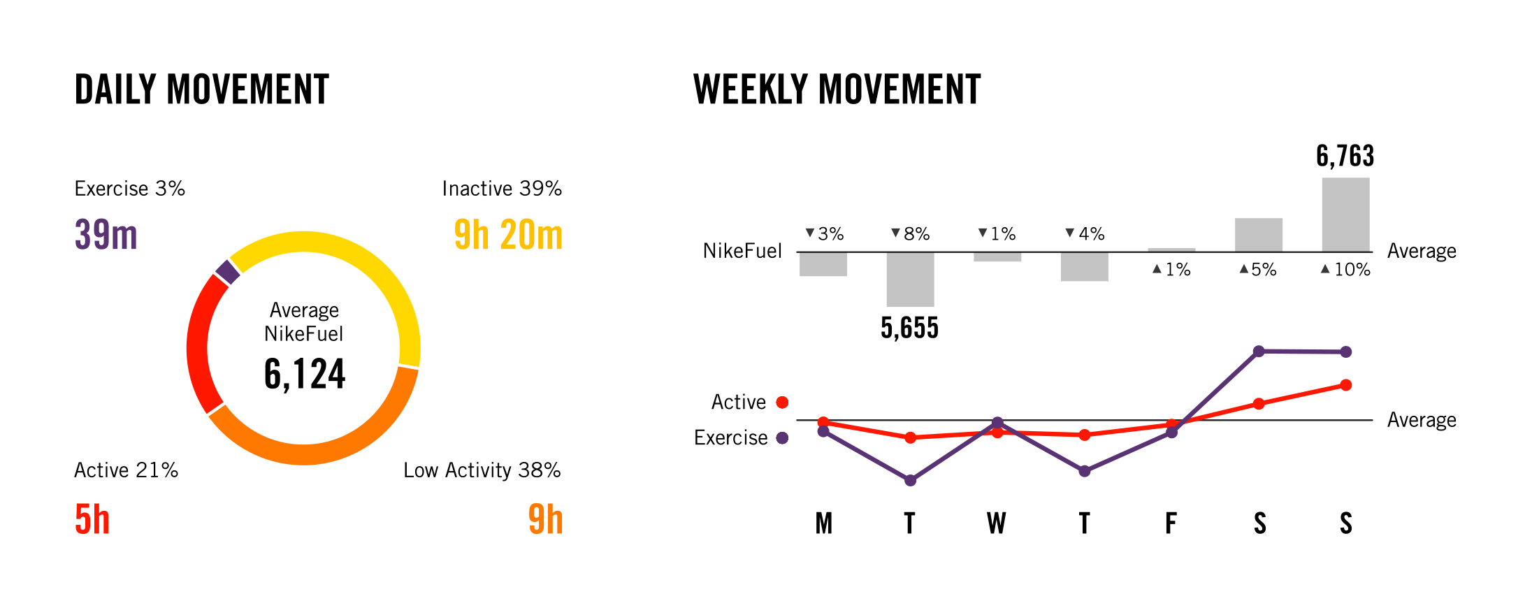
Each day is represented by filled yet transparent shapes, so the places on the poster with higher concentrations of color represent more ingrained behavioral patterns. While the fire-like layers on the top portion of the poster depict the regular intensity and activity levels of each individual, the bottom section of the poster aggregates various metrics to give a more tangible summary of each person’s movement. In addition, the posters relate individual activity levels to the U.S. Department of Health and Human Services’ Physical Activity Guidelines, so users are provided information that translates the NikeFuel metric to the context of weekly exercise.
In order to scale the project up to the Nike+ community, we created YearInNikeFuel.com, where Nike+ FuelBand users can view their personalized NikeFuel poster, and download a PDF for print. They can also share their activity trends with the Nike+ community gallery and with their social networks. The gallery allows users to see how they stack up against the rest of their peers, and illustrates how uniquely personal each individual’s regular activity is.
Enjoy some links to our own 2013 Year in NikeFuel posters: Ben | Teri | "Randolph" | Terrence | James | Alex.
We’d love to hear what you’re working on, what you’re curious about, and what messy data problems we can help you solve. Drop us a line at hello@fathom.info, or you can subscribe to our newsletter for updates.