Notebook
Here's where we post periodic updates on what we've been up to at Fathom. Reflections on the interesting stories that emerge from our client work, side projects, after-hours rabbitholes, and other miscellaneous threads of inquiry.
You can also follow these posts as a feed in your feed reader.
Lots to share since launching Rowboat: stacks, ranges, bars, and more to come!

After spending much of the last two years working away on some behind-the-scenes projects, 2024 became a Year of Big Announcements. We love sharing our work with the community we’ve built over the last decade+, and finally getting to talk publicly about work we’re extremely proud of has been a highlight of our year.

Delphy aims to lower technical barriers to phylogenetic research.


Taking a personal approach to understanding and implementing accessibility.

Why do we work with data?
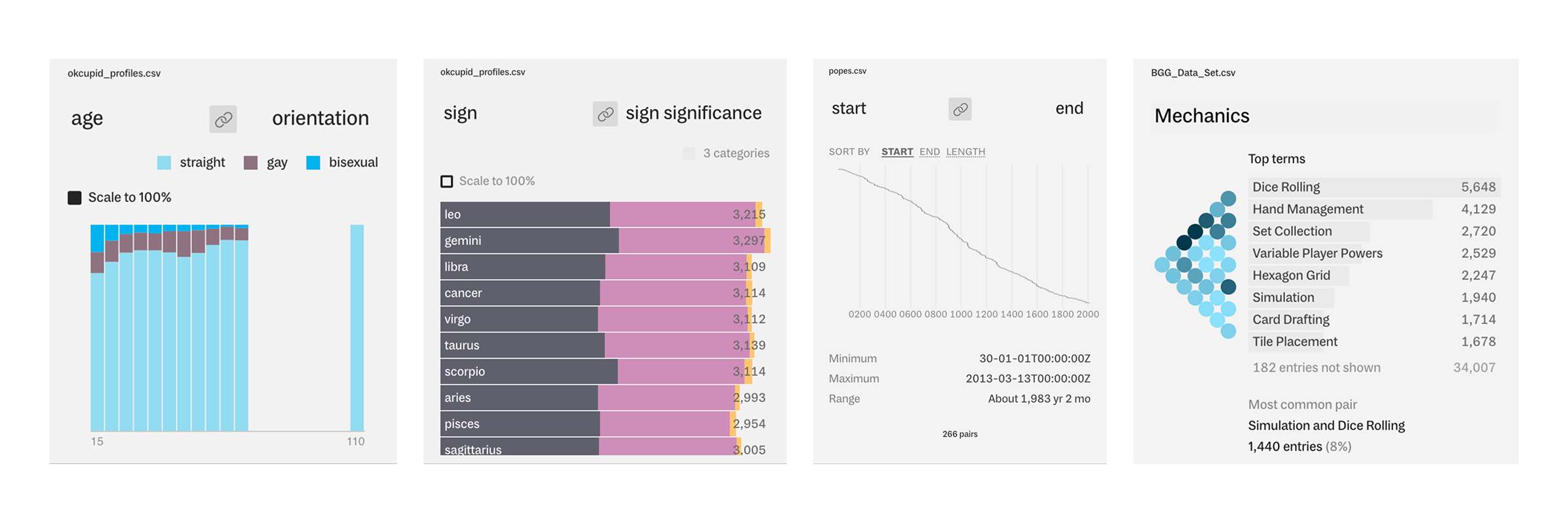
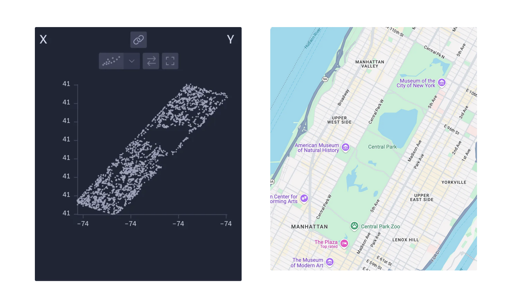
What’s the best way to learn about a dataset?
Why is it usually so difficult to work with data tools?
What’s the best way to learn about a dataset?
Why is it usually so difficult to work with data tools?

Join Elissa for a day in the life of her commute to the Fathom office!

Andy talks through the process of reviving our studio's 3D printer to make a set of map slices.
Fathom had a very busy - but exciting! - 2023. Though a handful of yet-to-be-announced projects have been taking up the bulk of our time lately, we were lucky enough to close out the year with the full team together in person in our Boston studio.