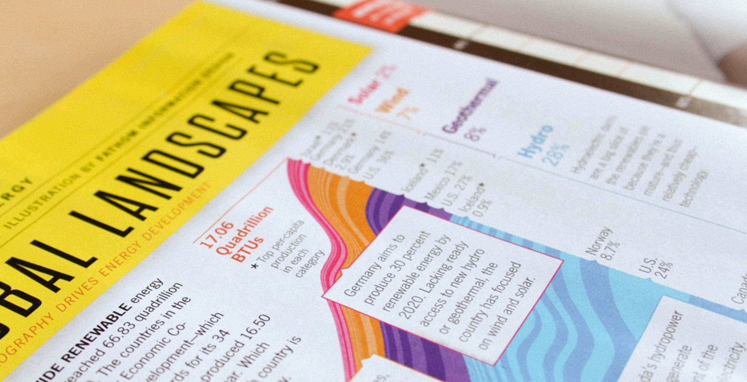
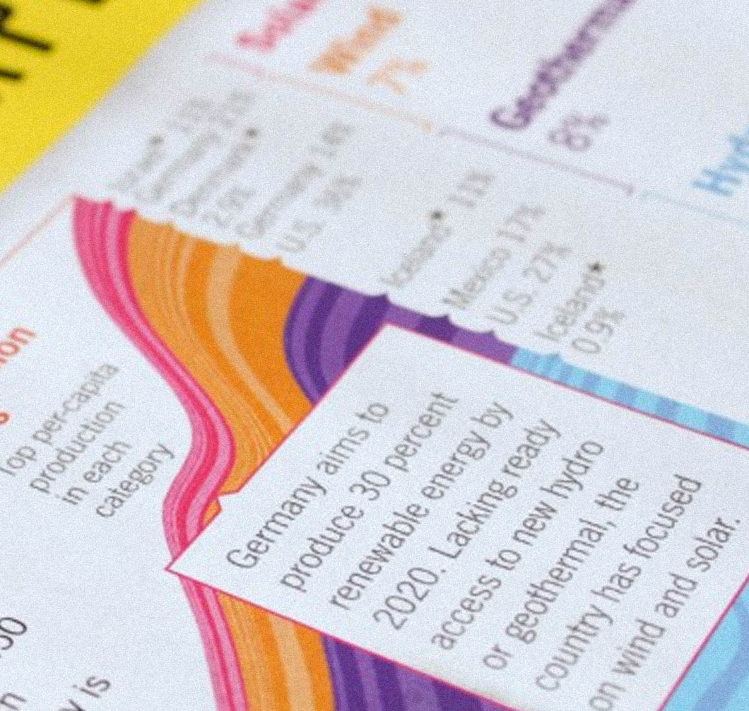
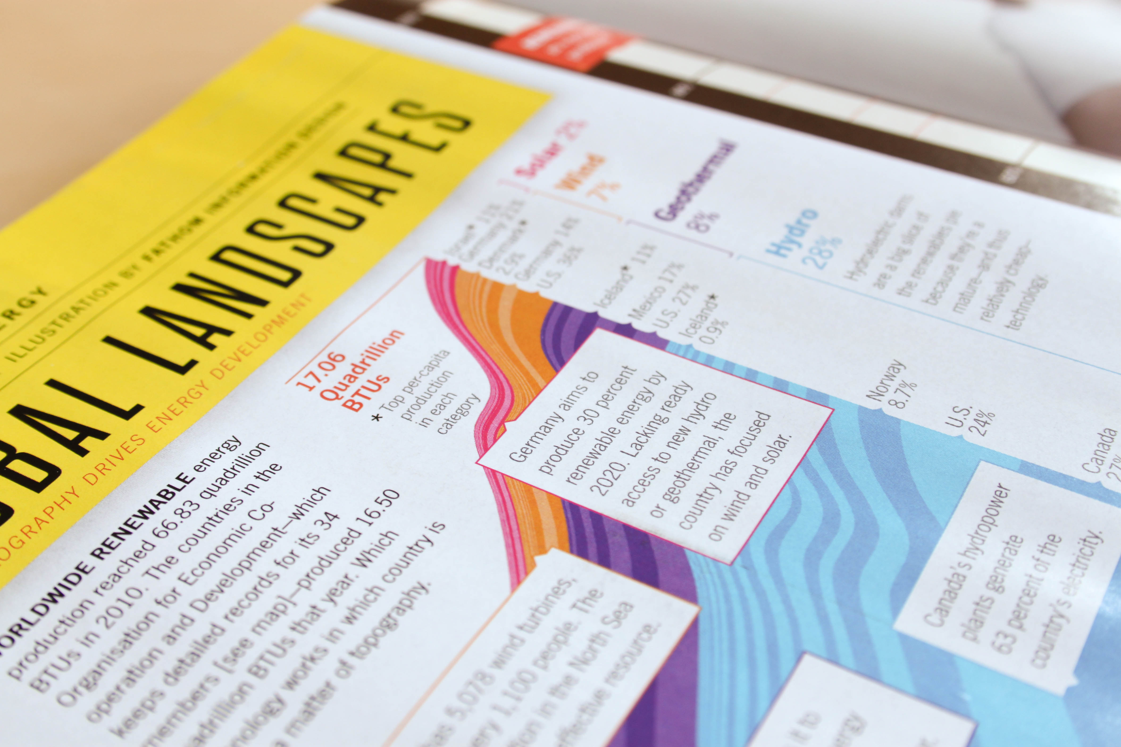
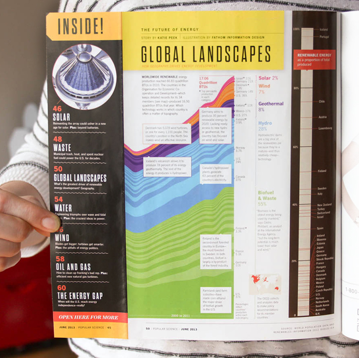
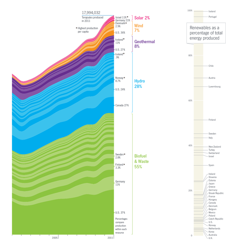
The Organisation for Economic Co-operation and Development (OECD) provides a dataset on the production and consumption of renewable energies in thirty-four countries around the world. After plotting out the data by country, renewable source, and per-capita, the graphical narrative began to take shape. We collaborated closely with Katie on the layout because we were designing the spread for print. As you may know about the publishing world, a project’s not finished until it’s in the press. Katie kept the layout flexible until the graphics sat well with the text. Comparing this story with the 2011 issue, we were pleased to bring a more positive picture of global energy production into focus. The final spread represents the countries producing the most energy in each category, and also shows the percentage of their total energy production that comes from renewable sources. The online version is available here.
Process for structuring the data
We initially looked at the data by country and energy source to find which nations were making the most progress and which energy sources were generating the greatest impact.
The list of countries with the highest production in each renewable category tended to have larger populations—so we normalized for size (i.e. gave smaller countries a little love) by measuring each country’s per capita energy production as well. While countries like the United States, Canada, and Germany often had the highest production numbers on a macro scale, the per capita view showed a pretty different set of leaders in renewable production.
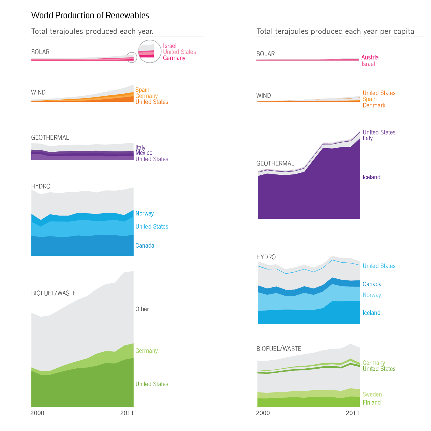
We also considered slicing the data by energy source to show which renewable categories were growing most rapidly. While wind and solar energy made up less than 10% of total renewable production, they’ve also experienced impressive rates of growth since 2000.
So what’s the next step in renewables, you might ask? For now it looks like solar and wind energy are making headway. In the meantime, we’re pretty excited about the countries that are forging ahead and catching the waves.
This post is brought to you by Terrence and Alex.