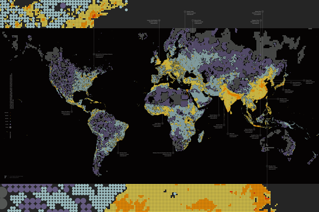
Dencity
What does seven billion look like? Dencity is a map of global population density as the world reaches this important milestone.
Capabilities
- Data analysis
- Data + code-driven print design
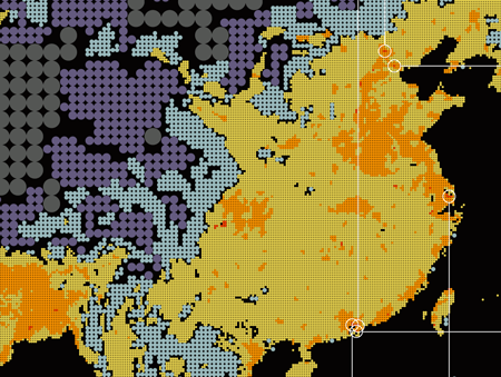
China. The largest city in the world is Shanghai, with over 23 million people as of 2010. China is home to six of the twenty most populous cities in the world, more than any other country.
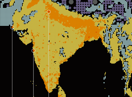
India and Pakistan. Delhi and Karachi are the second and third most populous cities in the world. The two countries are almost uniformly dense until they hit geographic boundaries such as the Himalayas to the north, or political boundaries such as Afghanistan to the west.
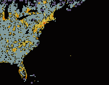
New York City. The East Coast is the most densely populated region of the United States, but New York City is the only American city to rank in the top twenty of the world's most populous cities. It's one of only three in the western hemisphere on the list.